
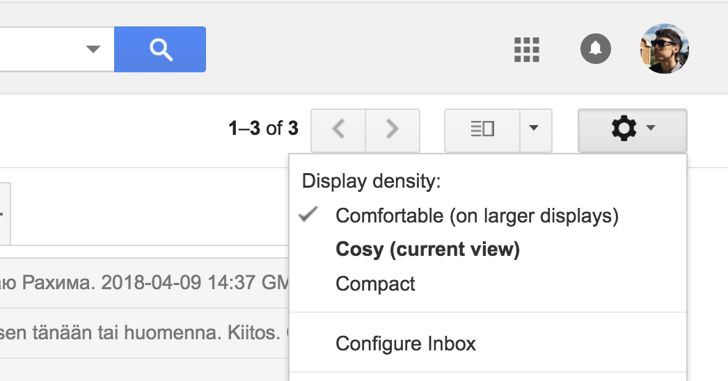
Gmail has three UI-modes: comfortable, cosy and compact. Basically, lots of whitespace, some whitespace or little whitespace. You can switch between them in the gear icon and the currently selected mode is checkmarked.
But the website also tries to be adaptive and actually jumps between first two modes as you increase or decrease the window size.
So, we have a problem: there are user-defined settings that don't change automatically, and there are automatically changeable settings that override the user-defined settings. And you gotta show both states somehow.
So, Google does the unthinkable: they add another status element that contradicts with the existing one. In the screenshot above my window is small enough so that "cosy" is automatically enabled. My "comfortable" setting is still enabled, but the reality is "cosy".
This is extremely confusing.
How to fix this? Well, I think it's important to recognise that those three options are actually very different. "Comfortable" is of different nature: it's adaptable. "Cosy" and "compact" aren't adaptable, they stay the same regardless of the screen size.
So, one solution would be to move "comfortable" out of this list altogether. Maybe, add it as a checkbox-setting "adapt to large screens" or something. Or even better: make it of the same nature and not adapt. This is actually what I personally wanted: I want lots of whitespace on any screen. In any case, do whatever but don't make your UI contradict itself.