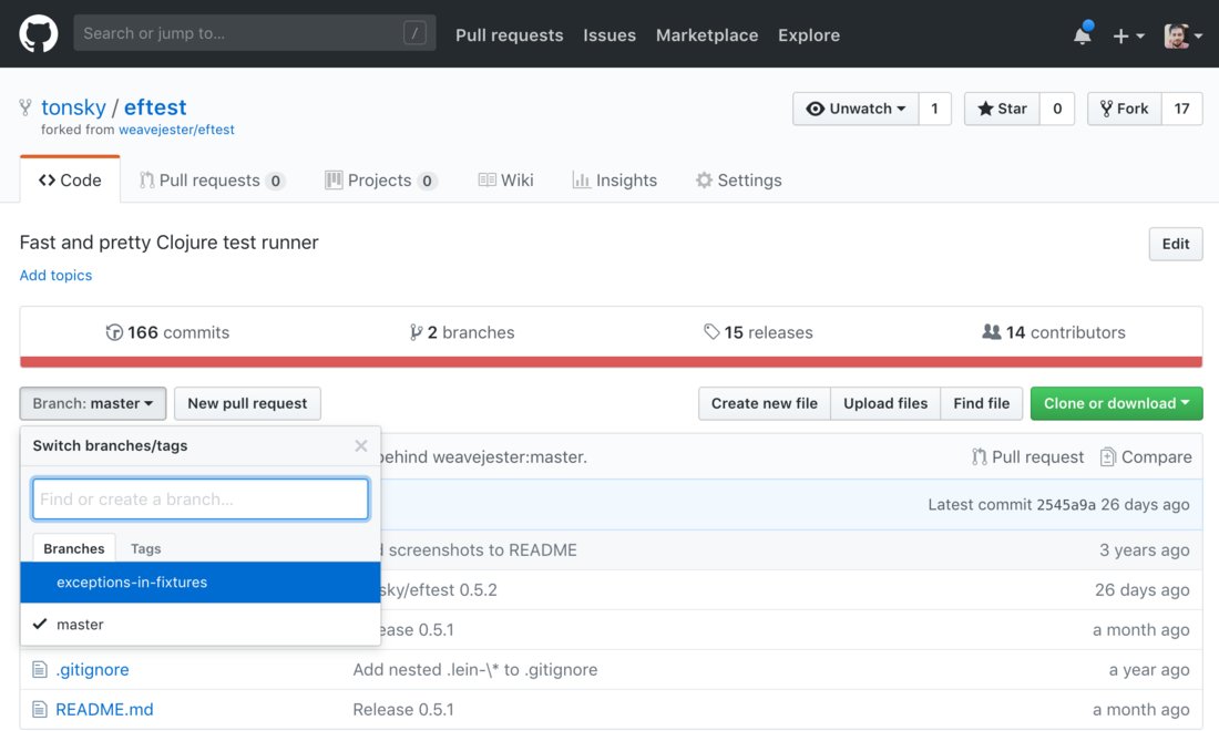
Github navigation. I mean, I remember there were at least two major redesigns, so they are trying, but always somehow mess it up.
The rule is simple: don’t put tabs inside tabs. It might seem logical for a programmer who’s writing it but in real life people don’t like hierarchies and don’t want to understand nestedness of your stuff. Especially when it’s not supported by visual cues. Which it isn’t here. But even if it was, it would not make it natural or pleasant to use.
What do we see? Top black bar is fine, it’s like separate sections of a website altogether. You either go there or you don’t. And has black background, which makes it easy to ignore. So this part is good.
Next we see our first level of tabs. It’s related to current repo. Ok, fine. If only it was the only level. The buttons Unwatch/Start/Fork also make sense here.
Then we get repo description. Why here? Why in a code tab? Shouldn’t it be on repo level? Edit button on the right is supposed to be contextual, but it’s really hard to find, given all the space that separates it from the content it’s supposed to be editing.
Ok, second level of tabs. Commits/branches/releases/contributors. You might argue that this placement is correct, after all, those make sense only in the context of code, not in PR or Wiki or Settings. True, but imagine you’re in another tab and want to take a look at commit list. It’s not natural to think “ok, commits are code so I should first go to code and then select commits here”. No. You’ll be just looking for Commits tab on a screen.
This is a problem similar to grumpy.website/post/0PKt_NN8B. When you group stuff, grouping makes sense. When you’re looking for stuff, you don’t think in groups, you’re looking for something directly.
What’s worse, even the grouping here isn’t consistent. E.g. branches are on this level and in a button one level below. Contributors are also in Insights.
Also I can’t not mention that big red line that separates tabs from the content that’s supposed to be “inside” those tabs. This is a language statistics, and you might wonder: why is it here? Well, because.
(Actually, what you see as tabs here and is funtionally a tab switcher has couple more peculiarities: current tab is not shown (you’re in “default”, unnamed view now), switching to any of them removes tab switcher altogether)
And then we have a confusing level of buttons (Branch/New PR/Create files/Clone) which are, well, not always buttons.
First of all, Branch/tag switcher is another tab switcher that hides in a button (each Branch is like a tab for your code). That would be a third layer, yes. Even more, the switcher itself contains tabs!
New PR/Create file/Upload are actions, that part is fine.
Then we have Find file which is, again, just another tab (or section) hiding under a button.
And Clone/Download is just a piece of info, not even a link, and certainly not an action (buttons are supposed to be actions). I suppose they painted it green because it was very popular but made it a button because didn’t found a better place for it.
It’s time to sum it up but look! There’re two more links (Pull request and Compare) just down below. Yes, PR link is actually an action (and is supposed to be a button), and Compare. Well, it’s enough to say those two links lead to exactly the same place :))
Ok, what’s the net result? Buttons, tabs and links are all over the place. There’re multiple “groups” or “clusters” of controls (~seven, depending on how you count).
Good news: lots of controls are top-level, not hidden under dropdowns and easy to access when you know where to look.
Bad news: grouping doesn’t make sense. It’s arbitrary, badly organized, illogical. Visual cues are not applied consistently (links that look like tabs or buttons, tabs that look like buttons or links, buttons that look like links).
As a result, I never know where to look for stuff that I need, even though I use Github every day in my work. Even just one big dumb linear list of “everything we have” would be better because at least you would know where to look for the things you need.
