
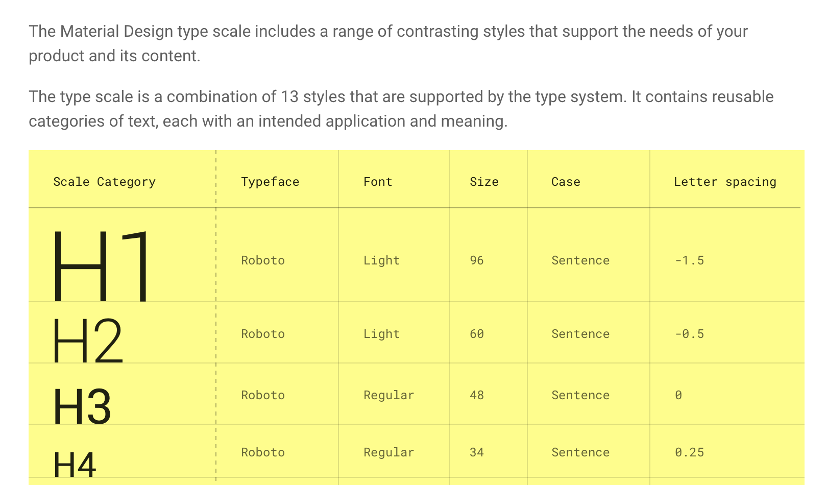
On the heels of Material Design's color contrast problems (grumpy.website/post/0TEJkwzPA) I present to you Material Design's Typography Guide.
It's *typography*. To present it, they use an image (why?!) with yellow background that isn't used anywhere else on the website (why?!!), and with a monospace font that is not used anywhere on the website and is against the recommended typeface in the very same table (why?!!!).
And, of course, the thin gray font doesn't have anywhere near sufficient contrast with the yellow background.