
(click the image above for a full-sized version)
Accessibility is a big thing these days. Everyone presents and promotes their guidelines on how websites (and apps, and design systems) should be accessible, how they have to be readable, how important the colours are and how crucial the contrast between the colours is.
The problem is, it's hard to make truly legible, readable, accessible things sexy. gov.uk sites are accessible and readable, but are they sexy? Hell, no.
Sexy is: whitespace, gray text, thin fonts. Accessible is: none of those things.
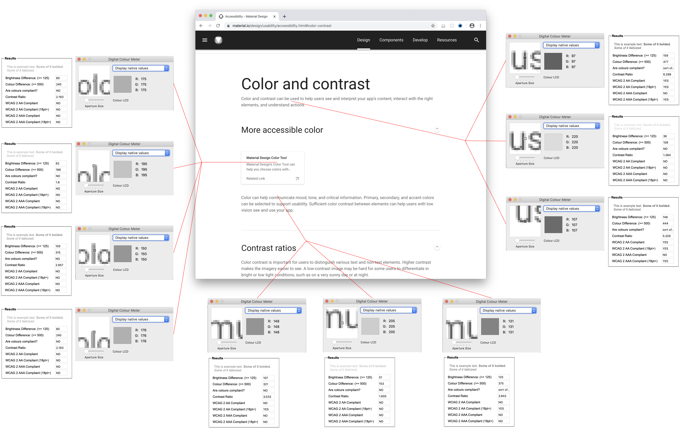
Take Material Design. On the face of it they talk about all the right things: colours and contrast *do* help your users. Contrast ratios *are* important. But all these pleas are only skin deep.
Material Design tricks color contrast tools into thinking that their chosen colours are alright: the background is white ( rgb(255, 255, 255) ) and font colour is seemingly set to black ( rgb(0, 0, 0) ). But it's not: it's black color with opacity ranging from 0.4 to 0.87 (so, rgba(0, 0, 0, 0.8) etc.). This makes it *gray*.
On top of that, they use Google Roboto, a very thin font. The result is... Well, see for yourself in the picture above (MacOS, Chrome, 100% magnification).
Even in the simplest shapes like the lowercase "L" white background bleeds through. 100% of the L does not have sufficient color contrast. In more complex shapes (such as "m" or "u") a full half or more of the character doesn't have sufficient color contrast (or insufficient contrast for small font sizes).
To add insult to injury, Material uses very slight variations on the same gray color to differentiate between headers, subheaders, and text which amounts to variations between indistinguishable insufficient contrasts.
Guidelines are only as good as the implementation by the people who promote these guidelines. For the rest of us: don't blindly copy-paste a design system just because it has nice-sounding guidelines and has a big company name attached to it.
Note: For color contrast checks I've used this excellent tool: snook.ca/technical/colour_contrast/colour.html
See also: Material Design Typography Guidelines grumpy.website/post/0TEKUvqDX