
Yesterday we talked about the shortcomings of traditional calendar view grumpy.website/post/0Uad3BltE.
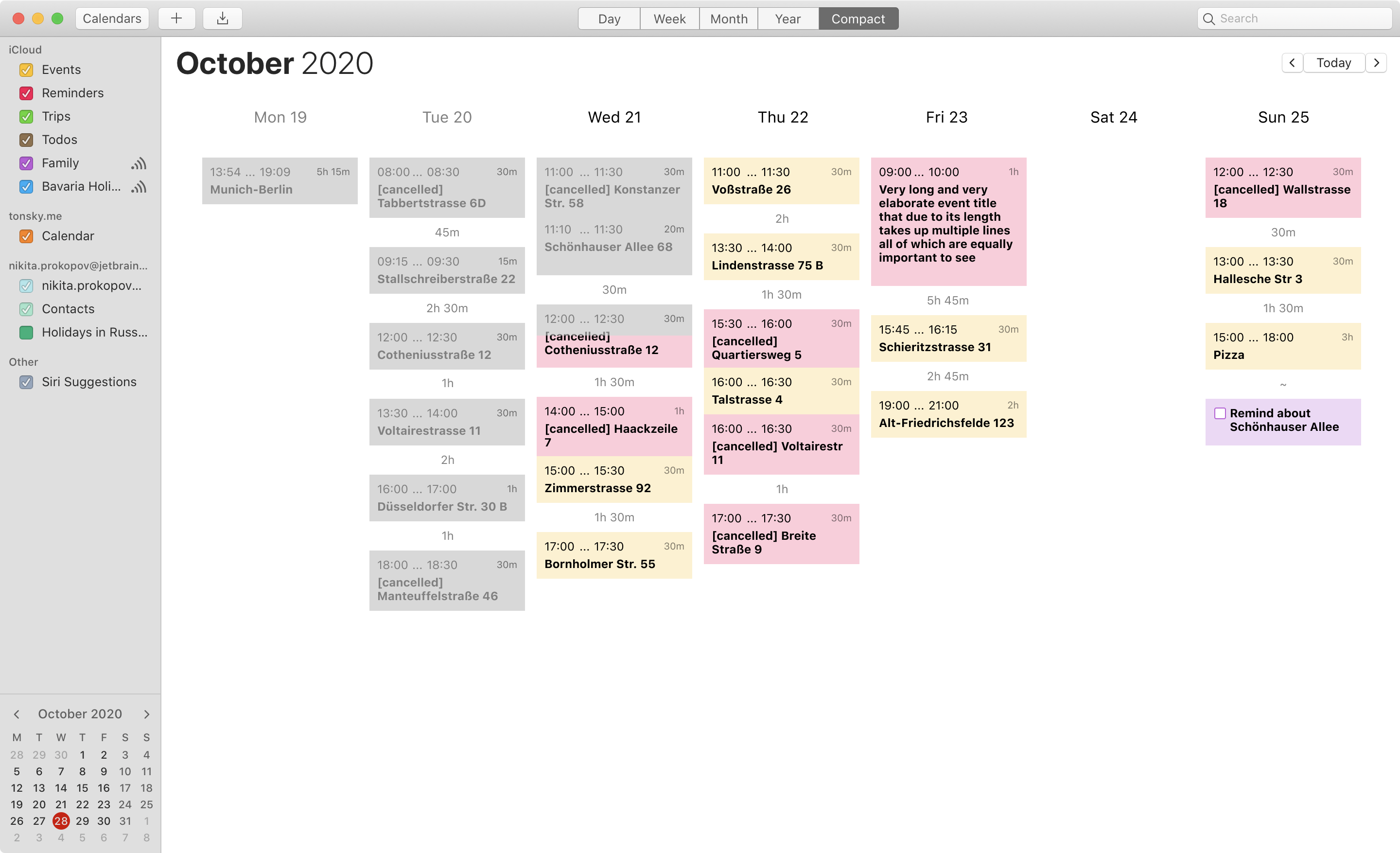
Here’s my proposal that fixes the information density problem of Week view: “Compact week”.
- Event height is not related to its length. ANY event card (even 15-min event) can fit as much info as needed (multiline titles, attachments, etc).
- Show start, end times and event length. All are useful in different contexts.
- Show amount of free time between events.
- Events are listed in order, not glued to single linear timeline. Fits more events.
- Events in the past are dimmed. Easier to find “Now”.
- Because columns are no longer actual timelines, one can add “open-ended” items (meet with friends) or simple todos (no particular time at all).
This is a middle ground between “flat linear todo list” (which I always have problem finding where does one day starts and another one ends) and full “timetable” view found in other calendar apps (which has problems fitting long title into small rectangles proportional to event length).