
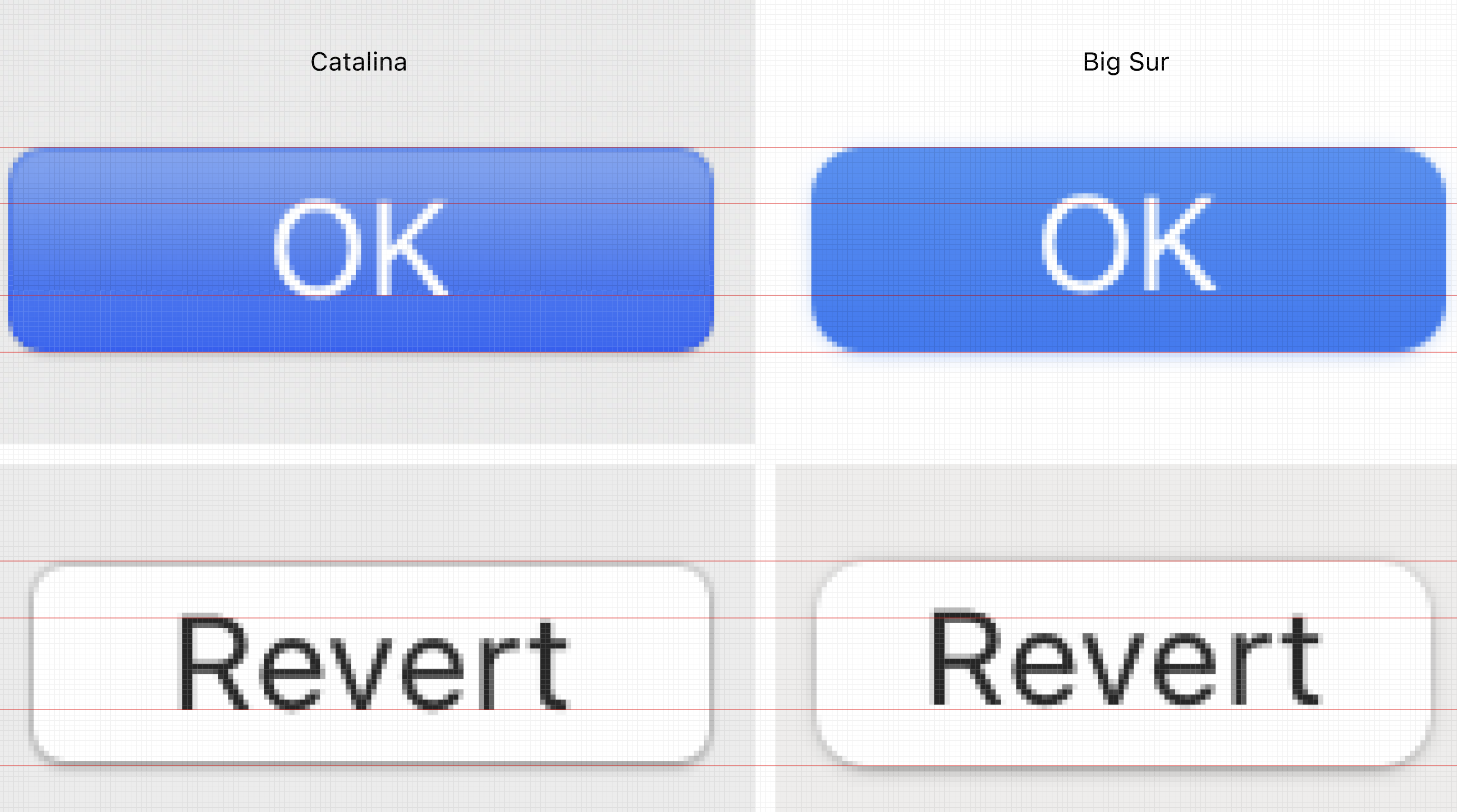
Years of web development trained me to spot a very specific thing: text not aligned vertically in a button. It is hard on web, where end users might use different fonts, devices and OSes.
But Apple controls everything: devices, OS, font! Yet in Big Sur, for the first time in human history, Apple did a poor job aligning text in a button. The end is nigh.
P.S. Yes, you can totally see it. Yes, it is consistent across OS. It is in EVERY button, every tab, every dropdown. Yes, it’s annoying as hell.