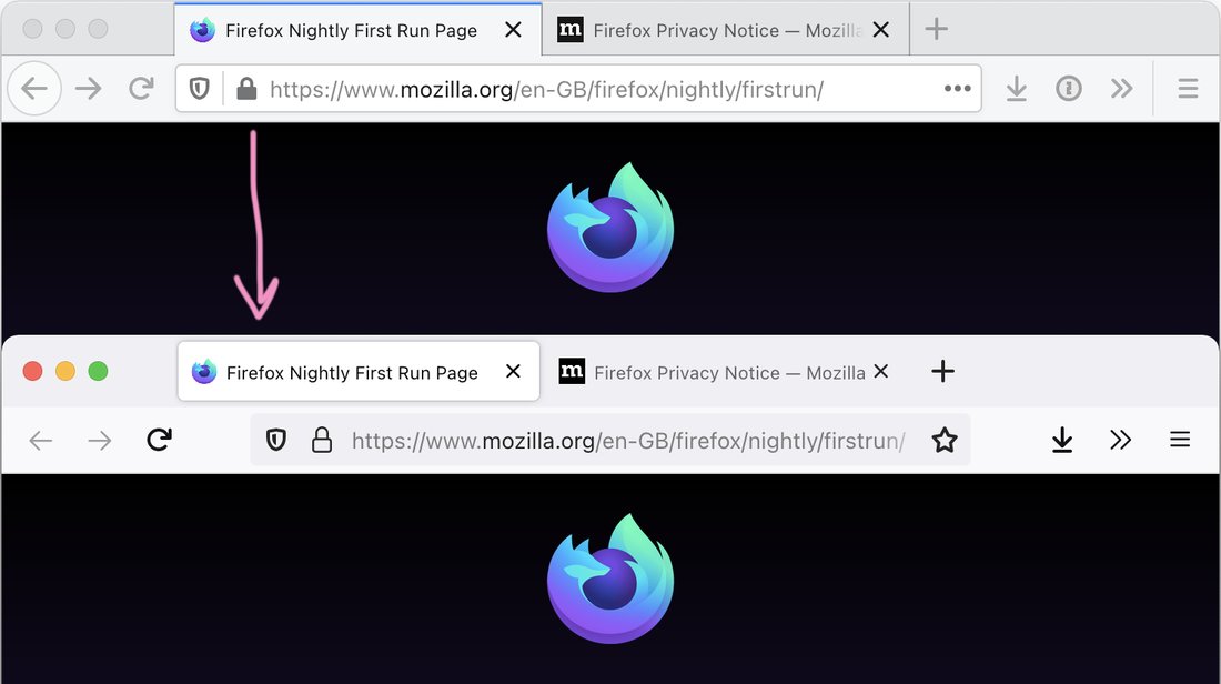
Firefox is about to update its tab design :( To which I can only say: jesus fucking christ, are you out of your mind?
Why did you put elevated rectangles instead of tabs there? With shadows? It looks like I am supposed to drag it somewhere, while I am not. They make so much visual noise!
And no sense, physically. Tab is a label on the rest of your content, so it should be part of it. No borders or other elements should separate tab and what it represents. Here, it’s in its own space, completely unrelated to what it controls.
Why are you doing this, Firefox? I don’t want to go to Safari. Please don’t make me switch back to Safari.
