
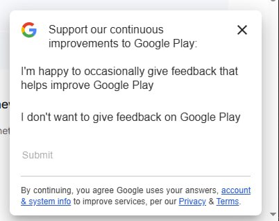
What kind of control is this? Radio group? Buttons? Links?
Minimalism went too far.
Thanks @komarovman for the picture
What kind of control is this? Radio group? Buttons? Links?
Minimalism went too far.
Thanks @komarovman for the picture
Notification without actual message is probably a bug, but the bigger question remains: why does headphone manufacturer’s app has a Messages section? What can I possibly communicate with them about?
Thanks @FaviFake for the video
I’m sorry, what’s the idea here? You make text field tall enough to fit both label and value. You then put label in place for value, where you expect user to type. Is it supposed to look inviting? Then when user finally figures this out and clicks inside, you move label to the empty space you had there all that time? Why not put it to the top in the first place?
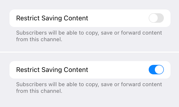
My first thought was: gray text is explaining what the toggle does. But then I read the text and it made no sense: if I _restrict_ sharing, it will allow people to save and forward?
Okay. Second idea. It might be explaining current state of the toggle. That would be wrong (don’t to this! always explain what toggle does when enabled), but at least I can understand the thinking.
So I enabled it and the grey text didn’t change. Now I’m out of ideas.
How do you tell a button from a text input?
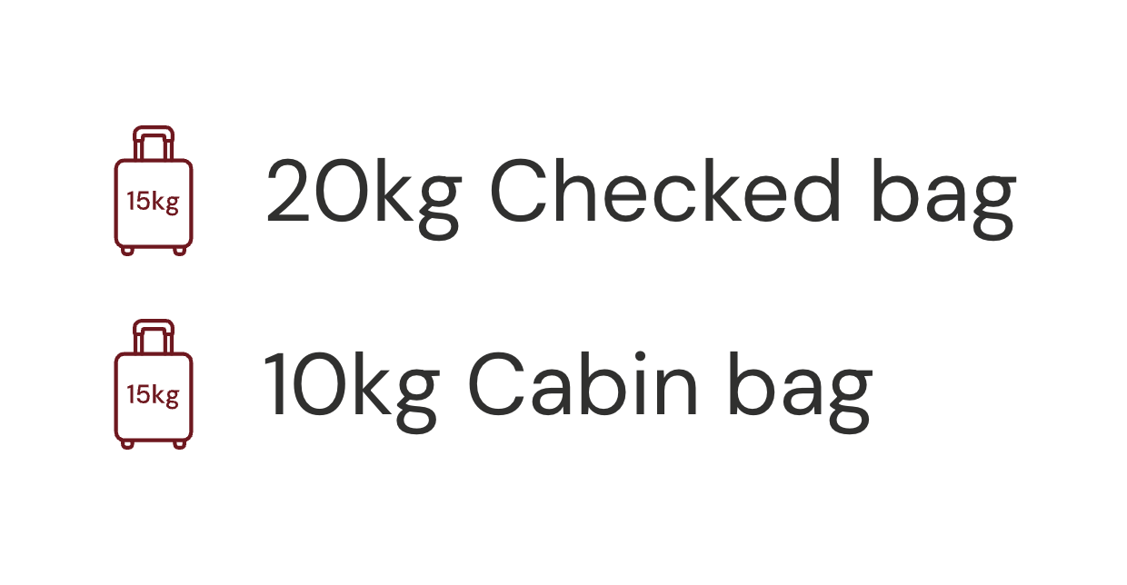
Please, make your #icons abstract