If your brand name is your domain name, you don’t get to append words to the end of it. Google.Maps is fine, Google.com.Maps would be not
If your brand name is your domain name, you don’t get to append words to the end of it. Google.Maps is fine, Google.com.Maps would be not
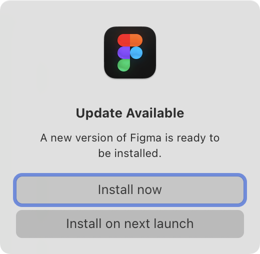
From a tool that spends so much time polishing every UI detail, this window is very unexpected.
What is really a choice here? I cannot not update. I can either do it now, in which case, why not do it automatically? Or I can choose “next launch,” but how am I supposed to know whether I will want to update at some indefinite point in the future?
Startup is also the worst time to show a window like this. If I open Figma, that means I want to do something, and this is guaranteed to get in my way.
If a window like this absolutely has to be shown, show it at shutdown. But the rest of the apps have figured out background updates, so why can’t Figma?
You know what? I don’t need shortcuts. I’ll just click through the menu, thanks
Things I learned today:
- Websites can override Cmd+R
- Google Sheets uses it to replace current cell with the cell on the LEFT
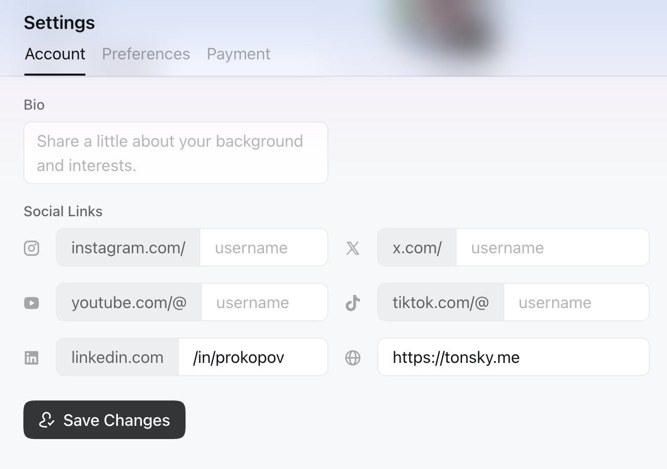
Don’t put checkmark on a button. Checkmark means “Saved, done”, not “Press to save” (in the screenshot, settings are NOT saved)
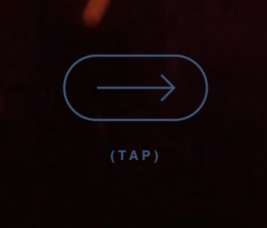
It’s always funny to me when a website has to explain what to do with it because there are no obvious controls or visible content. That’s a problem of your own creation.
It’s even funnier when the interaction icon itself is confusing enough that it needs explanatory text beside it. Choose a better icon, or just use the text.
All that said, in this specific example, the choice of an arrow to represent a tap is very unconventional.
Icons must help you understand. They are not just random sigils. It the list expands to the right, icon must show an arrow to the right
Thanks @HID_DEVICE for the video
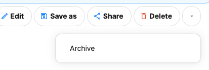
This is exactly backwards: non-destructive action behind a click, yet the destructive action “in the open”
Thanks KillerX for the picture
No, hiding sidebar toggle button under your logo is NOT a good idea.
Think about it from user’s POV: user needs to open a sidebar. They start to look for an icon that looks like a sidebar. How would they discover it under your logo? Only by accident. Users can’t click icons they don’t see.
Thanks nurikolan for reporting this.
Anonymous submission. This is worse than I could ever imagine. Original text follows:
---
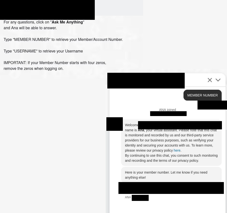
Your bank re-works their website. Here's what you have to do to log in:
- Use existing username + password: prompt “activate your account!”
- Enter name, birthdate, email, and... member number?
- Dig around files. Member number is not printed on card, not on checks.
- Login page has a button: “find member number” Fine, I'll use that.
- Button is JS that takes you to a new domain. No longer the bank's website!
- Url looks like <30 random chars>.my.site.com. Had to double-check—this looks malicious. It was not.
- Checkbox: “are you an individual”? Yes??? Continue.
- Enter: name, birthdate, email, FULL SSN (wtf?! remember, we are now on a third-party site)
- Do you get your member number now? Of course not!
- You get to meet ANA instead, and must ASK A CHATBOT to parrot your member number. (screenshots)
- Acquire member number, can finally log in.
I hope my SSN didn't make it into the chatbot's context.
1. I see a control (chevron in this case)
2. I start moving my mouse towards it, planning to use
3. I finally reach it. It was hard, because it is small
So why, at the moment when I finally there, would you replace it with an entirely different one? What do you think I was moving towards? How am I supposed to know?
Thanks Michaela for the video
You are not allowed to close this popup until May 31
Thanks Fuchen for the video
Okay this deserves to be called out. Over a year ago? For both 2015, 2018 and 2021? How is this helpful???
JUST SHOW THE ACTUAL DATE!!!
What are you afraid of anyways? That users don’t know numbers?
Thanks Daniel for reporting this.
I can finally articulate why I don’t like subscribe forms in the middle of an article: they invade the content space.
Yes, modern web is full of advertisements, self-promotion, branding, regulatory banners and other “product techniques”. Such is life. Most of them occupy their own space. Banners are on different layer. Marketing is usually before or after, or always visible on the side.
But inline subscribe forms are different. They live inside the text itself, and that pisses me off. You have no right! A person is talking to me, and you dare interrupt our dialogue? Get off our lawn!
Pro tip: instead of writing down a short sentence in full, make it appear on a marquee for dramatic effect