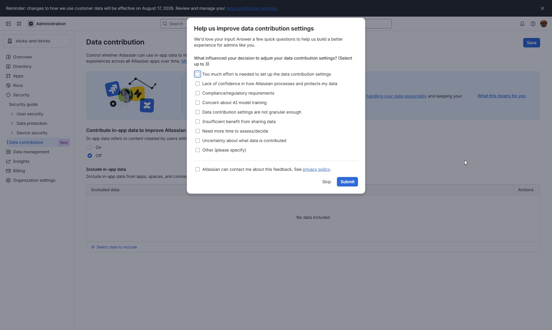
Help us improve this one radio button by answering 10 questions!
Thanks @komarovman for the picture
Help us improve this one radio button by answering 10 questions!
Thanks @komarovman for the picture
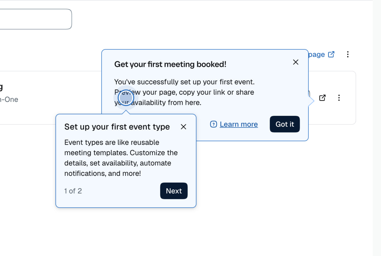
You know you have a popup problem when your popups start having popups.
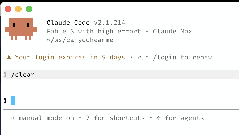
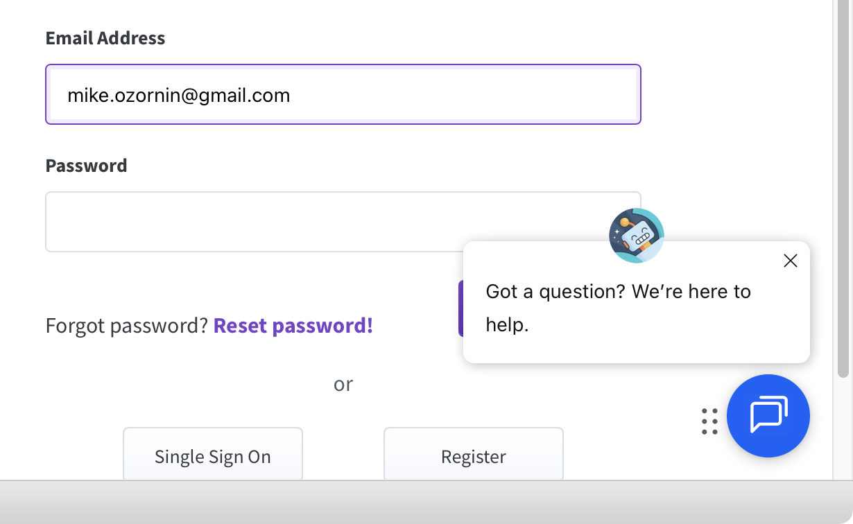
Why log in when you have to, when you can instead experience the same Kafkaesque maze of pages, redirects, confirmation emails, copying codes, and searching for a second device—all a week in advance?
#ClaudeCode #Anthropic #Login #SignIn #Authentication #Expiration
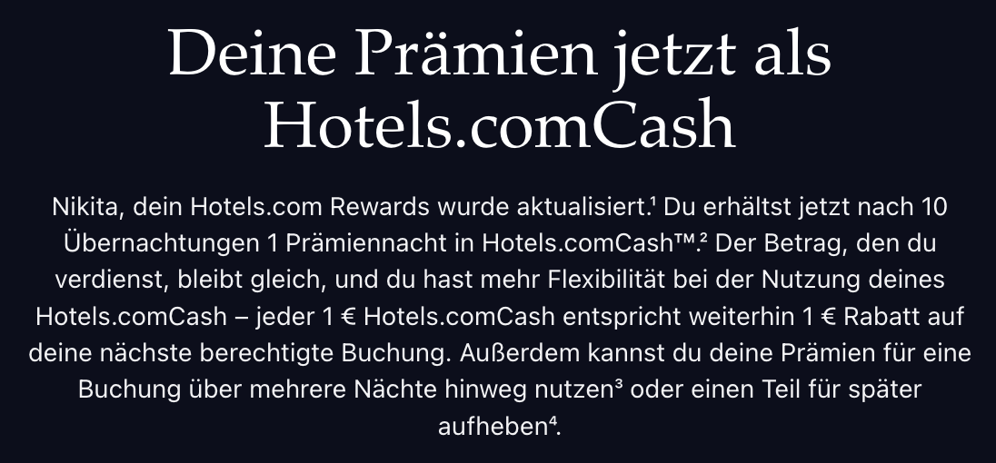
If your brand name is your domain name, you don’t get to append words to the end of it. Google.Maps is fine, Google.com.Maps would be not
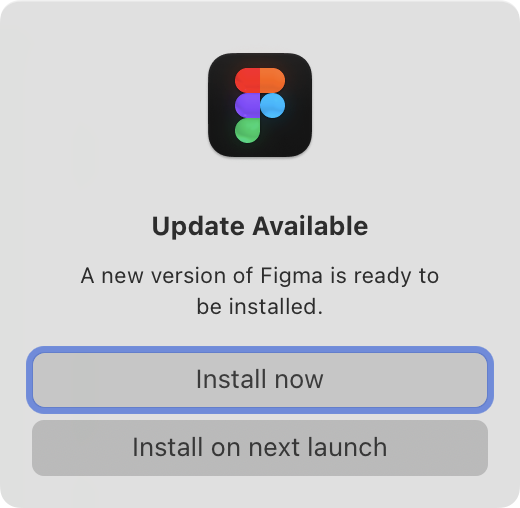
From a tool that spends so much time polishing every UI detail, this window is very unexpected.
What is really a choice here? I cannot not update. I can either do it now, in which case, why not do it automatically? Or I can choose “next launch,” but how am I supposed to know whether I will want to update at some indefinite point in the future?
Startup is also the worst time to show a window like this. If I open Figma, that means I want to do something, and this is guaranteed to get in my way.
If a window like this absolutely has to be shown, show it at shutdown. But the rest of the apps have figured out background updates, so why can’t Figma?
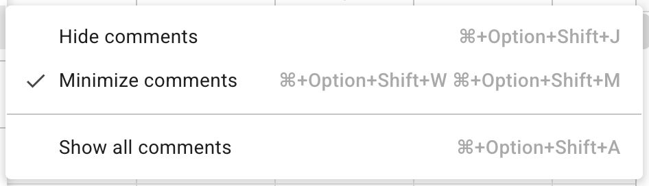
You know what? I don’t need shortcuts. I’ll just click through the menu, thanks
Things I learned today:
- Websites can override Cmd+R
- Google Sheets uses it to replace current cell with the cell on the LEFT
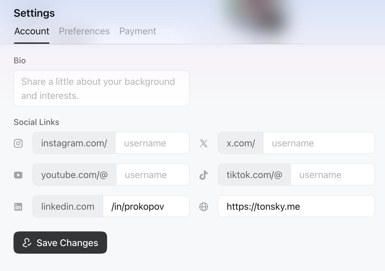
Don’t put checkmark on a button. Checkmark means “Saved, done”, not “Press to save” (in the screenshot, settings are NOT saved)
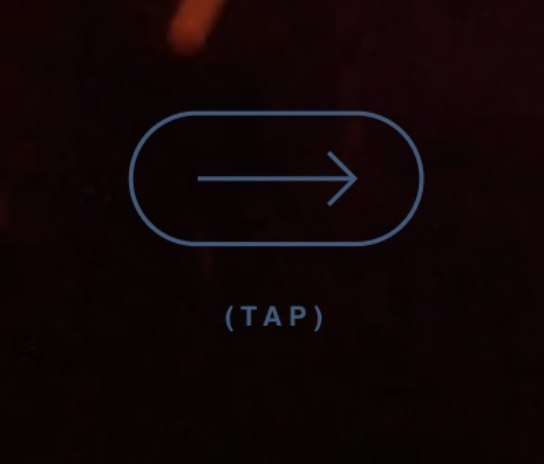
It’s always funny to me when a website has to explain what to do with it because there are no obvious controls or visible content. That’s a problem of your own creation.
It’s even funnier when the interaction icon itself is confusing enough that it needs explanatory text beside it. Choose a better icon, or just use the text.
All that said, in this specific example, the choice of an arrow to represent a tap is very unconventional.