
Classic
Classic
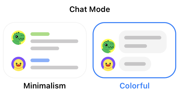
I like how Colorful option has less color than Minimalism, and Minimalism has less consistency than Colorful
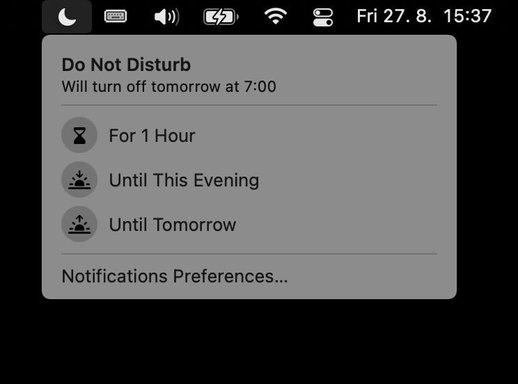
If macOS turns on scheduled DND, there’s no button to turn it off 🤦🏻♂️
Thanks @YuriySteam
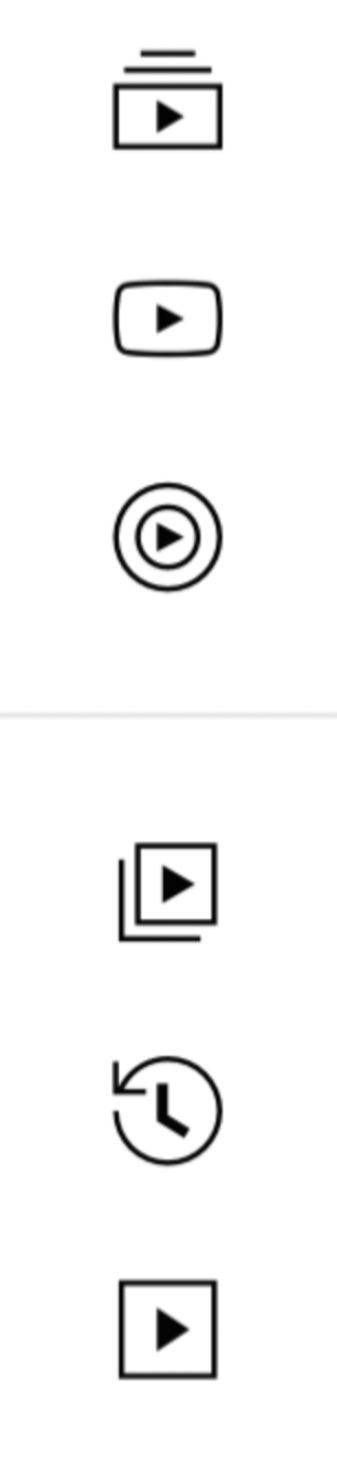
Quick! What these icons mean?
Thanks @YuriySteam for the picture
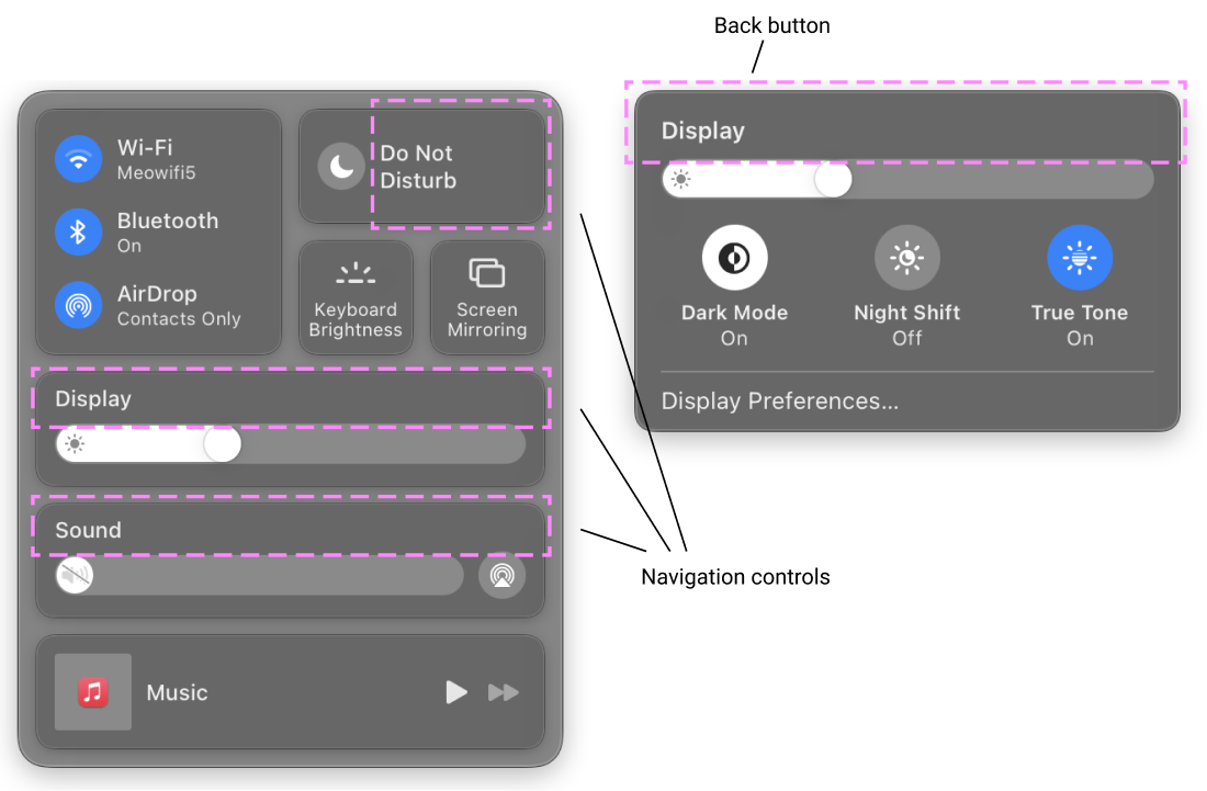
What really bugs me about Control Center in macOS is that its navigation controls are completely invisible. They are not controls even, just random parts of another controls that suddenly don’t trigger what’s drawn and written on them but instead move you to another screen. Navigating back is quite a puzzle either.
How could this have happened? Someone proposed: what if we make our controls _completely_ invisible? And everybody else were like: yeah, that’s a great idea, really clean and smart. And then they just shipped it?

Everything that's wrong with Apple's Photos specifically and with software development at Apple in general in one progress bar.
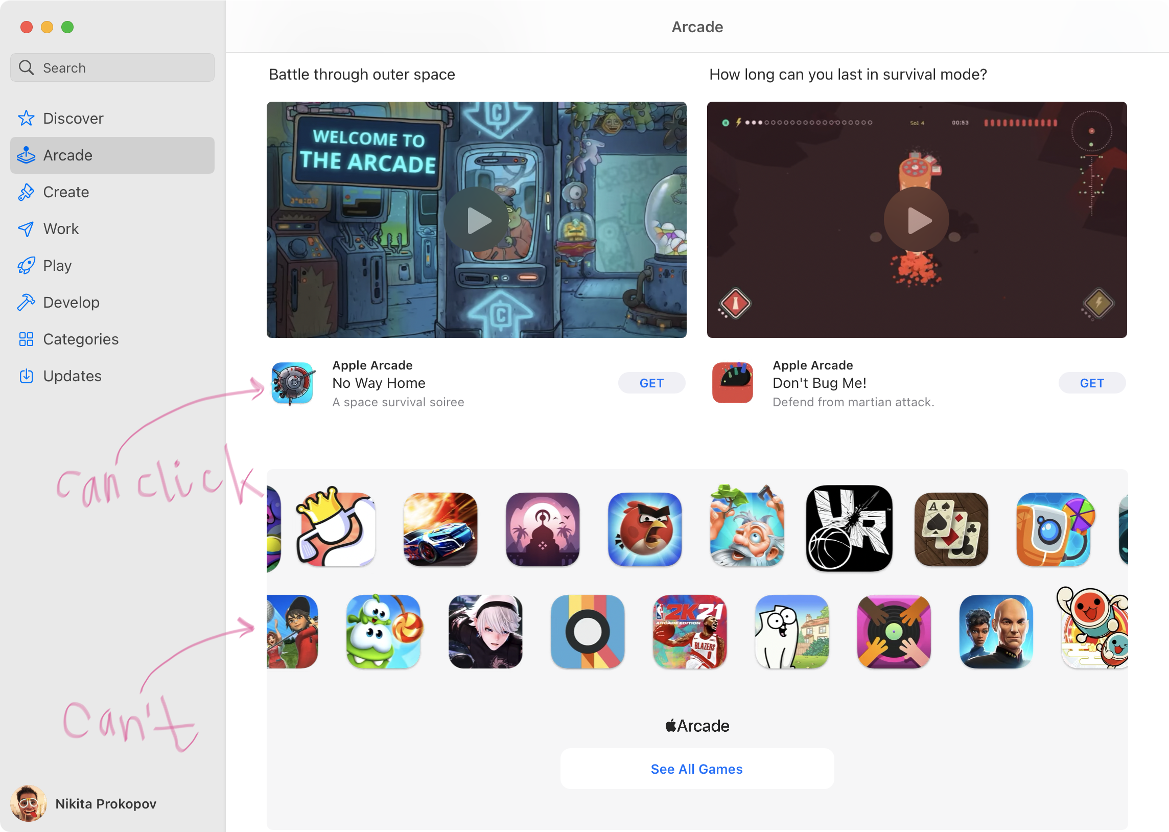
So you takes years to teach people small rounded squares are clickable, and then make a UI that makes them unclickable. Don’t do that

Buttons for toggles have this inherent problem: should they show state, or should they show action? Twitter elevated it to the whole new level: in one state it shows state, in another it shows action. To top that off, after a few years teaching users their visual clues they completely inverted the visual code.
If only somebody invented a control that can unabmigiously show the state and the action...
Left to right: Twitter before/Twiter after/My proposal

FaceTime group call sports TWO identical camera icons. One for accepting the call, one to turn off camera.
Thanks @YuriySteam for the picture
macOS Big Sur. Doing it all, in all new ways.