
Do Discord’s icons for muted/unmuted are crossed mic and... crossed mic?
Do Discord’s icons for muted/unmuted are crossed mic and... crossed mic?
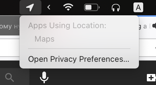
Times I’ve opened Maps app on macOS: 0.
Times it lets me know it uses Location services: every freaking hour.
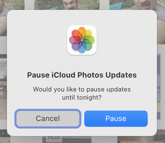
I remember times when all UI researches were acknoledging modals are bad. Yet here we are.
Why is this modal popup needed? Pausing/resuming sync is a TRIVIAL operation, non-destructive, with no stakes. Just pause it and leave it be
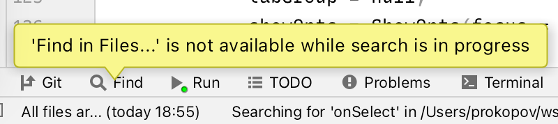
Apparently you can’t search while you’re searching

Don’t add explanation text (or a tooltip) if it’s goint to say exactly the same
Play button in the center, pause button in the left bottom corner. Very handy!
Also, pause shows still frame from the start of the video, but playback actually resumes from the last known position.
Don’t be smart when designing video UI.
Spotted in @meow_design
Wanna take a closer look at photos we made? Too bad, we covered them with huge red arrows, small red dots and black gradient for the lower third of the picture.
Solution: place controls outside!
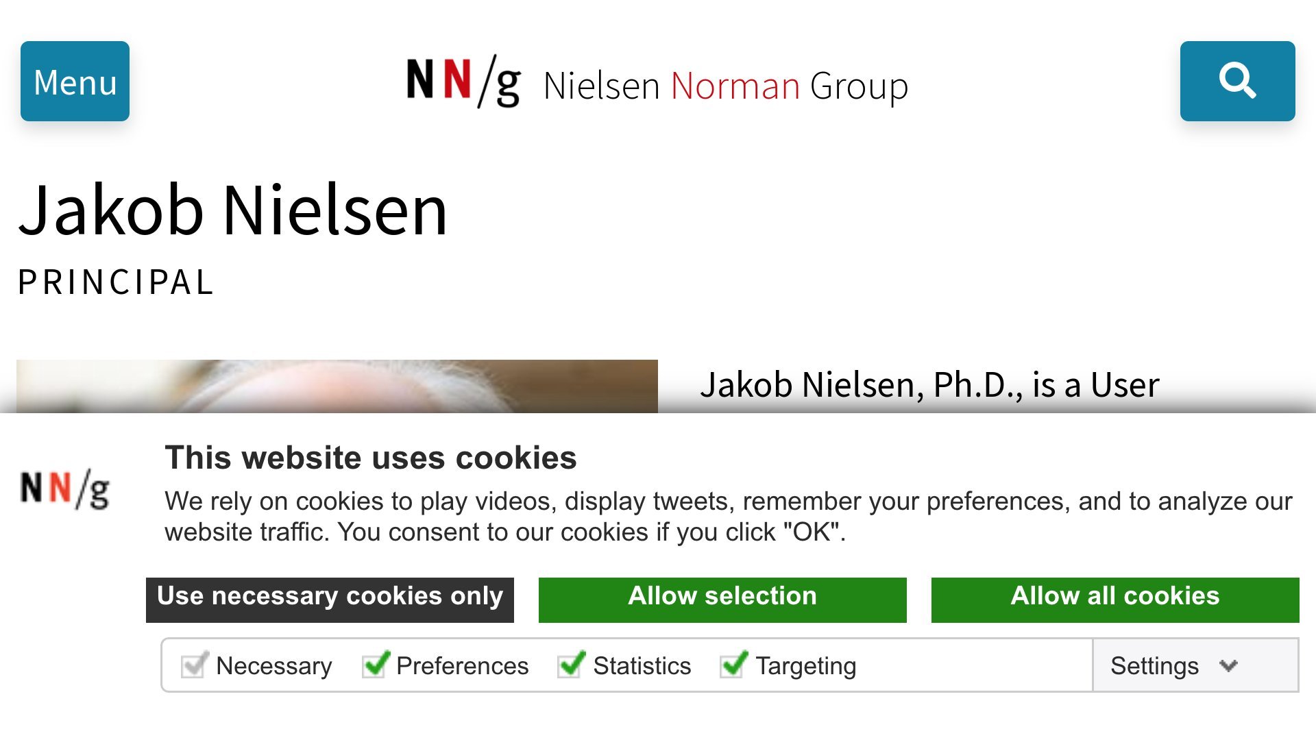
Cookie banners are mostly badly designed, but if you are “World Leaders in Research-Based User Experience”, shouldn’t you care?
- Checkboxes are separated from “Allow selection” button that applies them.
- Submit button comes _before_ the form.
- Checkboxes and two other buttons duplicate each other.
- No “OK” button mentioned in text.
Thanks @cadars for reporting
Try not to make placeholder text the same color as your main text.
Also, maybe hide placeholder when cursor is inside? Otherwise it looks like placeholder text is in my way of typing.
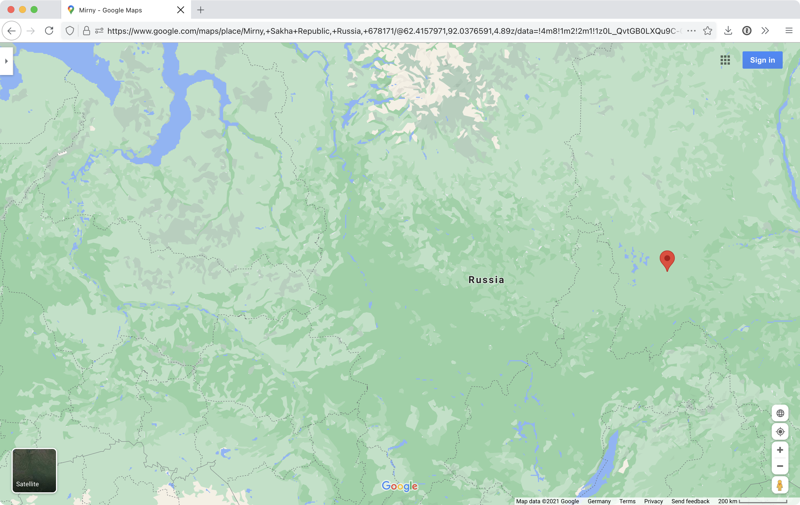
Do you think there’s a reason GMaps don’t show a single city at this zoom level? It’s not that they don’t have the space