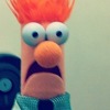


When you decided not to decide what shape your buttons are
Thanks @komarovman and (almost) @vanadium23 for reporting

Please. Sort your lists


Pro tip: one button is enough

Even mobile phones have enough space to display most of what you need to show.
Especially one-liners consisting of six-letter-words

First purple rectangle is a toggle. Second is an action button. With the best eyesight on Earth, you can’t find the difference

How long are your tooltips?
