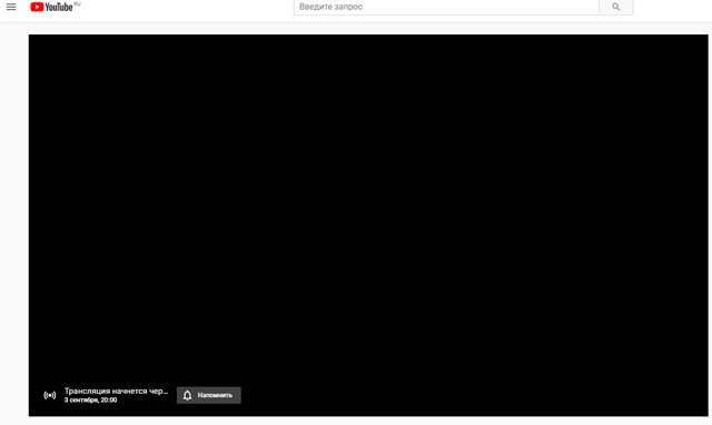
Grumpy Website


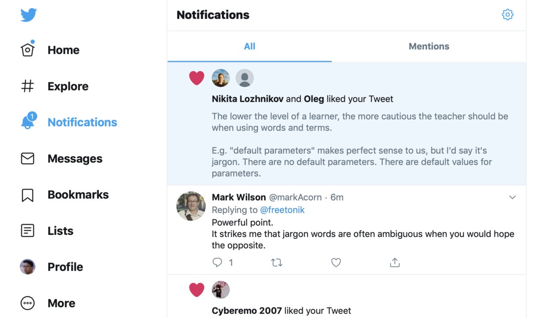
There's 1 new notification according to the counter. Where is it?

Did it not load?

Or is it one of those shown on the left already? Which one?

Should I assume the last avatar in the "likes" responsible for the notification? But likes don't seem to be ordered! The order changes as likes grow.

I can't understand the logic, if any. The product feels broken, like a cheap plastic toy.
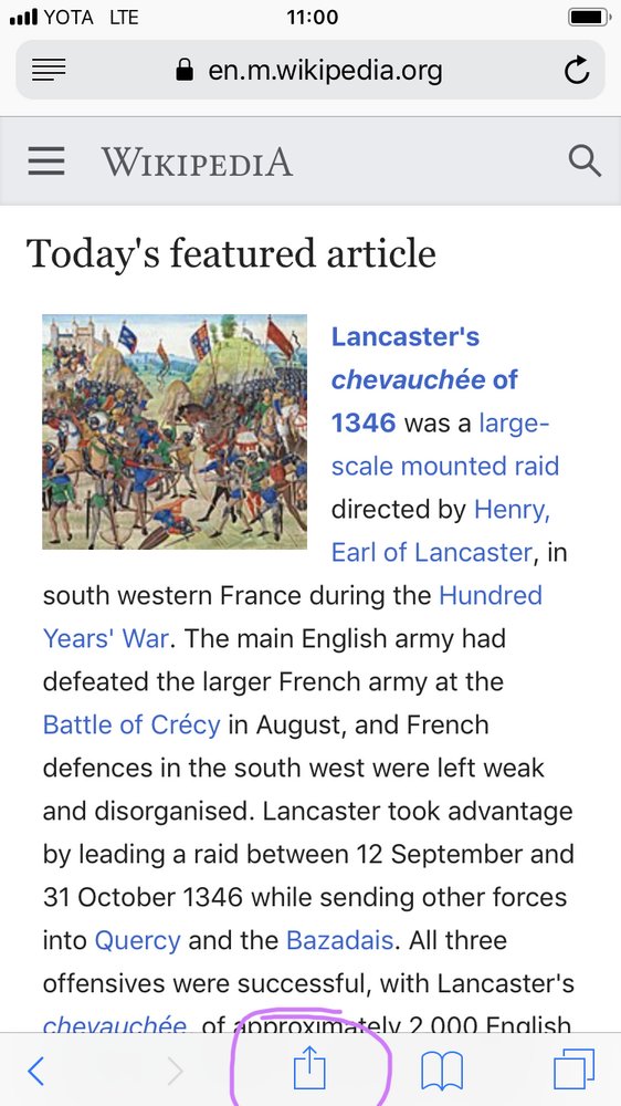
Another year, another my humble attempt to figure out how to search webpage text in iOS Safari. This time it’s hiding inside Share button! But wait, I’m not sharing anything! It doesn’t matter. We would do everything, however illogical, but we won’t add More button to our toolbar. Even though TECHNICALLY it is a More button already, just a disguised one. Apple logic. And OF COURSE, Request desktop version is in there too.

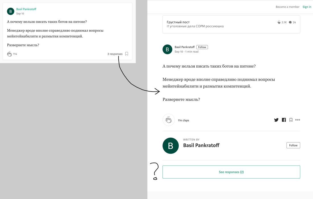
What do you get if you click on “2 responses” link on Medium? Same comment, no responses. Of course

The dilemma of More button. The name suggest that if I click it I should see, well,.. More. More stuff. More everything. Here I have to click two different more buttons spread across three screens only to find out there is just a single element hiding behind it. Why not show it instead?

Wait. But what if there are more? There might be more, right? Well, there aren’t. And it looks stupid.

There's clearly not enough white space to show more than two video thumbnails

Given

- billions in revenue,

- ability to hire the best designers in the world,

- world's most sophisticated AI,

- the fact that 99% of my clicks are within "Recommended" videos,

you can't but wonder why Youtube is such a constant stream of horrendous design decisions over, and over, and over again.

And that horizontal empty space? There's never enough of it on Youtube: grumpy.website/post/0SQrVgkJF

I feel confident and protected.

If you don’t know what is a valid email and what isn’t, at least try not to be arrogant and say honestly: we don’t recognize this. No need to put blame on user if you fucked up

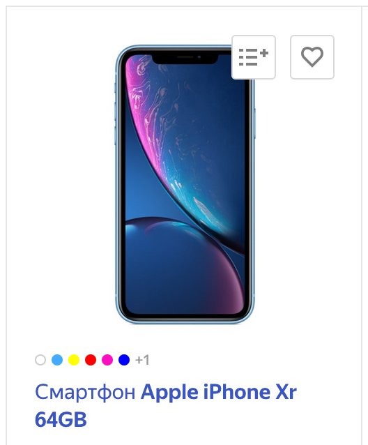
Those colored dots represent color options. They show at most 6, but in this case there are seven. So they show +1 label which itself takes more space than one more dot would.

If you hide something under More..., make sure you are actually saving space (e.g. you are hiding 3+ elements) or simply show everything right away.

Wrong:

If N > 6 then show 6 and “+(N-6) more”

Right:

If N > 8 then show 6 and “+(N-6) more”

Nothing is more annoying than just one element not shown on the last page.

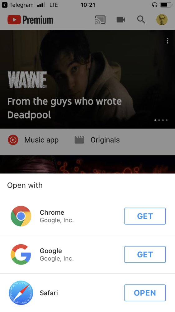
If you press “Watch later” anywhere but in YouTube app, you get redirected to YouTube but then this happens: Open with Chrome by Google, Google by Google or Safari by whomever

The label is cut out despite all the horizontal space in the world.

Thx @GeneralGDA for the picture

Pages:
161...5857565554535251...