Grumpy Website


How do you know people who build something don't use said something? By inconsistent and frankly inhuman interactions.

Human: Immediately display the authorisation dialog describing why it's needed. And maybe use TouchID while you're at it.

Inhuman:

- You have to authorise through accounts menu

There's no accounts menu

- Well, authorise via the submenu of the Store menu

Nothing happens.

- ...

Oh, it's because of the modal dialog that tells me to authorise

- ...

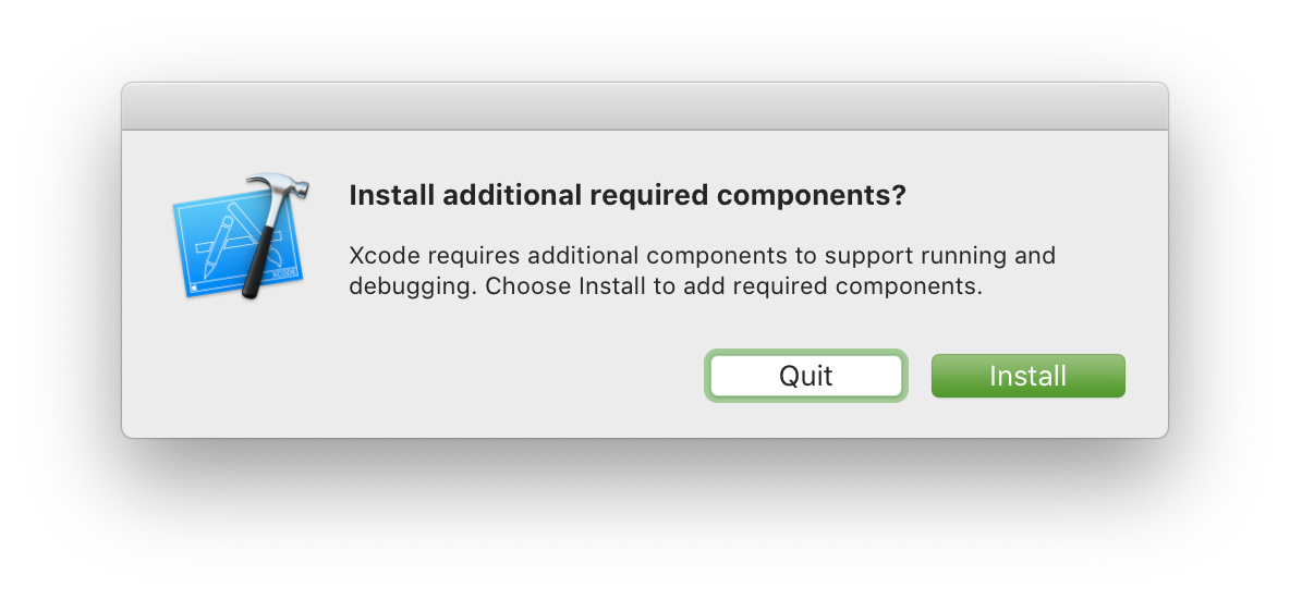
Ok, I'll dismiss the dialog and attempt to autho....

- Here's the auth dialog you requested 5 minutes ago

YouTube Plus (Premium? Paid? Whatever) has Download function. You know, for watching videos offline. Only if you downloaded it, it will continue to stream it from the net. If you go offline (the main reason you downloaded it in the first place!) it’ll just stop playing!

There’s no easy way to switch to downloaded version too. You see that ✓ Downloaded checkmark? If you click on it, YouTube will offer you to delete Downloaded version. You know, because that what you obviosly wanted to do when you realise you don’t have internet and your video stopped playing, right?

I mean, it’s strange to write this. It’s very strange to explain such elementary things. But if you make a checkbox, it’s a checkbox. If you want a navigation button, make a link. Do not, I repeat, DO NOT make checkbox text also a link! It’s impossible to figure out!

Thx @acedened for the picture

Google Monitoring. There's exactly one event. The "back" and "forward" buttons are disabled (you can't really see that because they are only just dark grey instead of near-black grey).

But sure, it's "1—10 of many" incidents.

There is UI. There's UX. There's interaction design and common sense.

And then there's Google.

"Never the twain shall meet".

Have you thought about joining “Join Channel” channel? #joinchannel #joinchannel #joinchannel

I really enjoy TablePlus. There are just two things that drive me nuts:

1. The button to toggle the filter panel is at the bottom right. The panel appears at the top

2. Dropdown options for filters by default don't display the full list and you have to scroll to the desired options.

Both of these can be trivially fixed by moving the filter panel to the bottom of the window

An update from TablePlus (highlighting that "trivial solutions" are usually anything but):

We used to have a filter at the bottom, but the main problem is most of the time, the user hovers the mouse over the screen (in full-screen mode) and it triggers the dock. We keep receiving complaint emails every day.

Hey! We’ve just installed half of your app. But it will be useless without the other half. So we ask you, should we continue?

Hope you didn’t leave your computer unsupervised while installing, only to find it waiting for you to do a single click until other half is installed.

Buttons that appear on hover are evil:

- If you need it, you don’t see it and don’t know where to move your mouse.

- If you don’t need it and just see empty space and thing “Cool I’ll just move my mouse here to rest” it suddenly appears.

It’s almost like a landscape that changes under your feet as you walk on it. Pretty hard to work with.

Thx @mamutnespit for the video

We put popup menu in your popup menu, so you could, you know, pop up more?

Txh @s_sarkisian for finding this

Pages:
155...7170696867666564...