Grumpy Website


(click on an image to see full res and follow me)

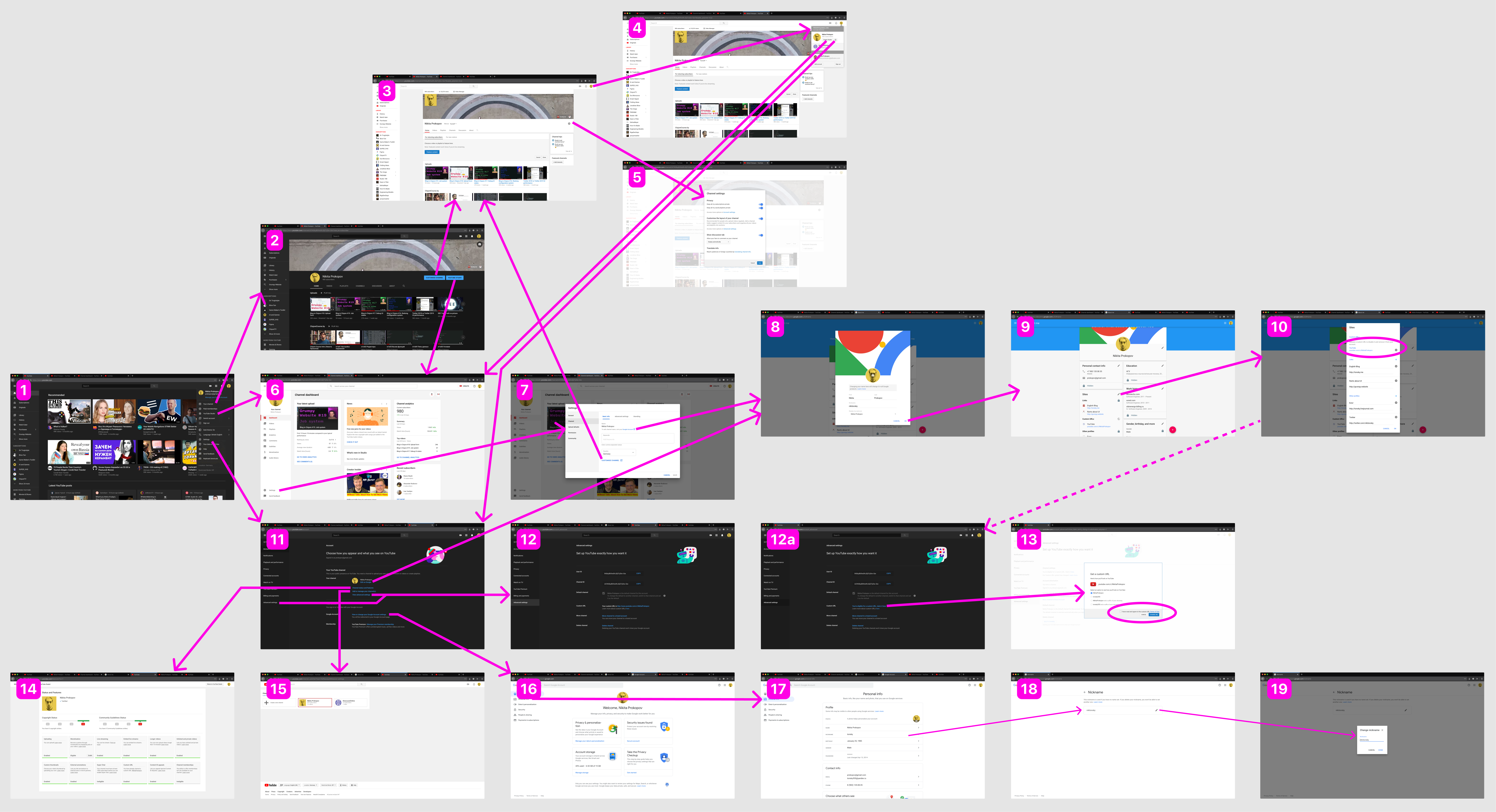
So I decided to change my YouTube Channel URL. No big deal, huh? You just need to:

1. Open a user menu on 1.

2. Aha, Settings! Go to 11.

3. Click either “Advanced Settings” or “Go to Advanced settings” (sick!). Get to 12.

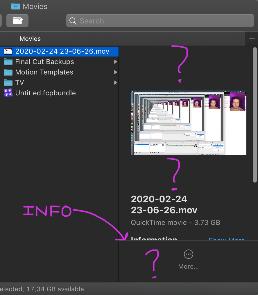
4. Read “Your custom URL is youtube.com/c/NikitaProkopov”. No button to change or edit. Nowhere to go.

5. Start from 1 again.

6. Go to 6 (YouTube Studio).

7. Open Settings there (7).

8. “To edit your channel name, visit your Google Account”. With a convenient link right there!

9. That link opens 8.

10. Close the popup that you don’t need, getting to 9.

11. Notice YouTube among your personal links (sick!), click pencil icon, go to 10.

12. “Release a custom URL to disable it and remove it from your account”. Not exactly what I was looking for, but that’s the first step.

13. Ok. That gets us nowhere, so we start from 1 again.

14. Go to Settings again (11)

15. Click either “Advanced Settings” or “Go to Advanced settings” (still sick!). Get to 12a this time.

16. “You’re eligible for a custom URL, claim it here”. AHA! That opens 13, which should look like a popup but it changes background theme to white, so you realize it actually is a separate page.

17. Notice that my only options are my First+Last Name, no space. Or mysterious tonsky555, which I only used tens of years ago registering on Yahoo? Is it even possible?

18. Give up.

This guide is only 18 steps short because I present to you the shortest and most optimal path. It took me much longer and much more trial and error when I was doing it!

Couple of honorable mentions:

- I was totally getting a feeling I’m going in circles until I started recording and drawing each single screen. It _literally_ felt like I’m in a maze! (or in a Kafka’s castle).

- Lack of page titles / wrong titles didn’t help. E.g. YouTube Studio (6) is titled “Channel dashboard” (and buttons leading to it are either “YouTube Studio” or “Channel Studio”). Settings (11) is just “YouTube”. Google Account (9) is “About Me”. Channel browsing (2) and channel editing (Customize channel, 3) are both just “Nikita Prokopov”. Thank god Nickname (18) has a correct title!

- I was only able to find screens 14, 15, 16 while doing this research and intentionally clicking on every single thing and tracking where it leads me. Completely undiscoverable.

- 9 and 17 both let you edit your basic Google account info (name, nickname). In two completely different interfaces. Not synchronized (changed nickname in 9, still see old one in 17).

- 5, 8 and 11 are all “Settings”. With completely different UI and set of options! And that’s not counting Google Account Settings (9 and 17)!!

- 17, 18 and 19 is the most overengineered text field editing I’ve seen. Two screens and one modal popup for what could’ve been an inline edit box.

I must say — building a map helps! When I feel lost now, I just consult it and I know instantly where I am and where to go. I suggest you do the same.

P.S. WHAT A MESS!!!!

Designers and developers, please stop fucking with scroll! There’s no way you can make it better and a million ways you can make it worse.

If I move my finger just a millimeter up or down, that means, normally, that content should also move a millimeter (stick to the finger). And that feels good! That’s the behaviour we all love.

If you try to be smart, like the app in the video, you ruin it! It scrolls too much, content jumps, random stuff moves under your finger, you feel you are no longer in control. Don’t do that.

I hate to ask, but is there really no way to display more information in that column without scrolling? No way at all?

Even worse, if you try to enlarge the window, empty space around preview grows too (!!!), delaying the information reveal.

Apparently new MS Office places same three icons in different locations depending on whether you hold the plus or tap it. I’m having hard time explaining why someone might think this is a good idea.

Also, hold mode has no labels. I have to say, two sheets of paper with a folded corner on different sides do not send a clear message.

well put

Text is not a button. Line is not a textbox. Empty space is not a text area. Minimalism can only go so far. If you remove essential elements, leaving people guessing what control element was “implied” here, it’s just bad design.

Install Twitter app. It shows a “mention” — was that you? In the same app I just installed. What’s the point of this again?

Chose your mobile and mobile data plan.

Top row: minutes

Bottom row: gigabytes

Button at the bottom: "Chose for me"

It takes up to a minute to scroll from 500 to 400. Really, this needs no comments.

A few years back there was a competition of sorts for the "worst way to enter a phone number". Looks like Yota's designers looked at it and said, "what a great way to design a dark pattern". See for yourself: imgur.com/gallery/r102w

Many thanks to @pier for sending this gem.

Suppose I was listening to a podcast. And the episode is basically over. I know it’s over. But there’s still 40+ seconds of closing words, credits, outro music etc. What should I do?

If I just close it it will stay unfinished. File will be kept on a phone, it will be shown in the “In progress” list etc.

If I keep listening, it will start next episode, which I maybe want to choose? Or I don’t have enough time for starting another episode? And I don’t want to mark a next random thing as “Started” because it’s definitely not my intention.

In short, I want “I’m done with this” button.

Livejournal mobile icons. My interpretation:

- A guy was thinking about doing some writing. About heavy machinery, I suppose.

- Nobody would publish his paper.

- He brought two friends.

- They wrote a book.

- It gets published.

- They receive a gift.

- He starts thinking about next book, but one of the friends didn’t like it, so he left.

- Some time later, second friend leaves too. He’s all alone again.

Pages:
155...7473727170696867...