
Fantasy Fo... I wonder what Fo... might be? But I get it, this is a card, low on space, sometimes text gets cut. I bet if I click to see the full story I’ll know... Nope nevermind
Fantasy Fo... I wonder what Fo... might be? But I get it, this is a card, low on space, sometimes text gets cut. I bet if I click to see the full story I’ll know... Nope nevermind
Yesterday grumpy.website/post/0T7Bxy9nU we talked why welcome sceens are bad. What’s the solution? Control center!
Thing is, welcome screens are not completely useless. They still might contain some useful links and controls. The problem is that they disappear after first use.
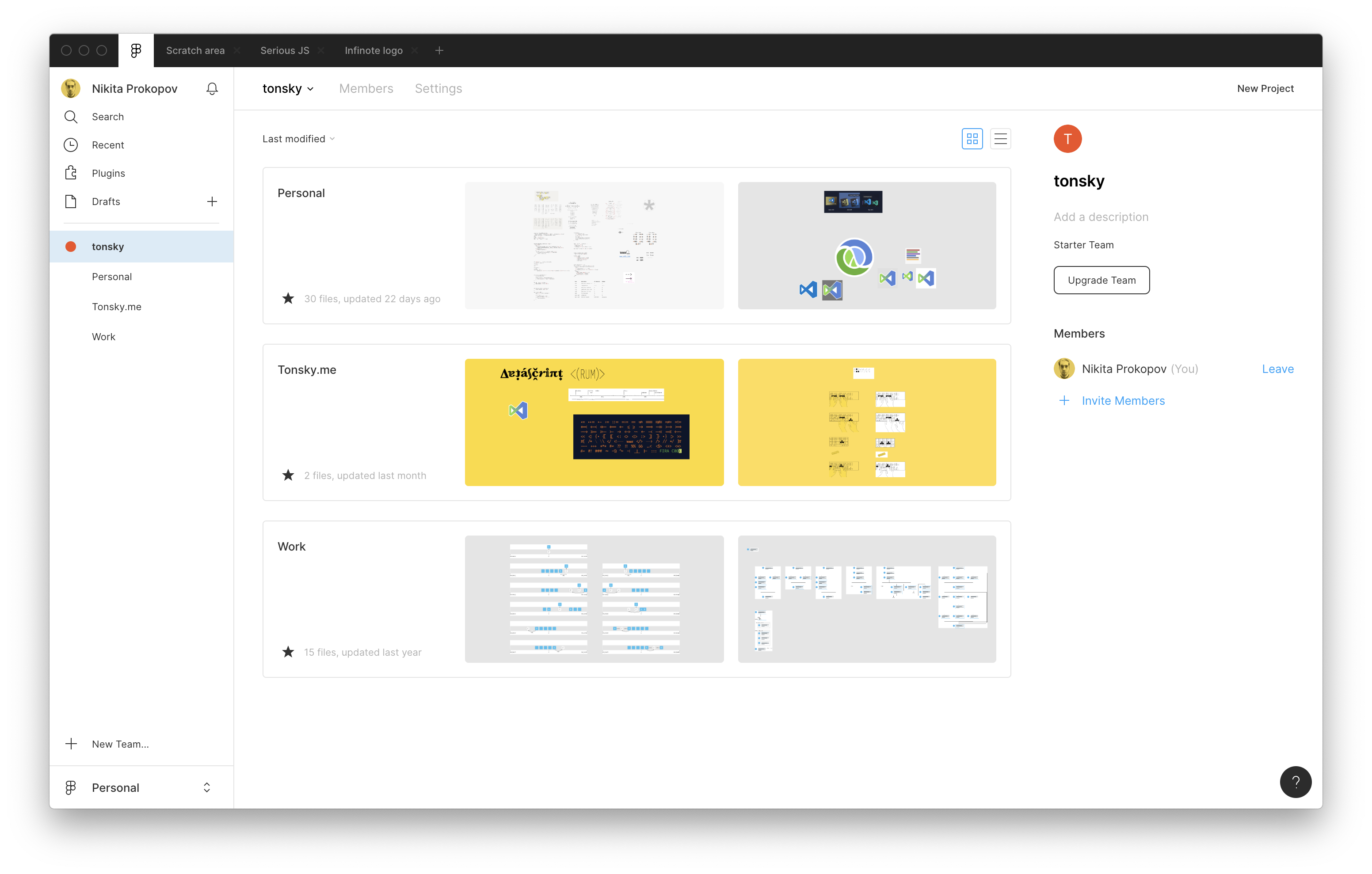
Well, control center is a welcome screen that does not disappear! Instead, it is always present at some convenient spot. Take Figma: control center is the first thing you see, but also, even if you open up multiple tabs and start working, it will still remain accessible. Thus, if you learn to use it, that knowledge is not wasted—you can call it up at any moment.
In case of Figma, it is also the one and only UI. This is even better, as this creates no duplication of controls and no confusion as in “what’s the one true way to open a file?”

Safari. Presented here without comment.
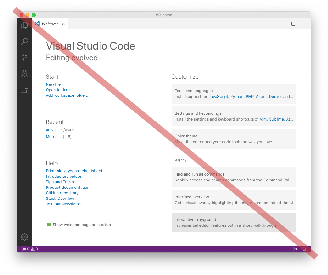
I conside welcome screens antipattern. The goal is praiseworthy: help your user to do something for first time. The problem is, though, that welcome screen is an additional, duplicate interface of commands that already exist in other places. Yes, you might use it once and it might even be convenient, but after that it’s gone! You are on your own again, forced to learn real UI.
You can’t rely on welcome screen because it will disappear the first thing. Using welcome screen teaches you nothing about real UI of the app. And if you already familiar with the UI, then welcome screen is an annoying obstacle standing between you and something you already know how to do. All downsides, no upside, 0 start, do not recommend.
Apparently, Twitter is world's best PWA and an example of how web technologies are already on par with native technologies. One can clearly see why.

Let’s think for a second how “Watch in fullscreen” button should work. When I click it, I clearly express an intent: I want to see this video in the most comfortable way possible, without any distractions. It might sound controversial, but normally it DOESN’T mean a tiny little rectangle in the center of my screen. GO HORIZONTAL! Yes I didn’t turn my phone (yet), but I already pressed a button to watch fullscreen! This tiny scaled down rectangle doesn’t work for anything, in any condition, anyway. Why show it at all?
Before you ask, yes, even if I locked my screen orientation to portrait before, I STILL want fullscreen videos (and only videos) to be shown in landscape. Because anything else makes sense.
P.S. controlling your phone orientation with actaully rotating your phone (you know, in a physical space) still sucks. I’ll take a button, even an on-screen button, over this any time.
Thx @s_sarkisian for the picture
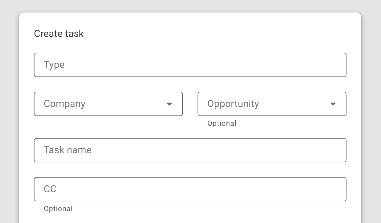
Sorry, I just don’t understand putting field name inside the text field. I mean, text field is a place where you are supposed to write YOUR answer. Form design should INVITE you to put your answers there. Empty space should be left empty to COMMUNICATE that YOU need to fill it in. Here everything is already filled, what do you need from me?
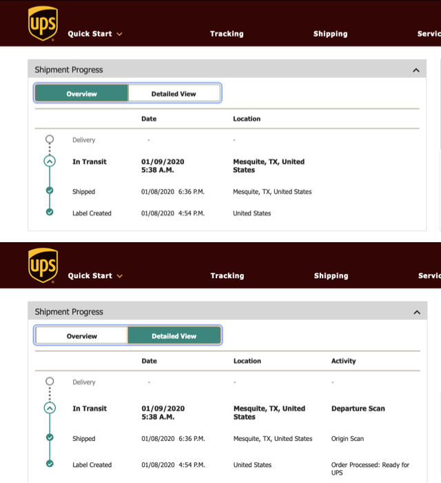
When there’s plenty of space for showing all details at once yet you still need to manually enable them. Bonus for classic “guess which of two tabs is selected” problem
Thx @akivag29 for the pictures
Excellent copywriting
Thx @boryskoretskyi for the video
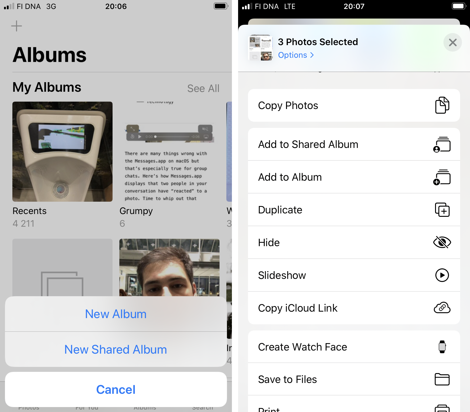
Why the hell are Albums and Shared albums two different things? Why do I have to decide on creation whether I want a shared or normal album? Why moving to an album and moving to shared album are two separate options? What is so special about shared albums that they are not counted “Albums”?