Grumpy Website


How do you navigate to the album in Apple Music? Well, you click on an Artist... Wait, wouldn’t that take me to artist? As a matter of fact, no. It will instead show you a popup with AN OPTION to go to artist. Another option is to go to the Album. To go to the Album you click on an Artist. Easy to remember.

Me: Hey Amazon, show me my password.

Amazon: Sure, I’ll show it below, but will make you type in those bullets anyway for security.

Me: Wait, how does it make it more secure?

Amazon: End of year sale, up to 50% off!

This is funny because it’s excessive, sure, but also scary. These people admit that there are better icons to represent device buttons yet they leave more obscure versions on the device itself. Why?

I give up on Google Drive. It constantly fails to do its only job: sync files.

You can't force sync, it syncs the local filesystem when it decides, and it's always late. But then it says "synced", and I can clearly see missing files.

Direct click is an order of magnitue easier than dropdown menu. That’s UI 101. Yet EVERY time I want to retweet I HAVE to go through this stupid dropdown menu, choose an option, move a mouse and make one extra click!!!

Make two buttons. Both would be way simpler to click.

Don’t like two retweets? Leave one button and move another into the menu. One would be fast and one slow, but at least it’s 2x better than the current situation.

In current situation BOTH retweet actions are hurting with no good reason.

Yes, that’s the big deal.

Well, you know what the problem is, and you know how to fix it. Please, fix it for me. You're a computer after all.

Also, why even have two seemingly synonymous commands rather than one that may or may not take an argument?

Cloud arithmetic. Does it add to 6.5 Gb to you?

Yes it’s a chest of drawers. Yes chest of drawers exist for 1000 years and yes, you can still fuck up their UX.

This particular piece has a tricky system that does not let you open a drawer if another one is already opened. I don’t know how it’s done, I bet the engineer who came up with this idea is very proud of herself (as she should be!) Yet it’s terrible to use!

For once, you can’t quickly search through all the drawers. If you open one you can’t just start closing it and move to the next one. You have to wait while first one finishes closing. It doen’t sound like much but it is terribly annoying in practice.

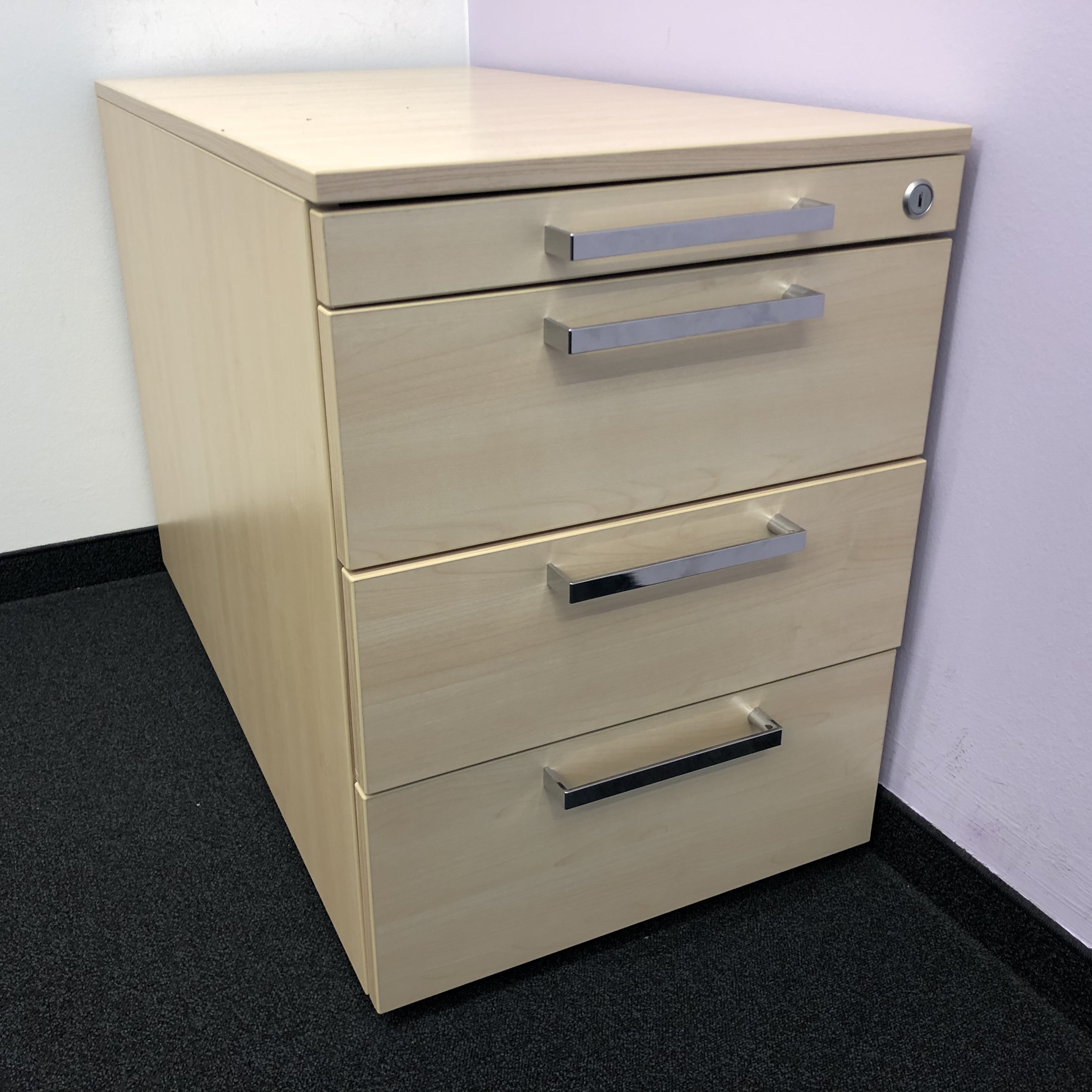
Another problem is that sometimes you can leave a drawer open a tiny bit without realizing it. And that means that none of the drawers would open until you figure which one is ajar. And it could be ajar for as little as 1mm. E.g. in the picture third drawer from the top is currently blocking access to the rest of it.

Donald Norman, one of usability pioneers, was famous for having problems with doors and ovens. Well I guess I have a problem with a chest of drawers now.

Technically, there’s no reason why smartphone can’t show desktop UI. You don’t even have to do anything special, it just work.

UNLESS you took specific measures to make your site unusable on mobile. But what sick mind would do such terrible thing and why?

There’s no such thing as too much security

Pages:
155...6867666564636261...