

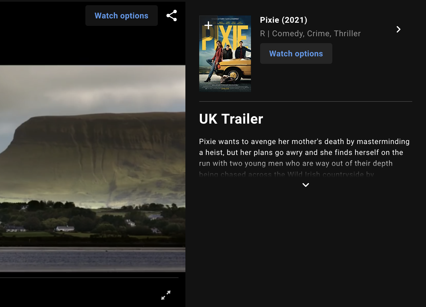
I love how this “LIVE” label means video is NOT live.
I love how this “LIVE” label means video is NOT live.
You start an app and, instead of taking you directly to what YOU need, it shows you a banner. I’m already using you, no need to advertise!
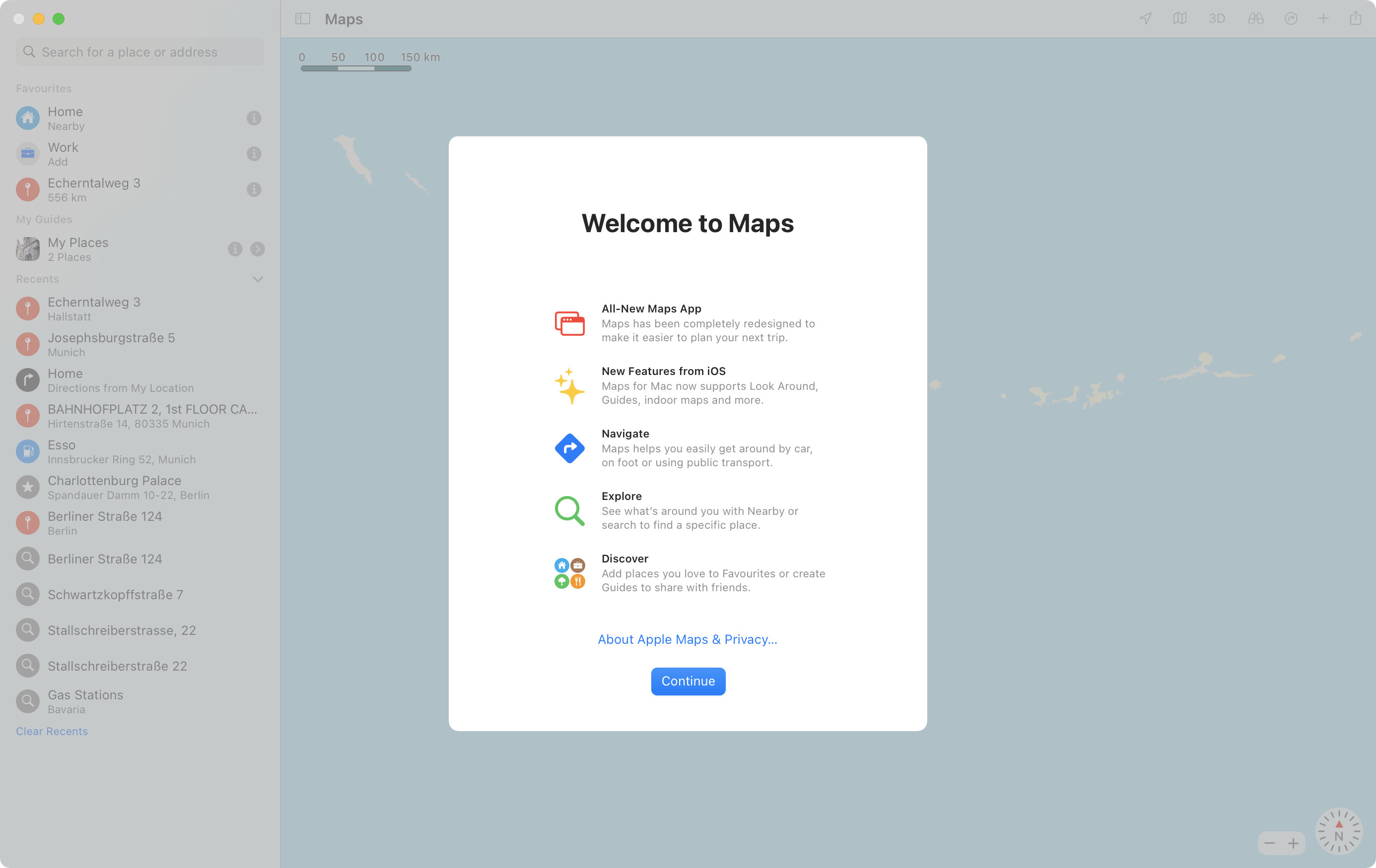
Sad to see many macOS apps adopt this modal nonsense.
Thanks for saving me all this empty black space. I guess
How to enter 00 minutes in Patreon? I will never figure it out.
(this is your regular reminder that customized text boxes are EVIL and you should never do it. Whatever you think you can pull off, you can’t)

Name of the object should link to the page about said object. Never to anything else, like filtered commits in Github case.
Thanks @martinklepsch for the picture
One search button? How about three? 🔍🔍🔍
Thanks @hutattedonmyarm for the picture
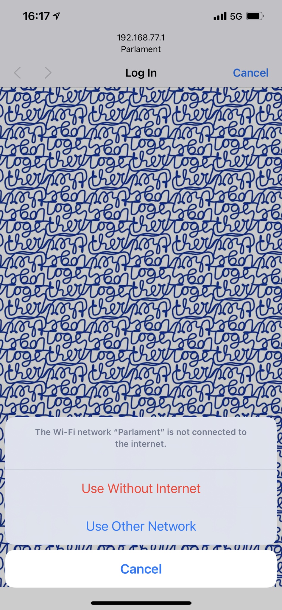
iPhone: Finds a WiFi network, connects to it, can’t use (all on its own). Decides that’s a good enough reason to bother a human person.
I mean, it’s ok to try WiFis in the background. If some of them work, great! But if not, don’t interrupt me with a problem that you created for yourself! Just keep doing what you were doing.
Options it offers are even worse: use WiFi without internet (how? why?) or find another WiFi network.
And all I want is just to keep using mobile data and not be bothered. Thank you.
Thanks @YuriySteam for the picture.
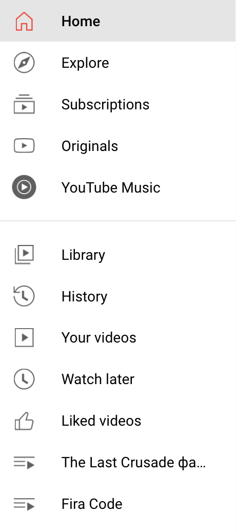
The main purpose of icons is TO DISTINGUISH.
If all your icons look the same, they do not fulfil their function!
All I can see is ▶︎▶︎▶︎▶︎▶︎▶︎▶︎▶︎▶︎▶︎▶︎. This does not work.
Thanks @fried_zucchini and @bouncepaw for reporting this.
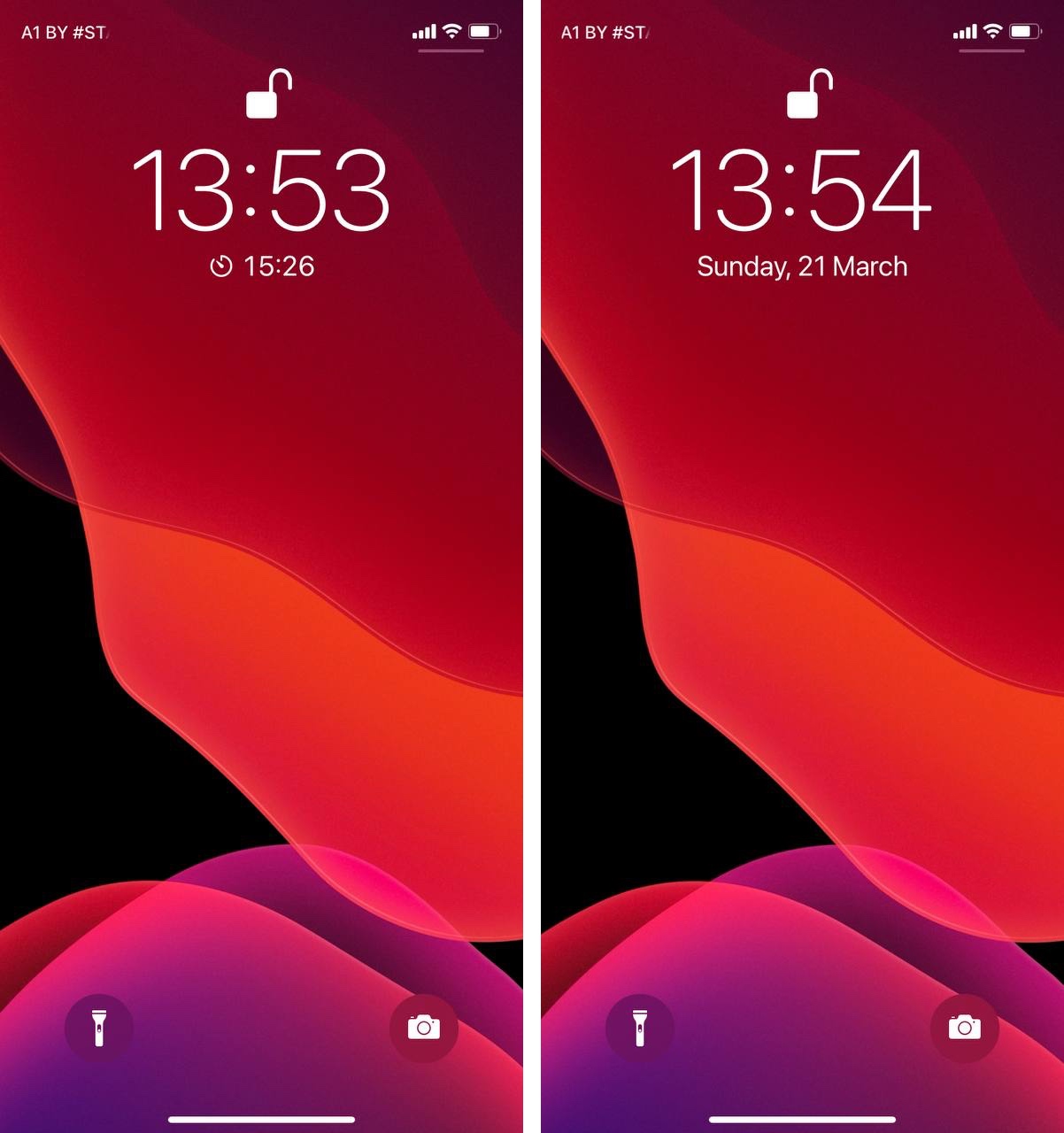
You can either see timer or date, never the both. Because there’s not enough space on a 2:1 tall phone
Thanks @theme_an for the pictures
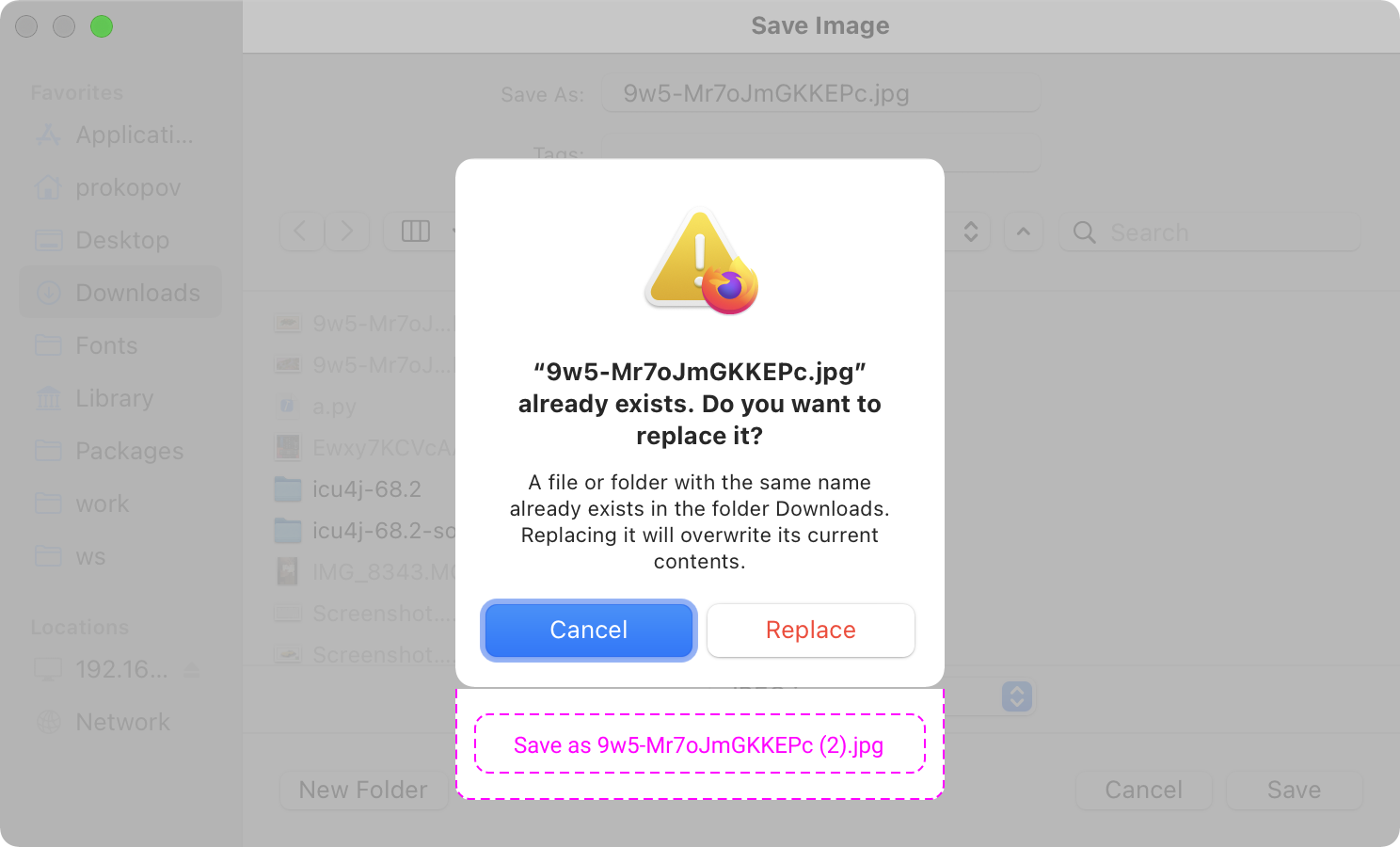
This nonsense has been bugging every computer user for at least 25 years on every OS. It’s about time to finally fix it