
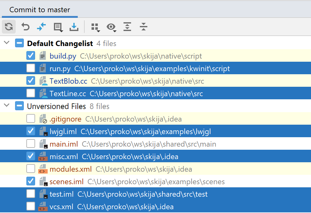
Which files are selected? Your options are:
- Checkboxes
- Blue background
- Yellow background
- White background
- Blue text color
- Red text color
Which files are selected? Your options are:
- Checkboxes
- Blue background
- Yellow background
- White background
- Blue text color
- Red text color
Interaction nitpick: if you zoom in objects on hover, do not move/change its siblings.
Why? Because aiming for fixed target is easy, but aiming for moving one is hard.
Slay the Spire: Wrong. Cards move left/right once you hover one.
macOS dock: Also wrong. Even currently hovered icon moves under your mouse!
Hearthstone: Right. All cards stay in their places, only the hovered one pops out.
In a global world, 01/01/1997 is not a good example to explain what date format do you expect.
Also, any modifications (so called “improvements”) to simple text input usually only look good in theory, but in practice confuse people.
Thanks @benKolyaM for the video
The quest for mystical rectangle icons continues...
Previously:
If you highlight something, make it clickable, too. The two aways go together
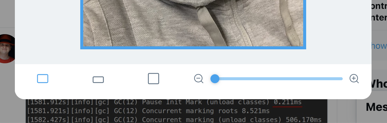
Whoever thought that making scrollbars invisible is a great idea... It isn’t. Turns out menu on the left is scrollable!
As a general rule, don’t hide UI elements: they work best when you can see them.
Thanks @volodymyr.obrizan for the picture
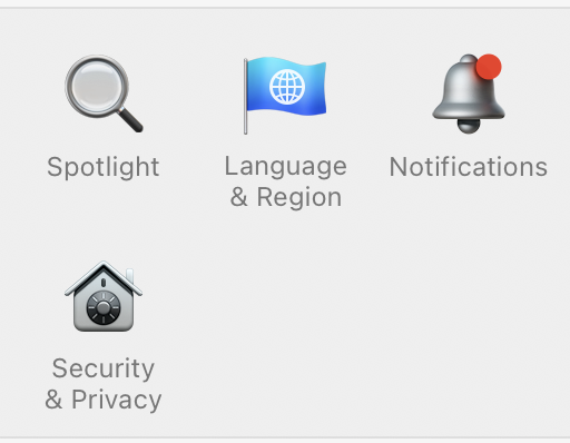
Your regular reminder that notification icon shouldn’t look like it has unread notifications. More generally, no icons should look like controls.
Thanks @delaguardo for calling this out
Previously:

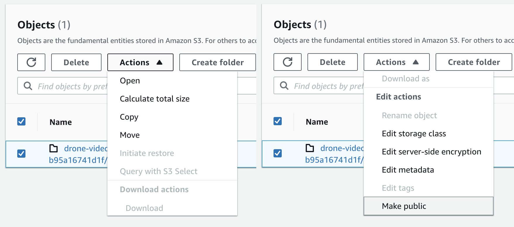
Another reminder that your primary action (downloading a file) should be bigger and have more contrast than every other action on the screen. Yes, you have to click on a text label to download.
Thanks Sergej Rube for the picture.
Previously on the same topic: grumpy.website/post/0V2iChtZz

Three years ago I described how no one at Google seems to understand how Google Accounts work: grumpy.website/post/0PU1U2r3v
Since then the situation has only become worse. So, you open a link. Your default (first?) account is signed out. You don't care, you want to use one of your other accounts. Nope, you have to:
- pretend to go ahead and log in with your primary (default? first?) account
- go through the dance of "organisational/personal" account
- and only then be presented with a choice of accounts
Cherry on top: what looks like a dropdown is not.
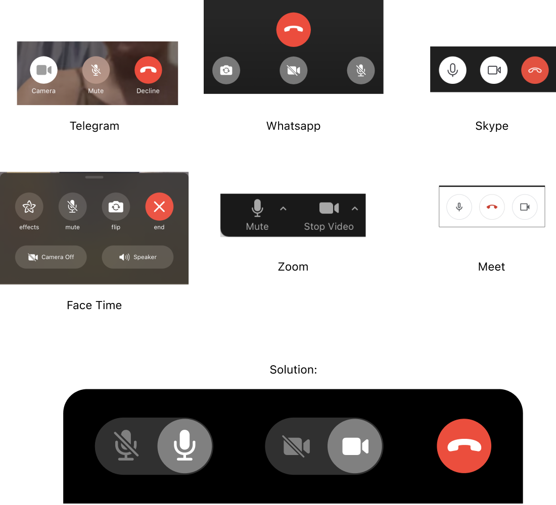
It’s time to end this madness. In all these apps, both audio and video are _enabled_.
Skype, Meet and Zoom use non-crossed icons to indicate that.
Face Time and Whatsapp use crossed icons.
Telegram uses crossed mic icon but non-crossed camera to indicate that both are enabled.
This mess means only one thing: both ways are wrong. You can’t indicate mute/camera state with a single icon. Whatever your reasoning might be, it’ll always be confusing. Don’t try.
Instead, use a control that clearly displays both states at once. I drew one for you. Feel free to copy. I’ll be only happy.