Modern UIs are more and more reminiscent of puzzle games.
How does one search in members? Well, if you scroll far enough, a button will appear in a special place...
Modern UIs are more and more reminiscent of puzzle games.
How does one search in members? Well, if you scroll far enough, a button will appear in a special place...

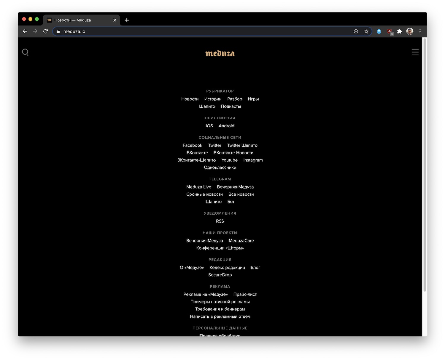
A popular news site meduza.io in a window of 1279 pixels: nothing to read, only a HUGE footer. The sizes less than 1040 and greater than 1280 actually work (mobile and desktop views respectively). But the 1040-1280 px width layout still cannot be rendered. Any reason for that gap?
I am not sure all UI designers realise those little dots are not supposed to be the only way to switch pages. Just in case: they don’t!
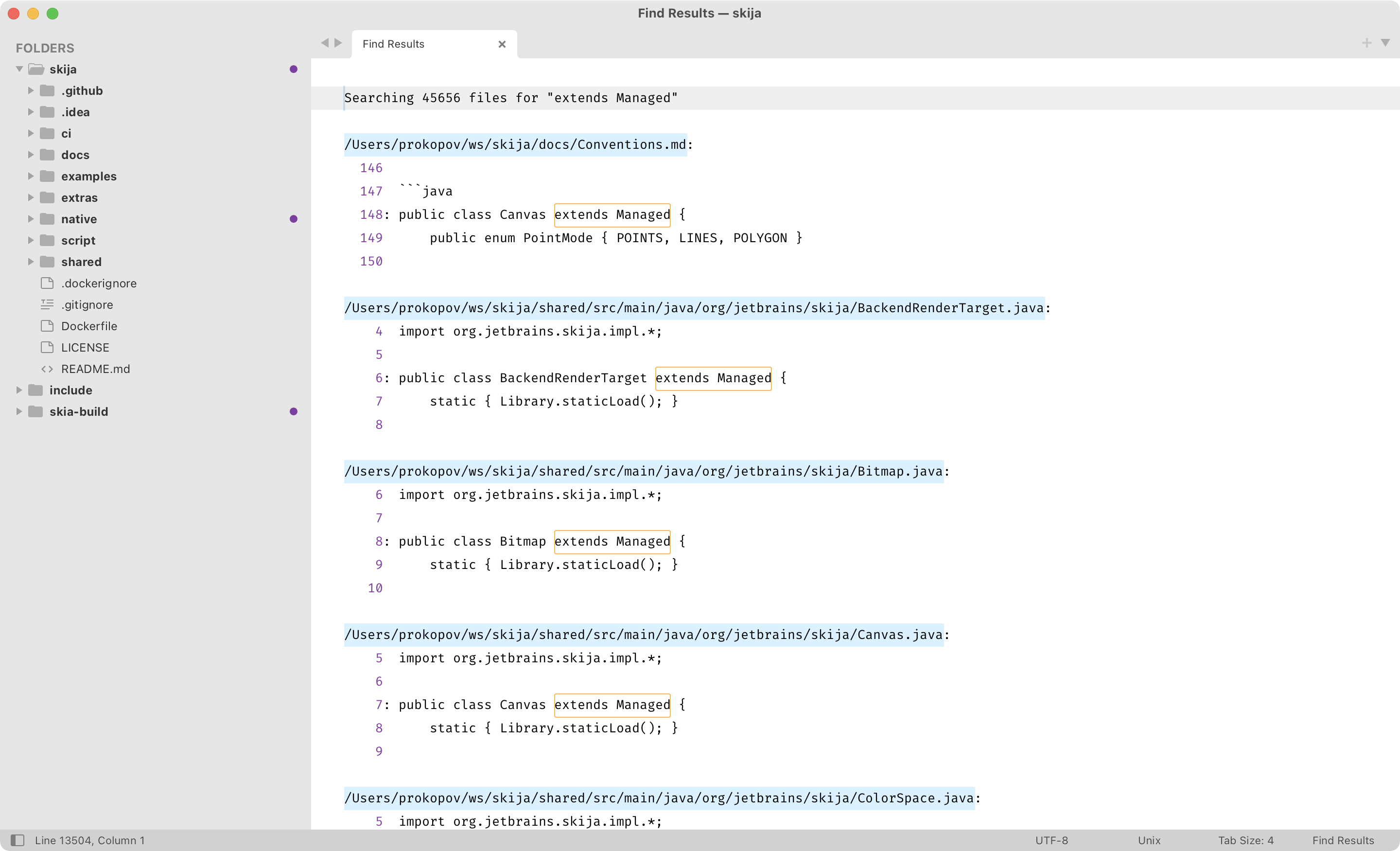
The genius of Sublime Text “Find in Files” window: it’s just a regular text buffer.
You see, there’s nothing special about this UI. Because it’s just a tab (instead of a panel or a dialog), you can do anything you can do with a normal tab. Move it around, open/close, split etc.
Because it’s just text, you can do anything you can do with text: navigate with normal commands (up/down/page up/page down/etc), select, copy, search (!). Yes, you can further refine your search results by searching in search results.
Finally, it looks like normal text. It’s not set in another font, it uses your normal color scheme, it looks familiar—no context switching and adjustment.
This comes with a cost, of course. There’s no handy shortcut to jump between results. No collapsing the results. No “show more/less context”. Any UI/UX designer looking at it would immediately have hundreds of ideas on how to improve it (by adding more UI, of course, because that’s what UI designers do).
And yet, it’s the most natural, easy to use, least attention-demanding UI I’ve seen. Hope Sublime team will keep it this way forever.
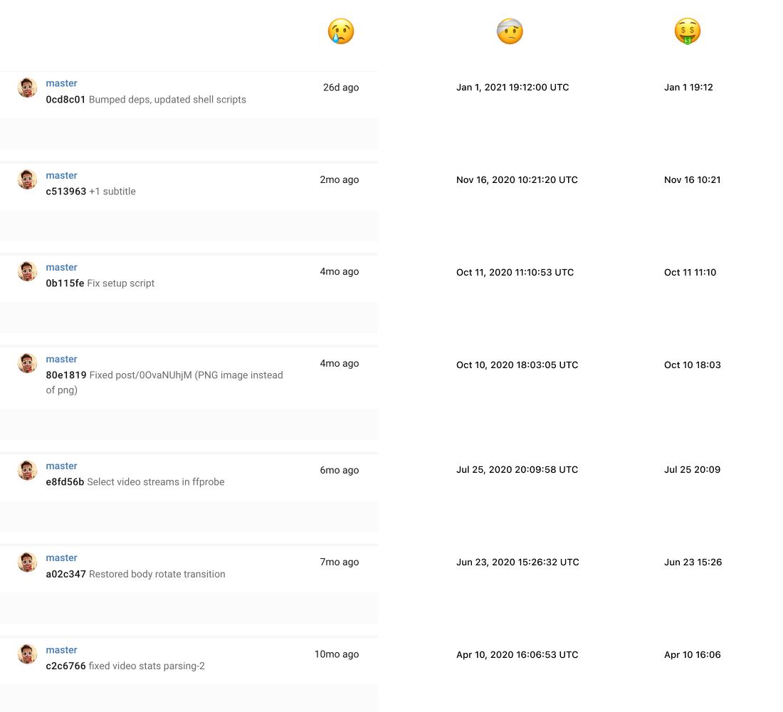
There’s a trend to print relative dates instead of exact ones. I can understand it for “1-5 min ago”, but after that it loses its usefulness.
“1 hour ago” — nice, but I can look at my watch to see that 3:00 pm is “1” hour ago from 4:46 pm.
“1 day ago” — not useful at all. Again, I know what day it is, so “Jan 26” communicates to me “1 day ago” as clearly as “1 day ago” itself. But I lose time, and time might be important. Was it morning? Evening? Day? Night? All this information is lost in abbreviation. Unnecessarily lost.
“1 month ago” — the most crappiest one of all. Nobody thinks in month, but sometimes you need to find something on a particular day. Also unclear, is “Dec 30” 1 month ago from “Jan 2”? Is “Dec 20” 1 month ago from “Jan 10”? “Dec 1” from “Jan 31”?
The recepie is simple: Always print full date and time. Maybe abbreviate to “1-5 min ago”, but no further.
A lot of empty space in _both_ columns, yet text is abbreviated. No way to resize the window too. Why?
Thanks @theme_artnest for reporting
Don’t read too much.
Thanks @nesterenko_dev for the video.
Your regular reminder that reminders work best when you can choose when you want to be reminded.
Thanks @sebi_io for reporting
Many videogames use “click and hold” gesture instead of just “click” for dangerous/destructive operations. I wonder why it never made it to desktop UIs? Would be a great alternative to annoying “Are you sure” dialogs.