Grumpy Website


If it ain't broke, don't fix it should be a mantra tattooed on the forehead of every programmer and product manager.

Here we have mobile Safari breaking site autocomplete that has been working just fine for literally over a decade.

I visit news.ycombinator.com a few times a day. So, every time I typed `n`, Safari would just immediately autocomplete it for me. I visited netflix.com once a couple of days ago. "Let's see", says Safari now, "he visited this site a thousand times in the past, and this other site just once. Well of course it's clear I have to always suggest this new site now."

Also note: I'm on iPhone 12 Pro which is more powerful than some computers. And yet, the lag is so bad that it doesn't have the time to autocomplete the website and sends me to Google instead half of the time.

How can you break something and make unusable that worked perfectly fine even on the original iPhone?

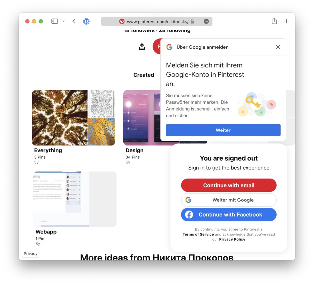
Always allow login with email for those of us who don’t like having their life at the mercy of big tech monopoly

Thanks @theme_an for the picture

How many login popups are enough?

Thanks @bouncepaw for reporting this.

Just beautiful.

Thanks @arsenii_that_b for the picture

It’s better to use the entirety of screen space to implement zoom. There’s no point limiting it to the original image aspect ratio

Let’s see what’s wrong with this UI here:

1. No action button unless something is selected. You won’t be able to press it but it’s good to have it visible anyways to plan your actions.

2. Selecting first item pushes the whole UI down. It’s better if UI content doesn’t move.

3. The primary goal of this UI is to free up some space. Yet it doesn’t show you how much space will be freed.

4. Selecting an item hides its details, in particular, its size.

5. Fourth column has a header that says “Size” yet it displays items.

6. Action button appears at the top, before the content, which is unusual for desktop UIs.

7. If you scroll down you see no action button.

8. Primary action button is an icon with no tooltip. For such an important action (Permanently delete) it’s better to use text label and red color.

9. You expect X button next to “2 selected” to clear the selection, but it closes the whole UI instead

Thanks Akiva Gordon for reporting this

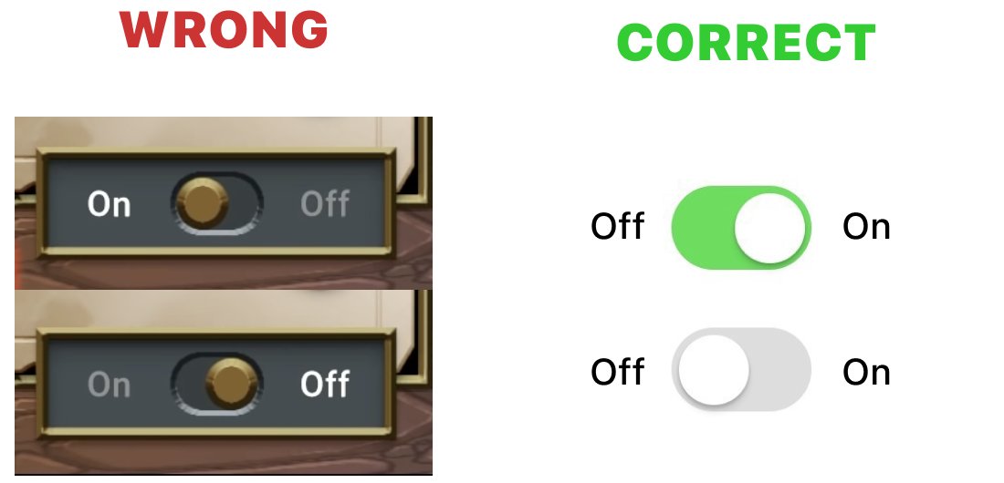
Let’s just agree that toggles should be ON when pointing to the RIGHT. Any other way is too confusing

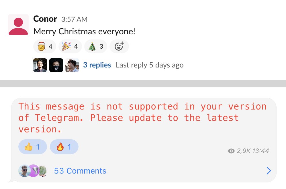
There must be a clear distinction between author’s message and reactions to it.

Top: good, reactions separated from the message

Bottom: bad, reactions look like the author of the message put them there. Comments are good though

Apple. Obsessive attention to details (c) TM

Yes. They managed to break scrolling in a simple list using a core component of Apple's own UI library.

Search should be case-insensitive. Always. Full stop. Don’t have to think about it. Just always.

Pages:
161...120119118117116115114113...