
I love how Windows shows you what year it is. In case you, you know, forget
I love how Windows shows you what year it is. In case you, you know, forget
Congratulations? Thanks for letting me know? Can I work now?
There’s exactly zero useful information communicated here. Also sad that even on a simple technical page there are cookies :(
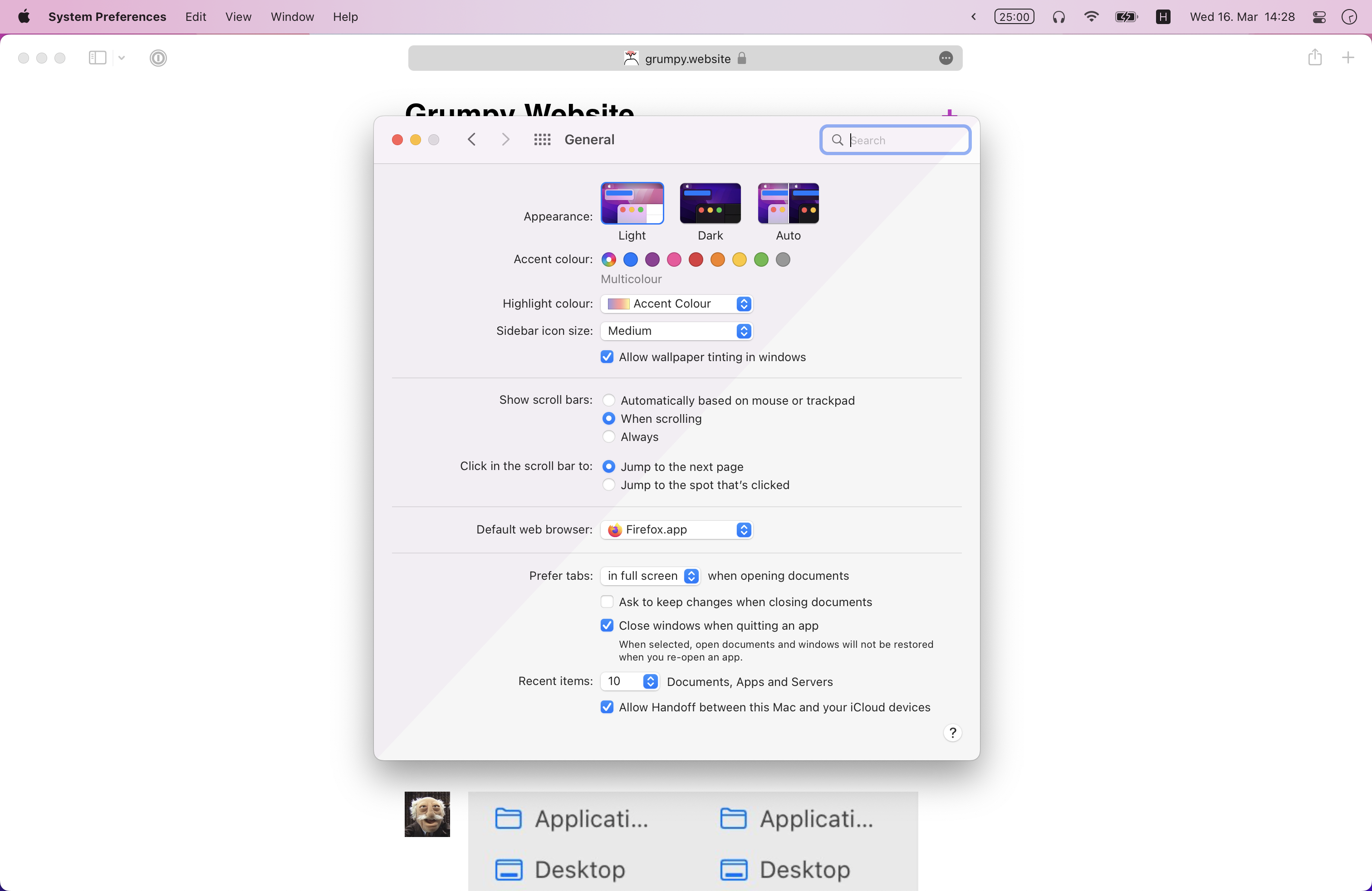
One of the weird things introduced in Big Sur is “Allow wallpaper tinting in windows”.
It makes all your windows pink if your wallpaper is pink, for example. It would even make sense if window is open on top of background.
The thing that Apple doesn’t realize is that during normal computer use you almost never see a wallpaper. So windows are pink for no apparent reason.
Good news is that you can turn it off in Settings!
BTW, transparent menubar is kind of distracting, too.
Show more is an anti-pattern
Thanks @arsenii_that_b for the picture

If only there was enough space to display full track name. If only...
Thanks @SomeKirill for the picture
Optical compensations.
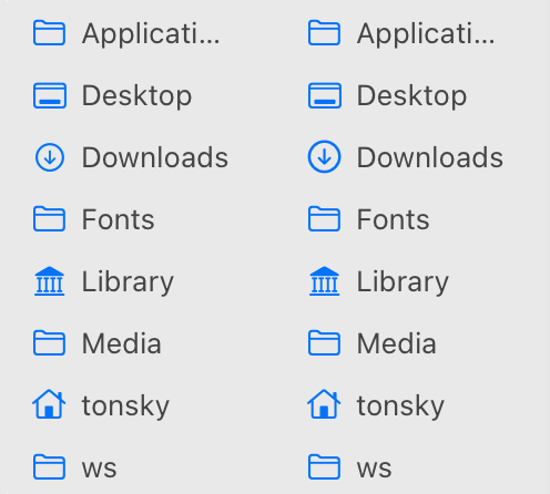
Left: Downloads icon (circle) is too small compared to rectangular folders.
Right: corrected. Even though technically it’s bigger, it _feels_ the same size among rectangles.
Close means close. Don’t open three windows and ask two questions when user just wants to leave.
Thanks @antoon334 for the video
You would think that centered blue text next to a button is also a button? How about text input?
Thanks @alexsubbotin for the video
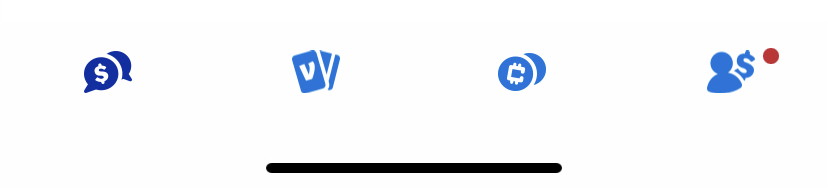
Why tabbar needs labels.
> I honestly have no idea what each of those icons was supposed to mean. And every time I come back to the app, I forget again and have to rediscover what they mean every time.
Thanks Akiva Gordon for the picture.
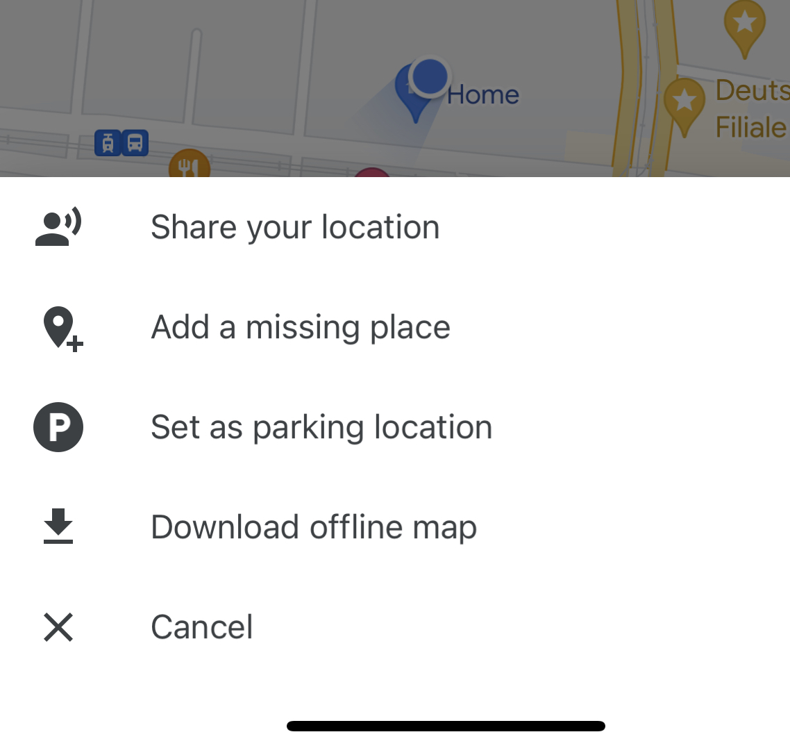
Breaking news! Blue dot on Google maps (where you are at) is actually clickable! And it contains tons of functions!
Found by @arsenii_that_b