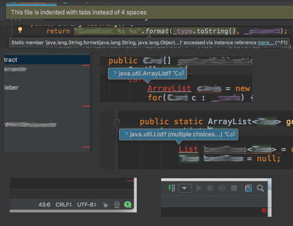
Grumpy Website


It's so nice when you right-click on selected text to open system menu but the second one made of vanilla html+css+javascript appears behind it. Thanks god, it cannot obscure the system menu.

I really wonder how did they test that? Did it look fine the them? How could you even click on that pseudo-menu when the system one overlays it?

Please stop doing this. Don't mimicry on the system elements. And leave the right mouse click free from your "smart" features.

You can rent movies from iTunes Store. Once you start watching a rented movie, you have 48 hours to finish.

Apple TV shows the time you have left rather confusingly: it's below the play button, and it looks like there are 32 hours left in this movie.

Freshly updated Spotify Android app.

Apart from the fact that it just looks ugly, the overall experience became worse. Before the album cover was centered and fully visible. Swiping on the cover skipped the track. Now the album cover is stretched to fill vertical space (which cropped the sides barbarically), and swiping only works in a vaguely defined upper portion of the screen. The swiping area is not visually defined now — you don't know if the swipe would work until you try.

This "let's stretch, crop and darken a picture and use as background" idea almost never works if you don't control the picture. Album covers come in all shapes and forms, and — believe it or not — they can be important to music lovers. This sort of "meh, good enough" approach to an important part of music is not something I'd expect from a music service.

And covers sometimes include words. So, cropping it and putting other words on top is not a great idea.

(Feedback and screenshot provided by @minotauria)

I've been using Emacs for years but recently had to switch to Idea to maintain some legacy Java code. One thing that really shocked me was lots of unnecessary information that the program splashes out on me at once.

When I start editing a file, a yellow bar appears at the top saying "the file was indented with tabs". Great, what do you want from me? When IDE handles indentation automatically, it's the last thing I'd like to care about.

A sidebar with the project's file tree has strange red lines on the right side. They are not bound to anything, clicking or hovering on them does nothing.

If you have a syntax error in your code, a tooltip will appear obscuring the right place you are editing at the moment.

Long tooltips with error messages have tiny "more" link at the end. To click on it, you should move the mouse across the tooltip's area. Once you move cursor somewhere else, it disappears.

Clicking on such a link I'd like to see some useful information, code samples, links or whatever else that could help me to prevent such an error in the future. Instead, it expands to show just a couple of extra words that did not fit the tooltip initially.

In the top right corner, there is a strange red bulb with exclamation mark. But in the top right corner, there is another green one with "1" in it. What are they? Was it so difficult to deliver this information with plain text?

In Emacs, I've got only two extra lines below the code area. The first one is status bar with all the metadata about the document I'm working on at the moment. The second one is for system messages. Surprisingly, that's enough to be on top of everything when working with code.

YouTube playlists on channel pages are scrollable horizontally. It's very hard to create a sane horizontal scroll anywhere, but you can at least not break some basic design rules. For example, don't change the type of control element under user's cursor.

Clicking on the arrow will scroll the videos, and if you just keep on clicking without moving the cursor (say, you want to get to the very end), the arrow will eventually disappear as you reach the end, and you'll click on a video instead.

This will load the video page, and once you go back — you've lost your scrolling progress.

modern computers made a long way since MS-DOS era, 8+3 for file names and other bizarre limitations. Yet we still see some arbitrary restrictions here and there. Take Hangouts: why can’t I use ampersand as a part of a call name? Because it’s going to use name provided by you as a part of a call URL, URLs have limitations and Google engineers don’t know how to do character escaping, apparently. Come on, it’s 2017! It’s almost 2018, even. People have computers in their pockets! Do you seriously expect me to write “data_and_variables” instead of “Data & Variables” because I’m typing that into computer? We don’t speak that way. We don’t write that way. We don’t want play your “computers are complicated” game anymore. It’s not even complicated. It’s just broken

an emergency device from a Vienna train that politely asks you to “push the button” yet no button is present. Better not get into emergency I guess

Grumpy website has switched to English!

We discuss bad UI/UX here, everything annoying in modern-day computers, mobile phones, design and consumer devices.

Feel free to share the link with your English-speaking friends. And if you are an English-speaking friend yourself, then WELCOME!

Файлы в Гугл-драйве. Обратите внимение, насколько странно ведет себя скролл. Чтобы промотать список, нужно скроллить именно табличку. Скролл по бокам и по шапке "Quick access" ничего не дает.

Но! При скролле файлов шапка спокойно уезжает вверх. Почему же тогда скролл на ней не работает? Это же двигающийся элемент, почему нельзя двигать его вручную, а только посредством другого элемента? Почему шапка и таблица не являются единым целым?

И чтобы два раза не вставать: зачем вообще взялся этот "Quick access"? Занимает треть пространства, не настраивается, не отключается. Я закинул пять файлов, а он показывает четыре. Все равно за последним скроллить.

если кто сомневался еще, что Яндекс это такая спам-компания, типа ДжойКазино, то вот, на оф. сайте Эппла выскакивает (с экстеншна, конечно). Прислал @aodzakitoko

Pages:
158...1918171615141312...