Grumpy Website


I love good UI animations. They are natural, visual, easy to read and immediately obvious. Except when they aren’t.

Here I’m trying to save a picture to the desktop by dragging it there. I’ve done it million times, and usually it works. But not this time. It just silently gets pulled back to the source. Why? What happened? Why did the drag failed? Was it something I did? Is there a technical reason? Is computer in the bad mood today?

No clue. It just won’t save ¯\_(ツ)_/¯ Thanks for at least notifying me about it with this cute animation

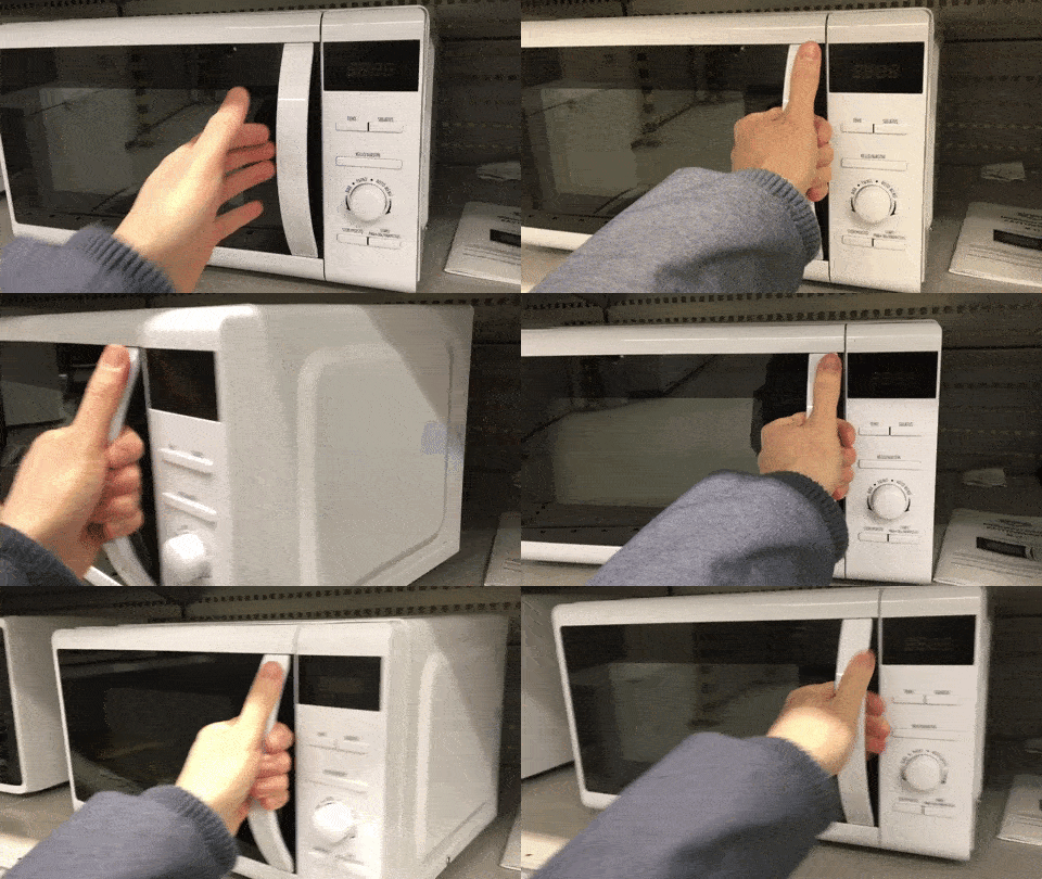
I can't stop laughing when a door with a handle does this. You had one job, door manufacturer!

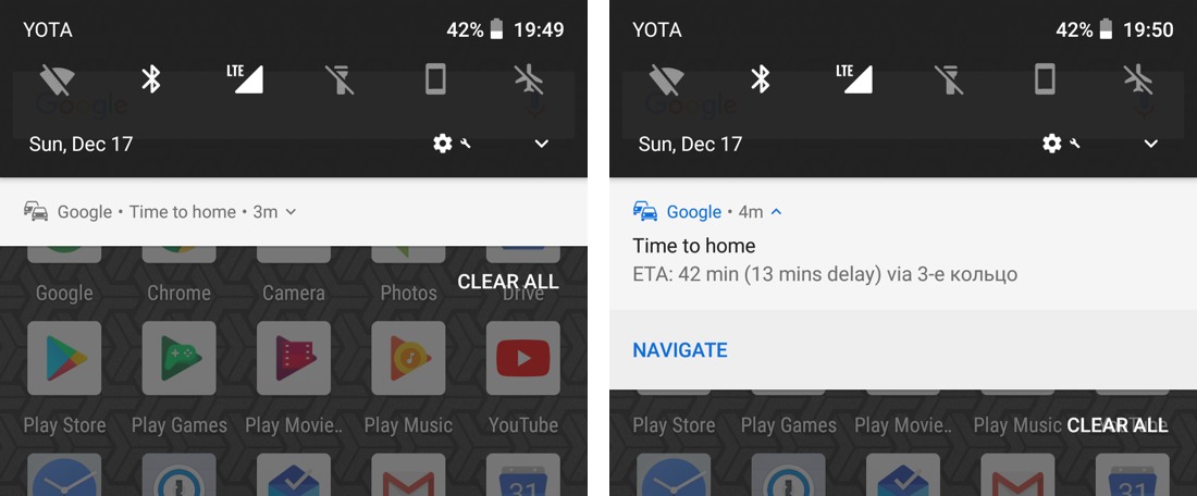
for some time I’ve been wondering why Google started reporting that I’m 2-3 mins from home when I was clearly at least half an hour away. Turned out that was _time of the notification_, not the actual information. But the context was so strong it was almost impossible to read it any other way

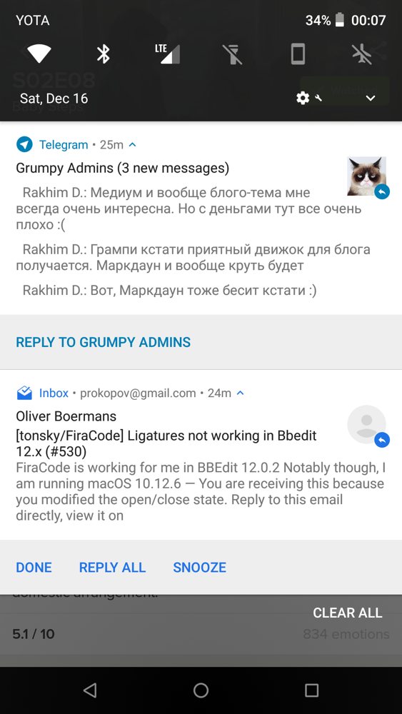
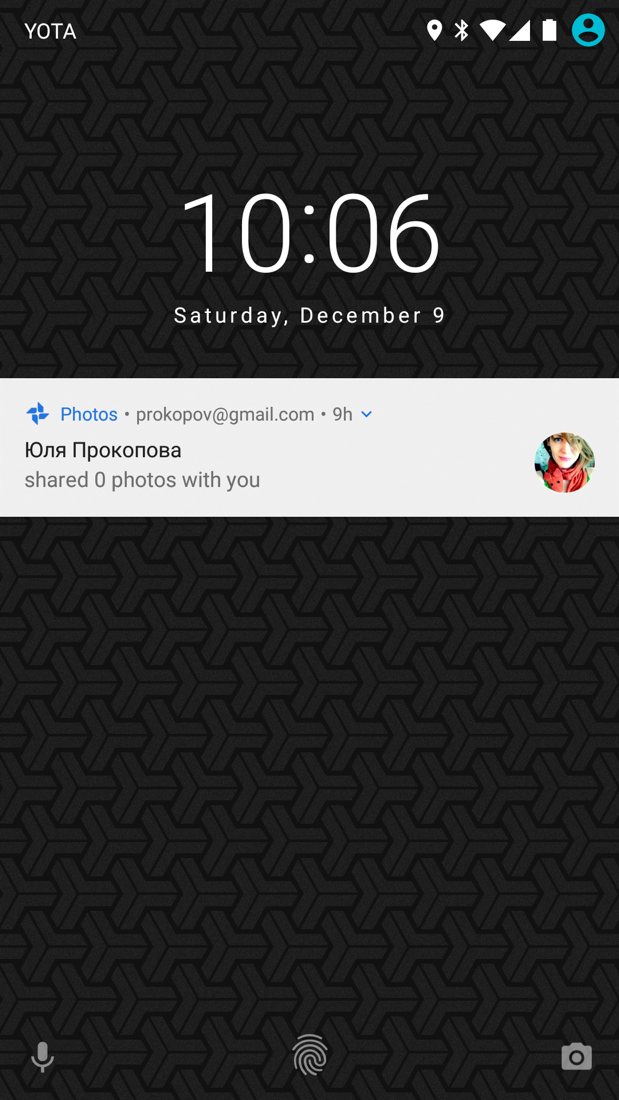
all of the sudden new Android 8.1 started to display those little arrows next to every notification. Remember Windows 95 shortcuts? These look exactly the same.

As I understand, they mean “you can reply to that notification”. But the language is all wrong: if you put something next to the person avatar it’s supposed to reflect person status or some other property of that person. Here, it’s supposed to mean affordance for you. I’m also not sure why we needed these arrows when big “reply” buttons were already there under each notification.

Sadly, it’s really hard to ignore those arrows because they are all bright and foremost for some reason. Do you really think that fact that you can write a reply is more important than the picture of a person who wrote the message? Seriously?

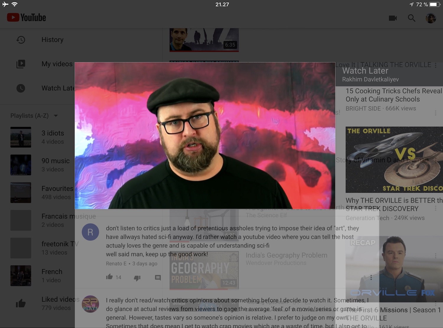
Transparency is indeed ugly (re: grumpy.website/post/0PBENBMof). YouTube mobile app lets you put the video in the corner while you browse elsewhere. The transition looks like something went horribly wrong.

transparency is ugly. It doesn’t automatically make your UI lighter nor does it add “another dimension” to the UI. It’s just noise and dirt and it makes everything messy no matter how hard you tried to clean it up. It has no function (it would be foolish to pretend someone could see anything through that “glass”) yet it distracts the hell out of me. Don’t

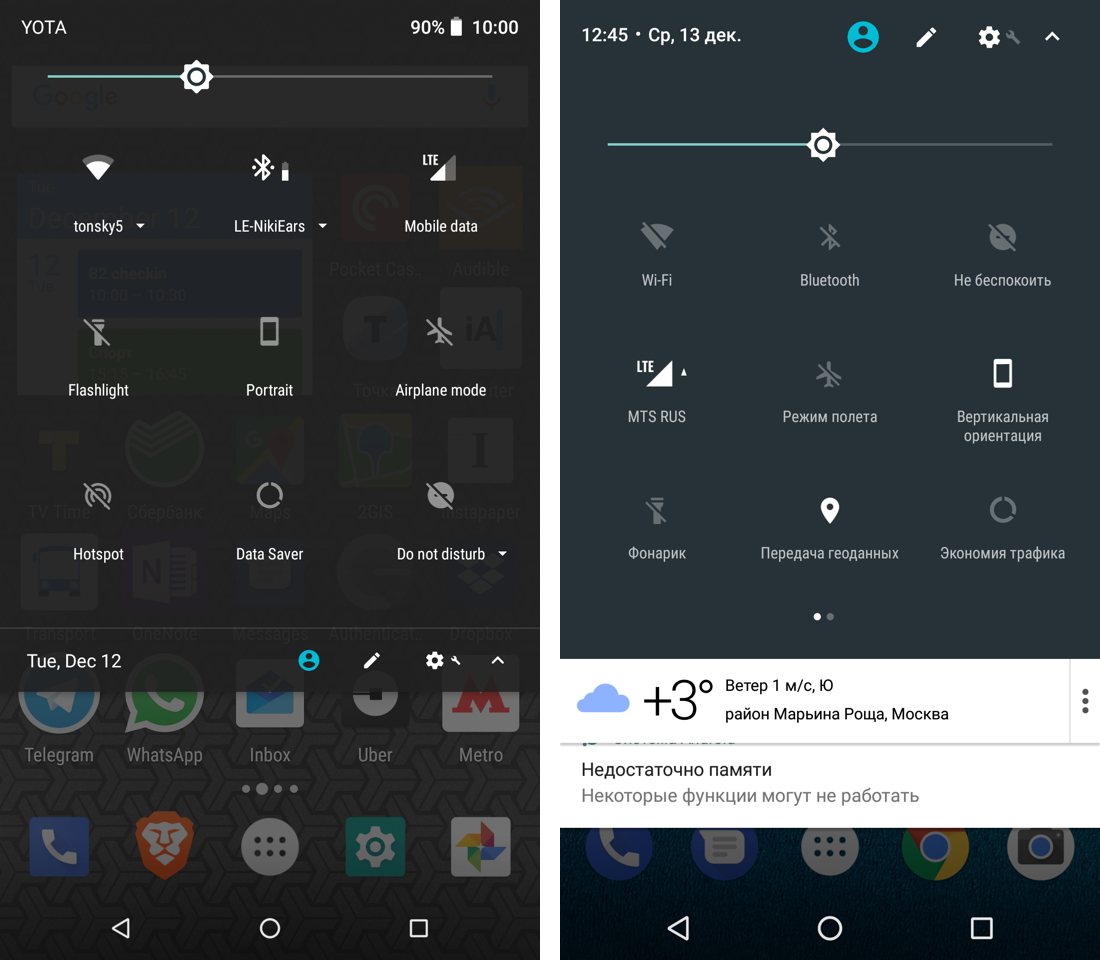
thanks for letting me know, I guess?

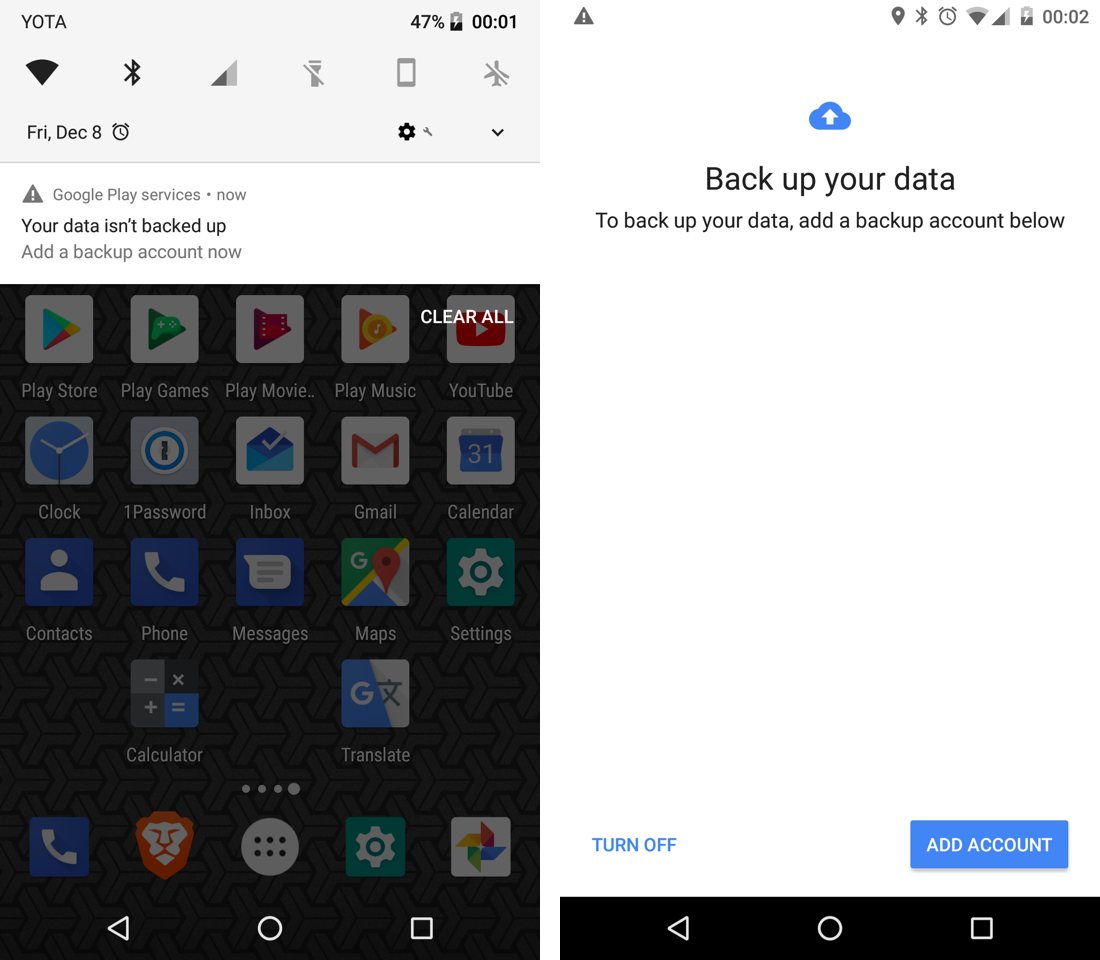
this happened yesterday. Some unknown popup popped up and demanded immediate attention. It said my data wasn’t backed up. What data? It didn’t say. The name on the notification was “Google Play services” which wasn’t very enlightening: I don’t keep any data in Google Play, let alone its services.

Ok, let’s click and see what’s it about, I thought. Which lead me to the screen of an unknown origin. It said words “back up” three times (five times if we count notification) but that didn’t make it any clearer.

Dear developers! If you want to bother us users with a favor, at least take your time to explain what it is about. No, repeating “back up” five times is not an explanation. Thank you

It's so terrifying when every button or link on the page doesn't have a direct link but only onClick handler

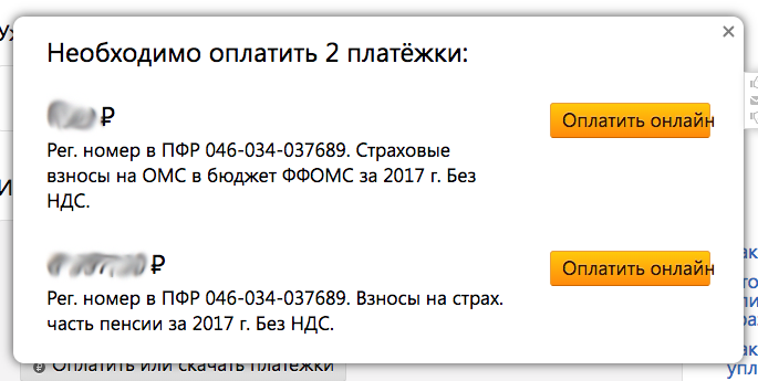
Here is a real use case. I need to pay for two invoices but when I click on one of them holding Command key, they redirect me to the payment gate so I lose that form. There is no a link to reach it again. The right, modern way is to start from the begging clicking this and that.

Even "duplicate tab" functionality does not work with such apps since browsers cannot clone existing pages but only open the same link.

This is not only about spontaneous irritation when you lose the app's state, no. Those single page apps are really killing the web today. A link that targets a particular page was a heart of the web. Instead, how could you share the code placed into the button atrribute?

Every time I imagine all the websites wouldn't have links but only JS-scripted buttons I shudder.

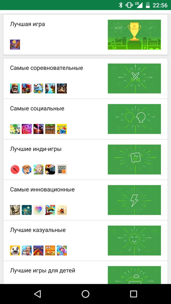
how not to design “top apps of the year” lists. Huge, meaningless, painfully boring illustrations nobody is interested in and small, barely recognizable app icons people actually came for. Don’t

Pages:
155...2221201918171615...