Grumpy Website


I'm not sure if this is universal or Mac-specific. Alt+arrow moves the cursor one "word" at a time. What's considered a "word" is a different and a somewhat difficult topic, but whatever the word is, it should be consistent in all directions.

But it's not!

If I do X jumps forward and X jumps backward I might end up in a different position, not the one I started in. Thanks to quotation marks and other symbols that break the consistency of words' borders.

maybe someone can explain this to me. Why can some apps be deleted from Launchpad while others can’t? I’m not new with computers, I’ve been around Macs since 2007, I work in IT and I’ve seen a lot of “programmer’s logic” type of UIs, but still, I can’t come up with an explanation here. Those same apps are perfectly deletable from the /Applications folder, for example.

Spotlight matching algorithm. It almost always correctly guesses what I want from the first letters—usually it’s the most used app. But when I finish typing it switches to something else entirely. Why?

how many alarms do you have? I have 51 at the moment, and it’s a mess. Every time I need to wake up or remember to do something at specific time, I set up an alarm that will stay on the list forever. Even if it was just for one occasion.

I wouldn’t mind cleaning the list, but there’s no easy option to do it. Each individual alarm must be deleted separately, and you have to do that by opening a menu for each one first.

There’s no option to delete all alarms at once as well. Trust me, there’s not a single alarm I feel I should keep. If I need one, I’ll just set it up again — it’s not a big deal, after all.

But what puzzles me most is why do the alarms persist in the first place? Why not set it once — fires once — disappears? Why keep everything and clutter the list? Might need it again tomorrow? Next week? Well, clean them if they weren’t touched in a week then. Do something. I don’t like the mess, and I don’t like that you make me feel that I created it all myself.

recently I learned that if you connect headphones to your Android phone, the alarm will ring in the headphones. Which makes chances of you hearing it close to zero. Counterpoints:

— What if I’m in a public place and don’t want to disturb anybody, but still need to set an alarm (midday alarm)? Well, for that you have alarm volume knob (read about it here grumpy.website/post/0P0hb8EJ_)

— What if I’m actually wearing headphones and won’t hear an alarm from a phone speaker? Well, obviously, the purpose of the alarm is to be heard. It should make noises in all channels currently connected to it.

But the main design principle for alarm is to be reliable. So any opportunity for alarm not to be heard makes it less and less usable.

what happened to the touch bar? I think people hated it because it didn’t give them anything new, so they focused on what they lost instead.

Touch bar was a second, optional way to do things we already could do. You didn’t GET anything. Whatever you were given, you already had it. Nothing to be excited about.

So people focused on what was taken away: tactile Escape key. Important or not, when you don’t get anything in exchange, it _is_ a loss.

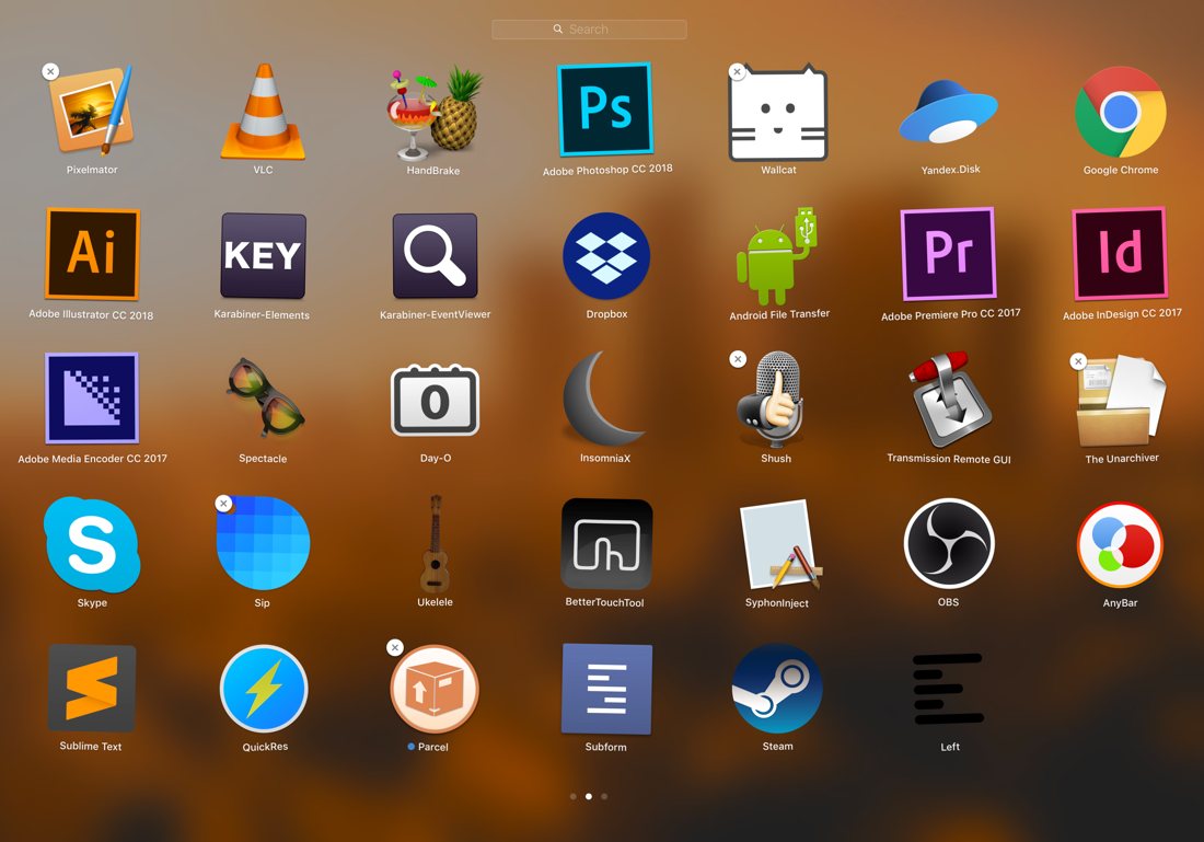
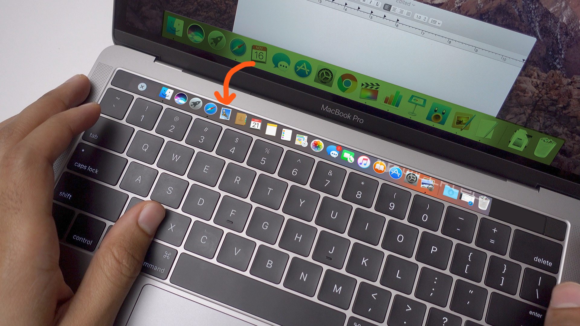
To win their customers back, touch bar should start doing something really important for them. My idea is to put Dock there. On small screens (and 12"-13" Macbooks’ screens are not very spacious) Dock eats up a significant amount of screen real estate that you value very much. Apple has a couple of solutions already (automatically hide Dock and fullscreen mode), but both are _compromises_: you don’t see what’s happening, you don’t see badges/running app indicators and, in case of fullscreen mode, can’t use Dock at all.

Instead, if we put Dock to the touch bar, we can free up a significant portion of the screen for the users. There are apps that offer that already but they are mostly app launchers, which is just one of the many Dock’s functions. No, it has to be real Dock: app shortcuts, minimized windows, badges, quick access folders, and, most importantly, Dock on the main screen should disappear.

If we can have that, there’s a good chance we can change people attitude about this invention. That and, maybe, a dedicated tactile Escape key :)

one night notification buzzer woke me up. Turned out that my phone wanted me to know that it’s running out of space. In the middle of the night! When I was doing absolutely nothing with it! And somehow it was my problem now.

Also: not all notifications are created equal. There was definitely nothing urgent, so why buzz?

P.S. screenshot above is from another time

I can't quite understand this because it only happens sometimes. iOS autocorrect often assumes that the correct word is a name of some sort. When I write "helen" and press space, iOS changes it to "Helen". I then immediately delete it, and once the cursor is placed at the initial position, the next letter I type is capitalized! The shift button is pressed by iOS.

Why? I mean, I explicitly declined the suggestion — deleted the whole word. But the capitalization part of the suggestion remains, even if I then type a completely different word.

1password mobile app lets you choose your own font for displaying the password. Yes, they make a good presentation of good/bad sides of each option (easily confused characters), BUT:

1. This is perfectly solvable by the app designers. No need to involve users.

2. Three of those fonts are effectively unusable because “0”/“O” look the same. Why offer font options that are known to be bad? It’s obvious from your own examples.

3. Out of the last two, both have confusing lowercase “l” which could easily be read as “1”. It’s obvious it’s different when placed next to “1”, but not so if you see it on its own.

If other app made the same mistake it could be understood: maybe they just haven’t thought about it. But here they have clearly done their research, put together a nice presentation and yet completely failed.

And the last thing regarding Skype (I swear). I haven't seen such ugly icons for years. They congratulate me every time I open the program.

Look at the first one. Who are they: men or women? What has happened with the older guy's elbow? Don't you know, Skype designers, that drawing something for humans eyes causes horrible feelings? bit.ly/2BcQcul

The second one is non better. Again, the guy's left arm looks really weird. The body line underneath it is also beyond any physiology. The guy looks like a coffee cup with cut heads flying around.

Only the third one is made sensible because there are only tech devices on it. Yet they forgot to add screens to a tablet and a phone.

Pages:
155...2120191817161514...