Grumpy Website


not sure if Twitter has logic behind its UI. Certainly not behind those “thread” indicators. In my timeline I see two tweets directly connected, while in reality they are not connected at all. In fact, there are three (3!) more tweets in between, including tweets from people I follow.

Terribly misleading. Somebody else seeing this might decide I was replying to him, and consequences might be quite negative. At least show some ellipsis or something

Unfortunately, I have to open Skype once a week to meet a friend of mine who cannot afford another messaging tool. And it shows a nice dialog asking if I'm enjoying using Skype.

Well, I'm not. Surely, it obscures everything else and prevents me from using the program. Closing it just delays the problem for the next time when I need to call those person again.

Ok, if I submit I'm happy, maybe they will live me alone, I guessed one time. Surprisingly, there was no any button for that. After some time spending on clicking and scrolling to and fro, I found that the dialog is scrollable!

Indeed, the yellow stars take so much space that the most important thing -- the rate button -- went somewhere down and became invisible to me.

Great user experience.

when internet was still young, file downloads were slow, brittle and ate up precious disk space. So we had Save Dialogs™ in our browsers.

It’s not the case anymore. I always want to save files today because there are literally no downsides. It’s easier to save-by-default and delete-if-undesired than answering that popup every damn time.

My second wish is that browsers would open files immediately after download. This is especially useful for archives: if I download an archive, there’s _literally_ no other next action than to unpack it. Why not automate?

The only browser I know of that does both is Safari on macOS. Did they patented this or something? Seems so easy to implement.

my favorite thing on the internets is when designers publish their work on a grid and nothing (literally, nothing) in the work actually matches _any_ of the grid lines, and the grid lines themselves are kind of arbitrary chosen too

I'd like to ask you, Clojure guys, what's the point to add Clojars widget on your repo pages? It looks nice, really, but has one flaw that makes it totally useless: it's a picture. So I cannot just copy and paste it into my dependencies. It makes me crazy: text information that is subject to copy and paste is brought with an image. Every time I have to open your project.clj source file and grab it from there.

Let the text be just text.

just a hairy graph for you. Also an example of how not to graph. Obviously

Once Skype has been updated and relaunched, it immediately shows a new notification saying that another one update awaits. No doubt, it was impossible to download two updates at once. But thank you for not reloading my computer though. Microsoft has really got progress in updating software.

Android call screen is unbelievably wrong. It’s just impossible to imagine how could one design a call screen so wrong and then redesign it completely without fixing any of the issues.

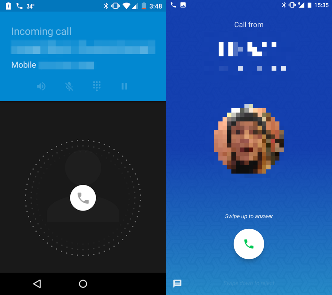
The main issue is that you just don’t see affordances. When you receive a call, all you see is a jumping icon and nothing else. How do I accept? How do I drop the call? What are my options? Where do I press?

You might think that that little round phone icon is what you press, but no. It’s not a button. It’s _a handle_. You _hold_ it to see your options. Yes, you can only see your options after you started holding it. That’s a terrible way to interact. It’s not obvious at all. There’s no clue that suggest it should be held or that more options will appear after you start holding it. You just don’t know it until someone explained it to you. It’s also not the best experience, trying to read the screen and make a decision while holding your finger in the center of the screen.

And remember: receiving a call is a stressful situation. It’s unexpected, you feel rush to answer, you probably spent last minute trying to reach the phone itself or trying to get it out of your pocket without accidentally pressing anything (which adds to the rush), you’re trying to understand who’s calling you and all that. You just have no time and no concentration to figure out whatever UI logic Google has invented for you. It’s just the wrong situation to play charades or trying to look slick and minimalist. Anything you see on the screen at that moment should be immediately obvious, no room for misinterpretation, no room for guessing and experiments.

That continued until Android 6, if I remember correctly (if not, it’s not that important anyways). Just FYI: to accept the call, you have to slide right from the center of the screen. Slide left was “drop the call” and slide up was “drop and reply with text”.

Then Android 7 came and they redesigned it. Did they fixed any of the above? No. They improved the looks and did one thing they should’ve never done. They changed one invisible gesture to another one. Starting from Android 7, you’re supposed to slide up to accept the call. Which is no better or worse than before, in general sense. New users wouldn’t care.

But if you used Android 6 before, the only way to make peace with that terrible screen was to learn and remember to always “slide right”. You can only reasonably use it by forming and habit. And the Android 7 ruined it with no apparent reason. Instead of fixing the screen, you now just have to learn another habit or panic every time you receive a call.

They also added text, which would’ve helped if it wasn’t that tiny and if you had time to read small print under the pressure of incoming call.

Why not add Accept/Drop buttons explicitly to the screen, visible from the start and painted in universally acknowledged green/red? Well. Well... Ask Google, I guess

a note about consistency. Android has three different volume levels: ring, media and alarm. It’s very logical to have separate controls for ring and media, and it makes sense to have an ability to mute them. Sometimes separately. It’s all fine.

But then you have an alarm volume, which is, I guess, useful sometimes too. But since first two can be muted, consistency suggest that third one should be mutable too. Now you got yourself into a strange situation: alarms, unlike notifications, are completely under user’s control. So if you set up an alarm you expect it go off when the time comes. There’s just no other use case to that.

But if (just if) you’ve muted an alarms before, it won’t. Basically it’s a very strange preference to let you get into your own way. Notice on the screenshot: if alarm is muted, they have to show a little warning about it when you’re setting up a new alarm. But they still let you set up an alarm, even if it won’t ring! It’s like a weird dream where things are not what they are. What would be the point of an alarm if it doesn’t ring?

You would think it’s all fine as long as you don’t touch alarm volume. And most of the time it is very inconvenient to change that, I agree. It’s almost impossible to do by accident. True.

Except for one case: early in the morning, when you’ve just been waken up by your own alarm. When alarm is ringing, phone volume buttons switch to controlling alarm volume. And this is quite dangerous: you just woke up, phone is screaming, and it’s a very natural gesture to turn down a volume a little bit. That’s the exact opposite of what you should do, but to understand that you should understand all the logic that took me four paragraphs to explain. That’s not what you’ll remember 7am in the morning when you’re disoriented and only very basic instincts work.

To sum up: it’s very easy to disable alarms on your phone without even knowing it. The muted alarm mode, being weird and useless, shouldn’t have existed in the first place. It’s a result of following consistency without taking context into account.

Touching our site is secure. Everything else is insecure! Please touch our site more

Pages:
155...2019181716151413...