Grumpy Website


So apparently Microsoft decided to bring PowerPoint to the 21st century under the name of sway.com. And yes, it’s as bad as you would expect. Not only didn’t they reduced the amount of animations and transitions nor simplified the overall experience (which you would expect from 21st century product re-imagining), they _increased_ the complexity, amount of animations and the complexity of those animations. Just look at it, look how painfully slow and arbitrary and unnecessary each transition between each slide is. Yes. Every freaking slide. Every damn time

Twitter is notorious for its use of popups and overlays as a primary UI pattern for all its interface tasks. Yet, when they implement one UI element that most people on Earth agree on—a context menu—they suddenly decide that they can’t draw it on top and have to display it inline, pushing the rest of the content away from the screen

Telegram has those floating dates bubbles. On paper it sounds like a great idea: dates don’t eat up chat space, they are always on screen so you know exactly when the message was written, even when it’s very long or there are million other messages sent the same day.

In practice you almost never care about exact date, but they eat lots of screen space and don’t let you read your messages: the actual content you care about. Good UI solution applied to the wrong problem.

Thx @bbbbbgdn for the image

Nobody (as I know of) has yet figured out a way to explain how cloud storages/cloud photo albums/cloud everything work. As long as there are two concepts: stored on device (which implies: devices) and stored in a cloud, it’ll always be a mess that no sane person could or should understand. Cloud was supposed to make us free from physical limitations, yet so far it just adds complexity

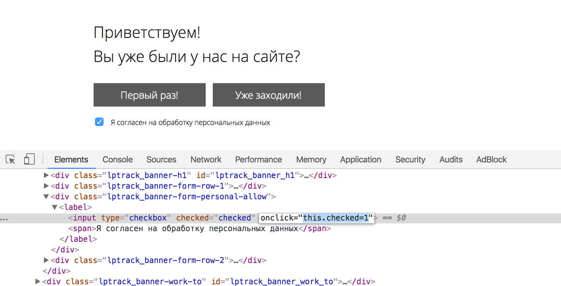
Clicking on a checkbox does nothing, it's always enabled. Well, another buggy website I thought. But let's take a glance on its guts. The very "code as law" principle in action! (thanks to @kverlin)

Somehow a counter-intuitive behaviour on Google Slides. When you Zoom In, it makes everything on a screen bigger, except free space for the slide, which is getting smaller as a result. When you Zoom Out, slide is getting bigger instead. Thx @tru_pavel for the submission

It's really a pleasure to read Twitter's documentation. As you see, there is too little of free space on a page, so they had to add invisible horizontal scroll. Good luck to you in reading through all the 100 fields with their specs.

Talking seriously, I remember even in early 2000s that was considered as a huge flaw in web-design. Today is 2018. Why do we keep stepping on the same rakes again in again?

Is there any sense in asking me constantly whether my iPhone should trust my Macbook? I've already answered "Trust" countless times before. Is it difficult to keep my choice somewhere is settings? To match a boolean value against a serial number, IMEI or whatever else on code level, no?

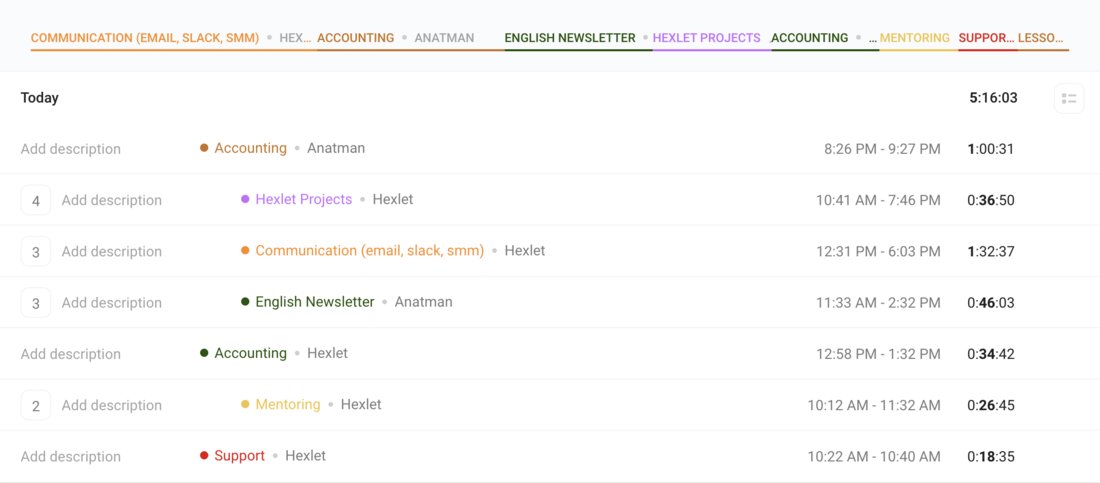
This is the dashboard of Toggl, a popular time-tracking app. It's a great example of how incorrect use of visual conventions make things extremely confusing.

The whole thing looks like a table — which makes sense, it's a time tracking app after all. The top bar looks like table columns with titles. It's not! And the whole thing is not a table.

The main content is the time slots that had been tracked. If two or more slots are tracked within the same project, the number appears on the left and the whole line is indented to the right. Now it looks like a hierarchy, right?

It isn't a hierarchy, it's just bad design.

Got another spam message in Viber. Two things make me wonder here. First, it says I have subscribed to their services. Well, I haven't. How has it happened that I has been subscribed without any intention from my side?

Second, the UI blurs everything preventing me from reading a message before I answer a question. What a strange behaviour! I'd like to read the message first and than decide whether it worth keeping that contact.

Surely, with 99% probability it is spam, but the program forces me to subscribe first. How can I decide on that without reading a message?

Pages:
160...2726252423222120...