Grumpy Website


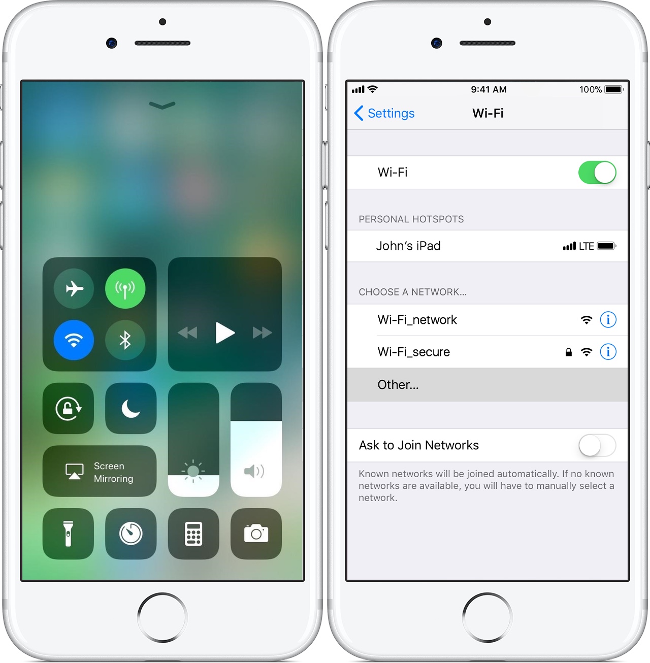
I might be the only person out there who don’t understand why quickly accessible control centres on mobile phones have WiFi switch that is simple toggle on/off instead of having some quick way to choose a specific WiFi network. Of course, if I’m at home or at the office or at friends’ house, the phone would remember their WiFi and join automatically. In all the other places, though (cafe, airports, malls, anywhere abroad) where I need WiFi I have to go to deeply buried settings, then find WiFi there and finally being able to choose a network.

I wonder how OS manufacturers expect us to use it? Don’t use WiFi? Don’t visit new places? What use would On/Off toggle have anyways? If I already joined a WiFi why would I want to get off it? (I mean, I can imagine couple of reasons, but none of them are as ubiquitous or as important as to put it to Quick Controls dashboard).

Only the very latest Android 8 fixed it, and it only took them 10 years or so. What am I missing?

Browser notifications. A web platform feature that was useless from the very moment of its inception, annoyed the hell out of everyone, never been used by anyone except maybe by accident, never worked, and now it receives a configuration option to disable it for good. Nice try

It's quite annoying when the system considers restart and shutdown as the same operations with a slight difference. The reason of that probably goes from the "shutdown" tool that turns the computer off and accepts additional "-r now" arguments to boot it up immediately.

Thinking machine-wisely, the restart operation is really a combo of turn-off/turn-on actions. But for me, an ordinary user, it's not the same. Please do not ask me anything after I clicked "shutdown". Just let me have an extra "restart" option in the main menu.

GdePosylka, a famous Russian shipment tracking service, has a strange detail. When I open the main page being logged in, I expect to see the dashboard with a list of my parcels and their state. Instead, it shows a huge logo with a search input that both duplicate the same elements in the header above.

What's the point to spend so much space on those things? Because if I'm already logged in, it means I already know what's the purpose of that service and what it does. Show me what I came for, leave the logo for anonymous users.

twitter showing same tweet with the same transparent PNG on a dark background in popup but on a white background in the feed is the stupidest thing ever. Second place stupid is probably using dark background for transparent images at all

organising stuff is a burden. You shouldn’t put your users through it unless they really, really, really need it. And even then, think twice if it’s possible to avoid it.

In the case above I wanted to add a place to the bookmarks so it’ll be easier to find. But instead of just marking it with a small heart icon, app asks me if I want to create a new collection. I don’t want to, in fact, I’m actively against it, but there seems to be no way around it.

So I roll with it and now I have to invent a name! What name should I choose? “Places I’m about to go to?” “Places I want to find quickly on a map?” “Places I want to see Heart icon next to?” It doesn’t make any sense. There’s no meaningful name to what I’m trying to do here. I didn’t wanted that collection in the first place! Don’t make me responsible.

It’s not all that bad though. There were times when they asked you to create an account before you can create any marks. Think four more steps in between—ridiculous!

does anyone know how Google came up with the idea to fusion weather and news into the same app? As a result, it’s impossible to use it to actually learn what the weather is like.

Granted, it opens up on the weather screen first, but it’s the weather at some random location. In the case above, I was travelling in Vienna, lived in Moscow before that, and it showed me the weather in Novosibirsk (twice).

So I used search, right? And it fulfilled that: it showed me the Vienna news, apparently.

Whatever alien logic it is, I went to settings, only to find that city selection is neither in General nor in Country & Language. It is possible to specify a city, but you have to go to “Local sections” and configure weather and news at the same time.

I know Google is very proud of their Search business, but is searching for weather report too much to ask?

Ok, so you've done with a tiny SQL query. Now it's time for a challenging task: try to find a button that executes it.

PGAdmin 4 looks surprisingly ugly. Surely, its UI has never been developed well, but at least the previous version had important buttons marked with colors.

Now, everything is gray. I don't have any other option except moving cursor to each button reading tooltips (thank you developers for keeping them).

meet Aerolab, “the digital agency”. They “design and develop digital_products for mobile and web, that people love to use.”

Apparently, they must be thinking people _love_ to use sliding headers. But because they are modern and digital and all that, they improved on the tradition by making header totally white and putting exactly zero content in it. It’s just a big empty white box that obscures your view and appears as a punishment for you scrolling up

that moment when you install an official LiveJournal application in a vain hope that at least it can show you comment feed in a decent way. Nope. All those notifications open POST page right at the top, with comments waaaaay down below and collapsed.

Pages:
155...2322212019181716...