Grumpy Website


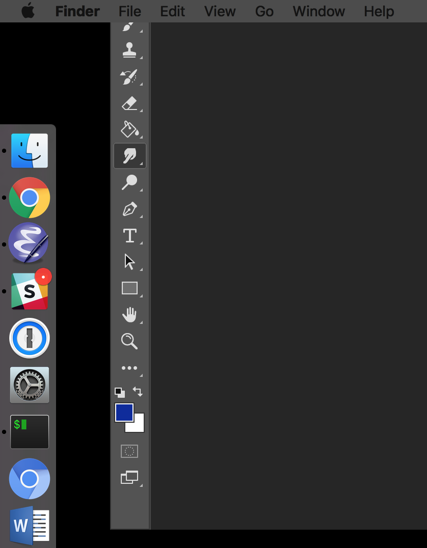
It happens again and again. On two-monitor systems, Photoshop window hangs somehow just in the middle of them. Does it have any sense? I always close the main window when it's displayed on the secondary monitor. So why doesn't the program just remember its last position?

Since the top part is less then the bottom one, the system shows just a footer of the main window which doesn't have any control to recover. After clicking for some time to and fro, I finally unplug the external monitor and wait for Photoshop fits my laptop's screen. Then I plug-in the monitor again and move Photoshop back.

Until the next time I open it.

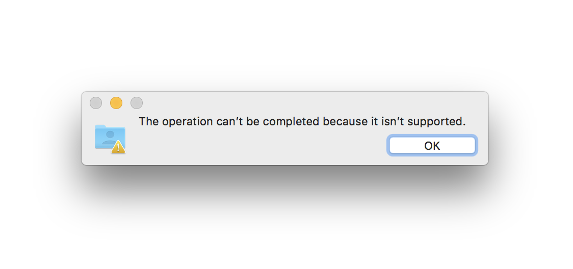
In general, any known algorithm to arrange windows across two monitors is a mess. The operation system, no matter if it's Windows, Linux or Mac, behaves quite as strange as it tries to compose some abstraction out from my windows. Some of them fly away and are shown partially. Other ones become tiny or huge. There is no any suitable way to return a window that flew away without suffering.

I love that symbol. It’s basically saying “we want people to scroll down, the main content is down there. But we also will design the landing screen so that it’ll totally look like there’s nothing down there, but we still want people to scroll, but we also are going to confuse them with the landing, so let’s add this tiny icon so that maybe somebody will accidentally notice it and maybe will figure out what we tried to say and will have a chance to actually see the stuff that we want them to see in the first place, so we put it down there, and designed the landing to hide that fact”. Ah. Non-verbal communication at its best

someone somewhere told designers that grey text looks “lighter” than the black one, and that the fonts also have light variants (Regular font weight is 400, Light is 300). Sure the page looks fresh and clean with grey font and light font, with the only downside that nobody can read a word. Only use font-weight: 300 on headers huge enough they could actually be read, never for copy text. And don’t be afraid of black text: the more text/background contrast your letters have, the easier it is to read. And no, nobody sees black text as something heavyweight or pessimistic. It’s alright, it looks bold and it’s a pleasure to read

Google released Google Drive File Stream for Mac, and this is what you get when trying to copy a folder from it.

Great.

Now, why isn't copying file a supported operation? And what do I do about it? Are my files being held hostage?

UPD: turns out this error occurs only when you copy a folder that contains those weird Google Docs/Spreadsheets files that aren't really files, but hyperlinks to the web-files.

So, Google introduced some bizzare non-files, then broke the normal filesystem workflow.

I want to turn off notifications in Chrome completely, and after digging into four levels of settings (it was in Advanced → Privacy and security → Content settings → Notifications, of course!), I see a switch that's in "Ask before sending (recommended)" position.

The only reasonable alternative in that binary switch for me is "Don't ask before sending", which, of course, couldn't be recommended.

Turns out, the alternative is "Blocked".

The whole idea of binary switches in UI is that one position is implied by the other. It's YES or NO, DO or DON'T. But in this case two positions are from different levels completely: one DISABLES the feature, another one FINE TUNES the feature.

I understand that fine tuning like this assumes the feature is enabled, but this kind of implication just breaks the UI language.

UX/UI choices matter.

We usually notice the annoying, the funny, the unexpected, the inexplicable, we shrug and carry on.

However, once every so often a dropdown menu may send a real missile alert to over a million people.

via @Aaron_Hudon

Don’t get me wrong—I used to love Windows Phone 8. Beautiful, strong, fresh design, good usability. But with Windows Phone 10 Microsoft is returning to its roots.

Somebody at Microsoft decided that alarms need names. But asking people to name each individual alarm would be too much even for Microsoft, so they decided to auto-generate those names. Good old “New Folder (7)” times, all over again.

Not everything has a name. Some things naturally do. Some don’t. Books have names. Pictures have not. Pictures are equal to themselves, there’s no _natural_ textual summary for them. Any attempt to force such name would end up with something useless like “IMG_20171103_221313.jpg”. Movies have titles. TV episodes are trickier. Text documents have names sometimes, sometimes they don’t. And no, “Untitled Document” is not a good default value. It’s better (and more natural) to not have name for a text at all.

Alarms, for certain, are in a category of things that are just that, things. They don’t need names, they don’t have to be “managed”. They are just what they are. 9am alarm is just an alarm that will go off at 9am. Nothing more

Windows Phone 10 decided to group its settings into categories (right). Android did the same in 8.0 (left). Before/after picture for Android: cdn.arstechnica.net/wp-content/uploads/2017/07/Android-8.0-Settings-DS.png

The goal is clear—they want to keep Settings screen short and tidy. That worked, but at the cost of making it almost impossible to use.

You see, if I need to restart Bluetooth, I’m not thinking “Which category does Bluetooth belongs to?” I’m just scanning the list for the word Bluetooth. At no point in my head I visualise the words “Connected devices” or even just “Devices”. I want to restart Bluetooth. My goal is to find Bluetooth. I don’t care about devices, to be frank.

Even worse, those categories make no sense. Just look at it: Location in Security? Vibration in Sound? Sleep in Display? Font size in Display? Keyboard in Time and Language? Find my phone in Update & Security? Seriously?

The grouping only works one way. Given the items, it’s totally possible to group them and make up categories. But given specific item, you have no way to figure out what category those ill minds invented for it.

We don't often talk about physical products even though we interact with them as often as with digital products.

Take, for instance, this LG washer/dryer combo. As with most such products you can delay the start of your washing cycle:

- The minimum time you can delay by is 3 hours (nope, you can't delay by 1 or 2 hours; 3 hours minimum)

- The maximum time you can delay by is 18 hours (nope, not 24 as you would expect)

- Moreover, if you select 3 hours, it assumes that you didn't make any selection and starts the cycle immediately.

That is, you can delay your washing cycle by 4 to 18 hours. No more, no less. I fail to understand the reasoning behind these dubious choices.

The cherry on top is the knob. An ordinarily looking knob. A physical knob that even clicks as you turn it around when selecting the wash cycle type. However, the LED indicator moves around with constant speed that is totally independent of the knob. No matter how fast or slow you turn the knob, the LED indicator will go from selection to selection with the same speed. Which is ~1s per section.

Why? Well, we'll never know.

There are over 30 million Apple Music subscribers already. I still can't believe we're forced to use iTunes on the desktop. And I still can't comprehend how a premium music service can keep a straight face while showing single releases as albums and call them all "Albums".

Sometimes (not always) it actually says "Single" in the "album" title, but — here's the best part — my 24" screen (or any screen for that matter) isn't big enough to show the whole title!

Is it a single? Is it an album? Who knows! I must click on every cover and explore myself, while waiting for this web-based monster to load each page like it's the first time.

So, yeah, on Apple Music you can't see a clear list of artist's albums. Period.

Is it 2018 already? Must be a NP-hard problem.

Of course, the reality is that the UX is the slave of the database design. Someone, somewhere, at some point decided to reuse the concept of "album" for any "bunch of songs released together".

Pages:
155...2423222120191817...