
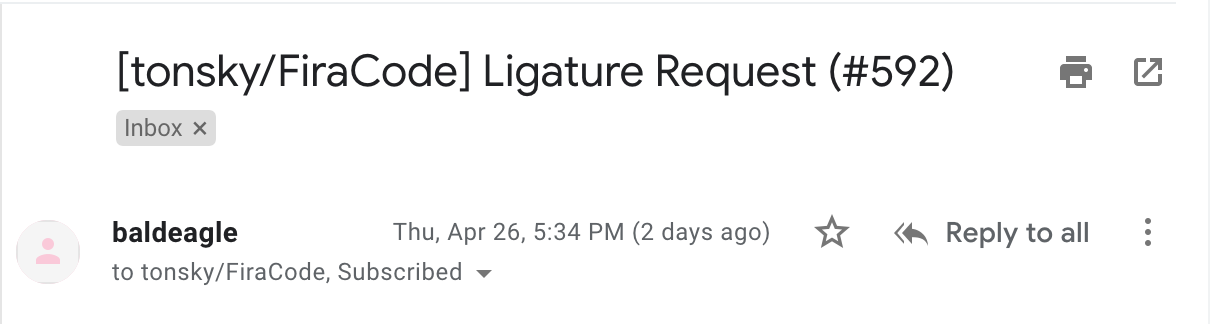
Let’s start our tour of new GMail redesign. My first question would be simple enough: what the fuck happened with the layout of email headers? This totally looks like broken CSS, with those huge holes and randomly aligned elements
Let’s start our tour of new GMail redesign. My first question would be simple enough: what the fuck happened with the layout of email headers? This totally looks like broken CSS, with those huge holes and randomly aligned elements
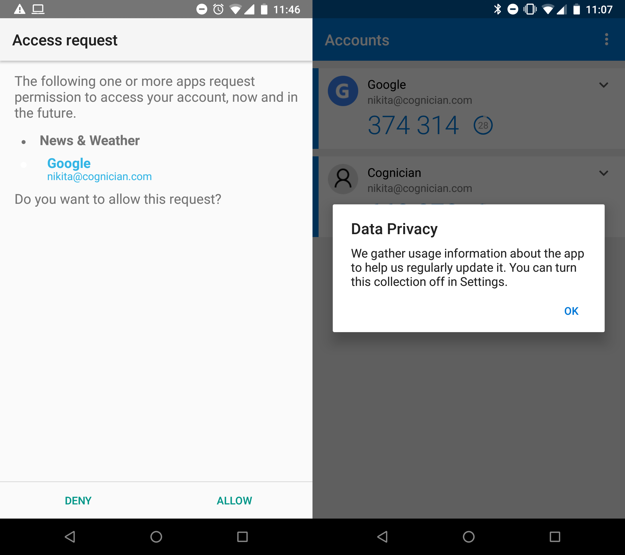
I think we all got a little bit carried away with all those social, crowd sourcing, big data processing nonsense. We forgot that a thing can be just that: a thing. Simple, functional, useful, no-nonsense. Weather can just display weather. I don’t want to manage profiles to learn how cold it is outside!
Delicate hint for Google & Co here: nobody wants to manage profiles. You, Big Co, might want profiles to collect more data from us, but not a single user out there wants profiles. Users want things to work, to do their thing, to get what they came for. I want weather and I don’t give a fuck which user I’m logged in under.
And then there’s telemetry. I mean, yeah, if you’re building big enough app you might probably want to collect “usage data” to know what works and what doesn’t. Especially if you’re a startup building something really novel and your life and death (revenue, really) depend on how well are users able to use your app.
But not every app is like that. I mean, Microsoft Authenticator just shows you a bunch of 2FA codes. It’s a very traditional, dead simple app with maybe two screens max. It can be tested extensively in a single evening on two of your fellow co-workers. For crying out loud, you don’t need big data processing to figure out which shade of blue to use in a header!
I miss simple things that just did their job and didn’t try to get to you, advertise to you, demand something from you, impress you with features or analyze you. Best apps are humble and quiet but you can’t live without them.

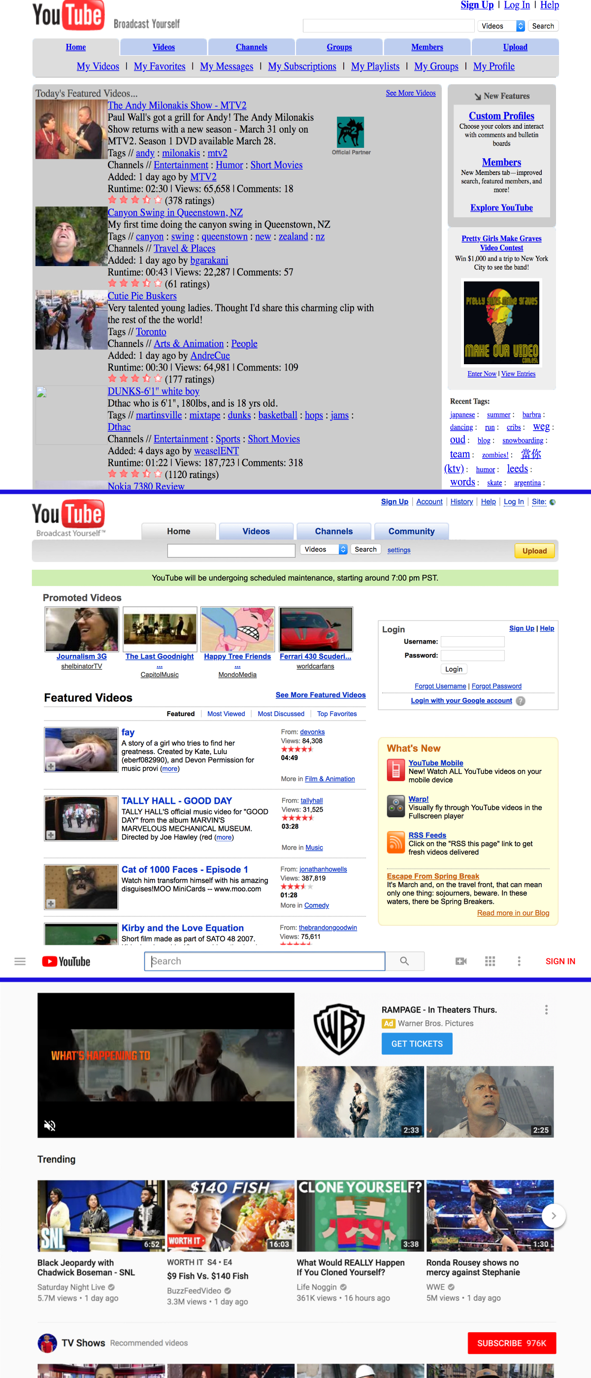
Museum of Websites (kapwing.com/museum-of-websites) is a gallery of popular websites' evolution over time. You can clearly notice the pattern many projects go over. It usually looks like this:
1. Ugly and functional.
2. Nice and functional.
3. Ugly and dysfunctional, but "trendy" and "modern".
Take YouTube for example:
1. Initial version: ugly and functional. Made by engineers. Pretty ugly, but 100% functional. Everything is clear, links are links, buttons are buttons. Pure HTML, native behaviour, no JS enabled bullshit. Nothing breaks UX, even if that UX is not aesthetically pleasing.
2. Version two: nice and functional. Aesthetic iteration over the initial version. This is the sweet spot! All the benefits of the "engineers" versions with some nice whitespace and proper placement of elements.
3. Current version: ugly and dysfunctional, but "trendy" and "modern". The information density is reduced to the point of uselessness. Links don't look like links, buttons are sometimes links, links are sometimes buttons. Native behaviour is broken in many places, JS does half the work of the browser and it's very fragile. Most of the things are hidden behind multiple clicks.
(Note that not all screenshots are 100% accurate; they are probably taken from the archive.org and sometimes they don't cache CSS properly. The first YouTube screenshot is probably missing some styles for whitespace)

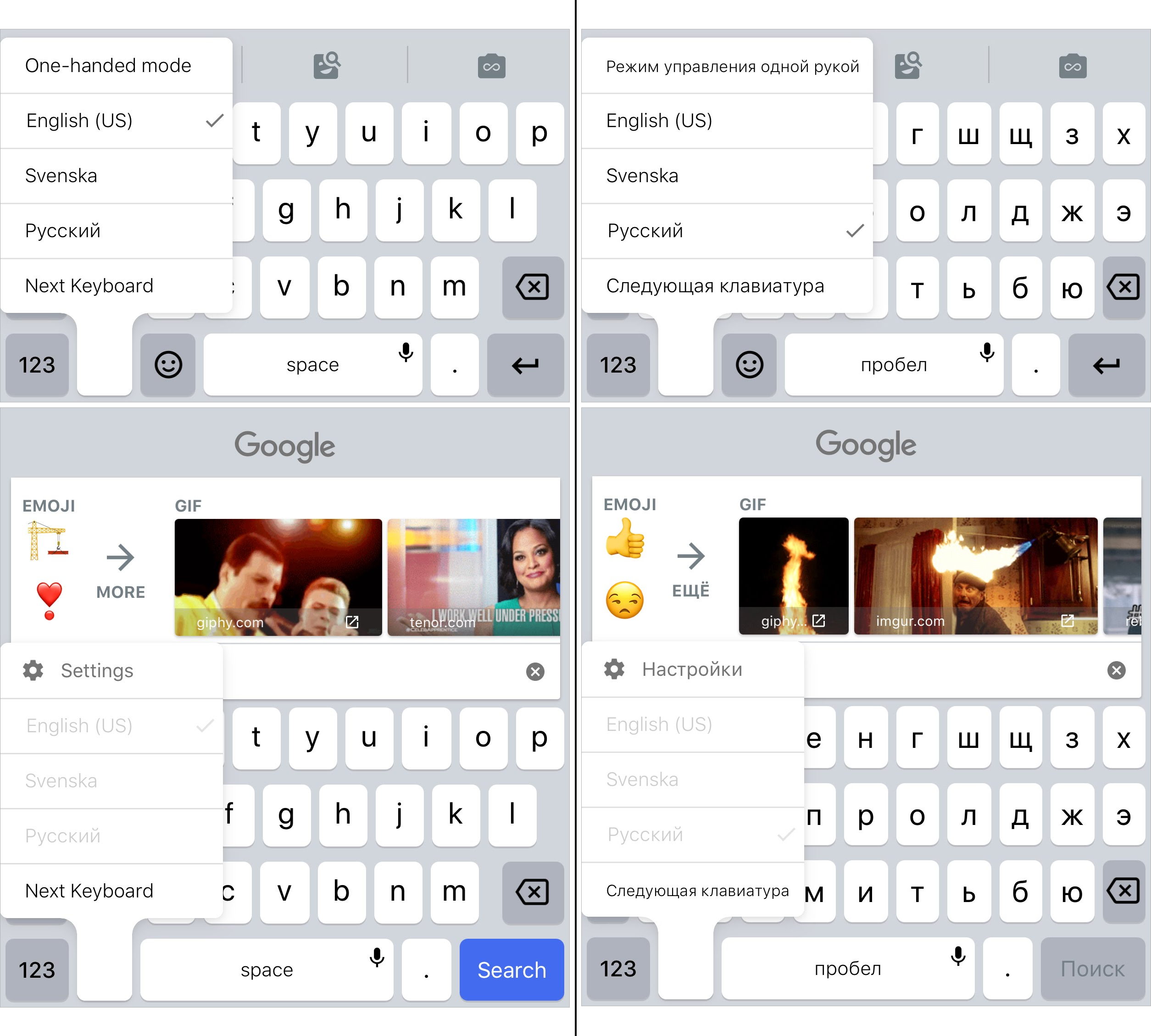
Google's custom keyboard called GBoard lets you search for funny gifs and emojis in multiple languages. The caveat? You cannot switch the language while you are searching.
You have to switch the language first, and then search. Convenient, isn't it? (Not)
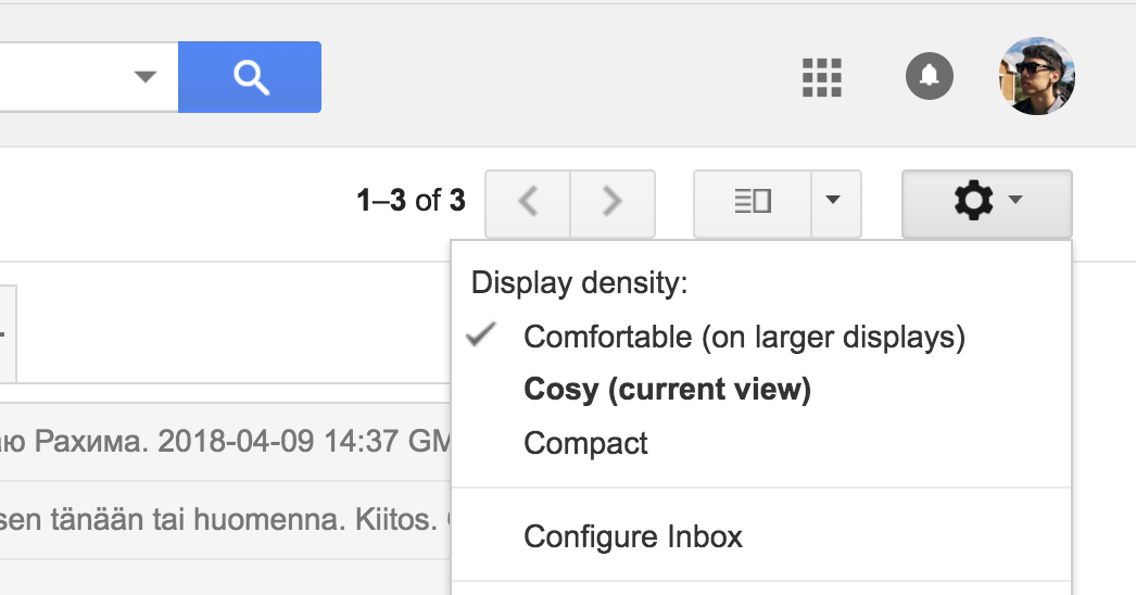
Gmail has three UI-modes: comfortable, cosy and compact. Basically, lots of whitespace, some whitespace or little whitespace. You can switch between them in the gear icon and the currently selected mode is checkmarked.
But the website also tries to be adaptive and actually jumps between first two modes as you increase or decrease the window size.
So, we have a problem: there are user-defined settings that don't change automatically, and there are automatically changeable settings that override the user-defined settings. And you gotta show both states somehow.
So, Google does the unthinkable: they add another status element that contradicts with the existing one. In the screenshot above my window is small enough so that "cosy" is automatically enabled. My "comfortable" setting is still enabled, but the reality is "cosy".
This is extremely confusing.
How to fix this? Well, I think it's important to recognise that those three options are actually very different. "Comfortable" is of different nature: it's adaptable. "Cosy" and "compact" aren't adaptable, they stay the same regardless of the screen size.
So, one solution would be to move "comfortable" out of this list altogether. Maybe, add it as a checkbox-setting "adapt to large screens" or something. Or even better: make it of the same nature and not adapt. This is actually what I personally wanted: I want lots of whitespace on any screen. In any case, do whatever but don't make your UI contradict itself.

I've got a feeling that this PayPal widget works a bit strange. Usually, we input dollars/euros/whatever, then period, then cents. I'd rather say we almost never input cents. Is there a reason to withdraw 120.79$ instead of just 120$?
Though PayPal acts in their own way: when you input numbers, they appear from the right side populating cents first. So if I need to submit 50$, I'll have to input "5000" what is always unclear and forces me to check what I'm doing twice.
As a programmer, I understand they store and process money in cents what is really a good practice from DB perspective. But let the widget operate as if I was an ordinary user who doesn't need cents.
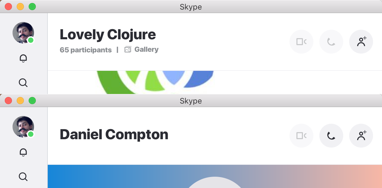
Sometimes consitency is a good thing. Sometimes too much consistency is not. In Skype, if you’re in a group, you have this “Add person” button (top right), which totally makes sense. You want to be able to add new people to the group. When you are in a group context.
But what happens if you’re talking to a single person? You have the same button, which does... well, exactly the same! It adds this person to a group. But why? Why, when talking to someone, would I want to add them to a group? Which group? It doesn’t make any sense.
Then there’re call buttons in both interfaces. Yes, video/audio calling _a person_ is a totally logical thing. In a group context... I’m not so sure. Sometimes, you want to call a group, but most of the times, a group chat is just it—a chat. I mean, did I ever accidentally called 25 people at once? You bet I did.
Thx Daniel Compton for reporting the problem
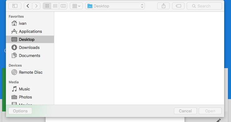
It's so weird that in Chrome, a file dialogue blocks all the tabs, but not only the current one. Say, I'm about to upload my avatar. Wait, I haven't got it on my desktop, need to switch on Github and grab it from there. Not so easy: none of keys or clicks works, please close the dialogue first.
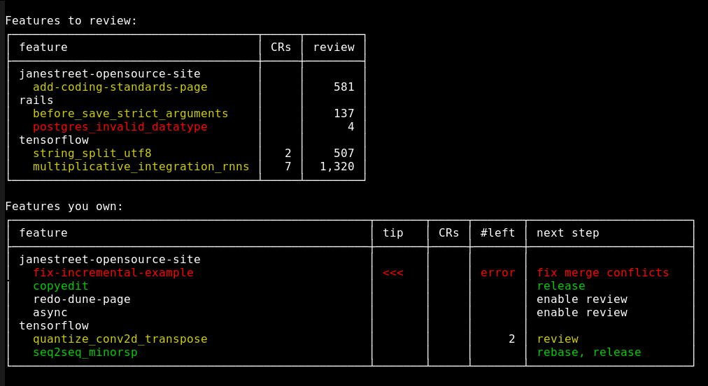
Jane Streen engineers have built their own intergrated code review UI that unifies local directories, local DVCS repos, remote DVCS repos and pull-requests/task management. Details here blog.janestreet.com/putting-the-i-back-in-ide-towards-a-github-explorer
What I find particulary interesting is this line:
> One of the things we found with our system is that it didn’t really click until we had a sub-100ms code review server.
So they’ve designed couple of features for a very narrow and specific use-case, polished the integration, removed all other barries and otherwise did everything right and, apparently, brought a lot of value. Yet nobody considered it valuable enough until they got the response time right.
When they did crossed that 100ms barrier, though, a qualitative change happened. People changed their views of a tool from something they have to cope with to something that’s fun, valuable and eventually become their second nature. Now they can’t imagine how they lived otherwise.
Now imagine how many programs and services around us make us wait more than 100ms. I’d say more or less all of them, starting from almost every website. You don’t think about “requesting” Google when you type your search query and it auto-completes after each letter. But you do think about rebooting your computer. Or booting up your text editor. Or even loading a Medium article (6 sec last time I checked). Because they’re all so slow you have to adjust and build your habits around that waiting time. Heck, Jane Street built the integration because waiting on Web UI to load was an eternity.
Millions of programs have that unfulfilled potential of becoming your second nature, something you don’t even think about when interacting with. They’re waiting to be enabled to “click”. Speed is a feature.
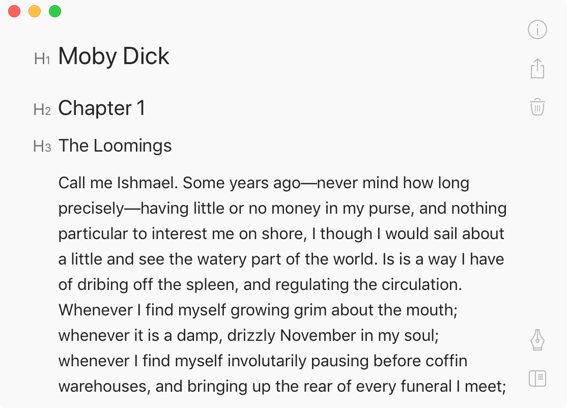
One of the stranger things Bear app did is how they decided to emphasize headers. First, if you’re WYSIWYG, you don’t need any additional means to mark headers out. Bigger, bolder font is self-explanatory.
If your text input is plaintext, though, like Markdown (note: Bear app is NOT plaintext), then you have to invent a convention. What’s great about Markdown’s is that they use symbol that you usually don’t see in a text: it’s neither a letter nor a number nor a punctuation mark. When you see this:
### The Loomings
you clearly separate the text and the markup, even in a plaintext document.
But when you see
h3. The Loomings
you can’t help but read the markup (h3) together with the text. This is annoying because you keep falling into that trap every time you encounter the header and also because it is completely unnecessary. Text is already huge, I get it’s a header, stop tricking me into reading your icons. I want to focus on content.
I guess the lesson is don’t make icons that consist of letter/numbers only and no shape.