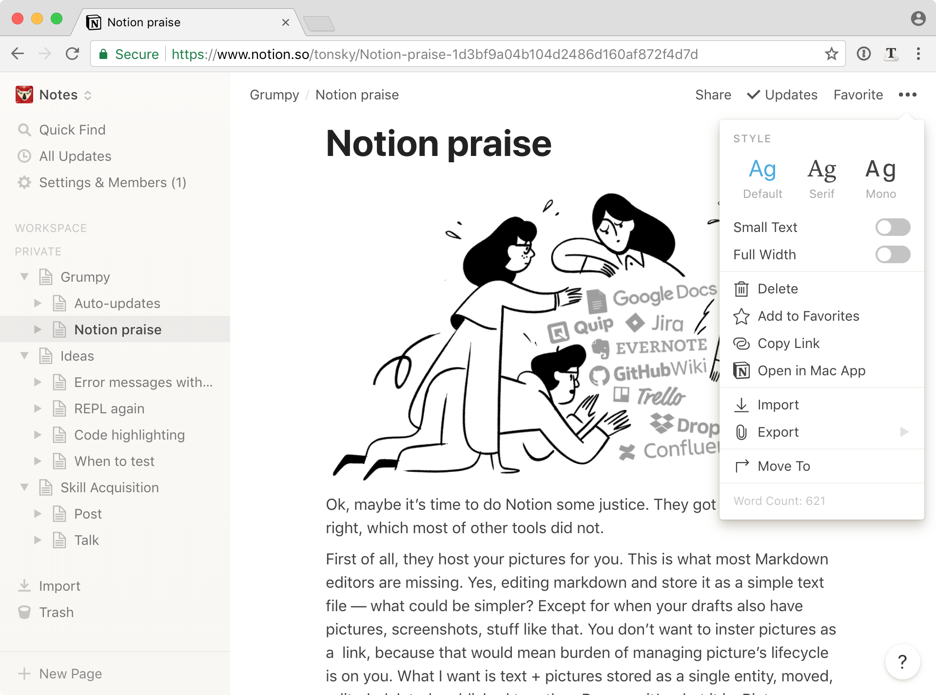
Grumpy Website


When you need a toggle, don’t use a button. That’s because button label can be read as an indicator of current state or as an action to switch to alternative. [ OPEN ] — does it mean it’s open now or it will become open when I click?

To get around that ambiguity, use checkbox. When it’s on, what label says is true. When it’s off, what label says is false. [ ] OPEN means not open. [v] OPEN means it is. Simple, unambiguous, well-understood. And don’t put negatives on the label because it’ll become double negative when read and will be confusing again. It’s like UI 101.

Except when you’re Google (grumpy.website/post/0PMmG9X3u). It seems like they wanted to add clarity by describing the current state but they broke the grammar of the UI in the process. So label says “Block adds” but checkbox is off, meaning... Don’t block adds? In reality, they wanted it to mean “Do block adds”, but used the wrong UI element for that.

Saying “Ads” / “Popups” on a checkbox is kind of wrong, too. You’re not controlling the ads, you’re controlling ads _filter_ in the browser, so it should say “[ ] Allow Ads”, not just “[ ] Ads”. I guess that’s the reason you felt your label needs additional explanation in the first place.

Also, why do you need a whole screen for a single toggle option? You’re literally showing it inline on that very screen.

You might think it’s a joke at this point, or exaggeration at least? Nope. This is a real article wired.com/story/rss-readers-feedly-inoreader-old-reader opened in real Mobile Chrome. I guess the message wouldn’t be as effective without so much “context”.

And if it so happen that you decide to follow Wired’s RSS after that eye-opening article (I’m all pro-RSS, no joking), you’ll find out that they don’t have one (duh). Well, they do, but they only publish article titles, which kind of undermines the whole point of RSS.

Why not publish full articles? Because you can’t show ads in RSS. This is why Google abandoned it, too. RSS is one of remainders of the old web, when it was still driven by people’s needs and interactions, not by advertising.

By the way, RSS always was and still is _the_ best way to follow grumpy.website updates (hi everyone reading this in a reader!) Most of the RSS readers are capable of finding link to the feed themselves from the site URL, but if yours is not, use grumpy.website/feed.xml. We serve full articles and don’t care whether you visit our site or not. We care that you can consume our content the way that’s most suitable for you.

Here you have it. A love letter to RSS

My favorite case where developers clearly missed the mark: Direct message on a tweet. You see a person in replies and decide to message them to discuss some private details. And there’s button for that! Right there. How handy!

Except that this button will ask you to select user next. What? Turned out, they built a button to send a _tweet’s content_ to _someone else_ inside a direct message. Why would anyone want that? Also, there’re about 3 other ways to let another person know about the tweet: @mention, retweet and, since recently, like. Are you sure, Twitter, we need a fourth shortcut for the same basic use-case?

Ok, maybe it’s time to do Notion some justice. They got couple of things right which many of other tools did not.

First of all, they host your pictures for you. This is what most Markdown editors are missing. Yes, editing markdown and store it as a simple text file — what could be simpler? Except for when your drafts also have pictures, screenshots, stuff like that. You don’t want to insert pictures as a link, because that would put burden of managing picture’s lifecycle on you. What I want is text + pictures stored as a single entity, moved, edited, deleted, published together. Because it’s what document is. Single entity. Pictures are intergral part of document and handling them differently just because technically they are separate files — well, it’s programmer-centric, not user-centric.

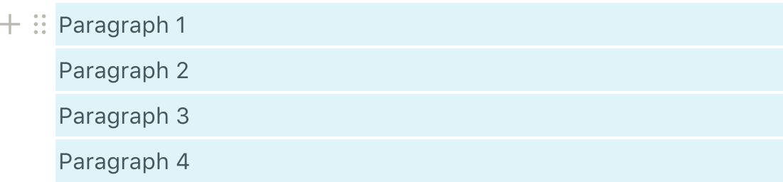
Second, they have simple block model of text documents. Blocks are pictures, paragraphs, headers, quotes or embeds. The important part is: each block always fills the whole column. There’s no “text flowing around picture”, “two videos next to each other” or any of those complex layouts. Their document model is simple, stupid and _just enough_. Remember inserting picture into Word or Google Docs document? You have lots of positions to choose from but always end up with a mess. In Notion you just don’t have those. And you know what? It solves the problem.

Speaking of “just enough”, they don’t have text styles either. Hell, you can’t even mix fonts! And it’s a great idea. Anyone who has worked in a company storing their documents in Google Docs knows how easy people mess _everything_ up about fonts. No styles, no problem.

Now to more subtle things. Typography is fine. They made narrow column the default, which is great because no one can read 200-character-long lines. You would be surprised how many apps got default column width wrong.

Having spacing between paragraph is also what you would expect from text app at this point. Please don’t make me put empty strings to separate paragraphs anymore.

I wish there were options to make text bigger and true black instead of this #424241 but nobody is perfect.

The whole UI is muted. They use light gray for secondary elements and avoid colors anywhere in the UI. This is great for long interactions because last thing you want while writing is for a big colored button to distract you all the time. In contrast, Dropbox Paper does exactly that: they put big bold blue button right in front of you (“Invite”, is it really SO important?). Bear app uses colored bullets (why???). OneNote? Not even funny. My point is, if you’re going to spend lots of time with the app, make sure there’s no color, as little UI as possible and no other distractions.

And finally, they make switching between documents really instanteneous. Remember how many hops does it require to switch between docs in Google Docs? And how much waiting does it imply? Well, here you have docs list on the left, each is one click away and loads fast enough that you stop thinking about it as a time-consuming process.

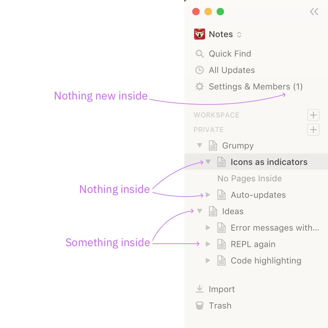
Special mention in this category for all the apps that implement navigation using two panels on the left instead of one. Bear, Quiver, macOS Notes, Standard Notes, Simplenote. Guys, it’s just notes, not a library of congress. And nobody likes nested hierarchies BTW. Special mention inside special mention for OneNote who made _organizing_ notes more complex than anything I could’ve imagined in my scariest dreams. Every time I start it I have to go down so many levels I forget what I came for.

Here you have it. I haven’t used Notion for anything more advanced yet (first impression — super complicated), but it works as a personal notebook I guess.

Bad parts:

- grumpy.website/post/0PiBqZVUI

- grumpy.website/post/0PhtVMD52

- grumpy.website/post/0PhfmxDnA

- grumpy.website/post/0PhAYfy0b

How do you know when no one working on a software product actually uses the product? Easy: when key functionality is implemented in the most unnatural, cumbersome way that goes against any common sense.

Case in point: Twitter's mobile site. Why would you put the reply button and word count in the most inaccessible place that scrolls away when you start typing? Because you never ever use the product yourself.

Bonus: try replying to a long thread of comments. Yup, you guessed it: the reply button will be at the very top of that long thread.

Icons are powerful symbols that serve both as indicators and as controls. In fact, some icons are so powerful that misusing them might accidentally send the completely opposite message to your users.

Here Notion displays “expand” triangle even next to the pages that have nothing inside. Now you can’t tell which pages actually has nested content and you complicated the whole UI with unnecessary icons. I constantly check those because “hey, I didn’t put anything in there, why do you show me that I did?”

The Settings & Members indicator is annoying too. (1) means there’s one unresolved thing that requires your attention, except it doesn’t here. In Notion it’s just an indicator of how many users are in your group. Why do you need to see it all the time? Why have you display it as if it’s a thing to resolve? I don’t know.

How complex do you think text editing _interface_ is? Cursor movement, selection, cut/paste, all that? Does MS Word / Google Docs have interface for text on the page? They do, in fact, and it’s pretty complicated thing, even if it doesn’t seem so. We’re just so used to it we take it for granted. To understand how intricate and complex text editing is, you need an app that does text editing _almost_ right, but not quite.

Meet Notion. For some reason they have not implemented text selection between paragraphs. You can’t select a piece of text from the middle of the first paragraph till the middle of the second one. Why? Who knows. My guess is it’s not that easy to implement. Fact is, take such a minor thing away and you get almost unusable text editor as a result. You can try to do it differently (which they did) or even improve how it’s done, but the end result would be: there’s nothing simpler and more natural to use than good old plain text editing.

In Notion to invoke a command you type “/”. It’s a fine shortcut as long as it happens at the beginning of the line. Unfortunately, Notion decided to also open a commands panel when you type “/” in the middle of a sentence, which happens. To make things worse, it doesn’t disappear if you keep typing, so you have to reach out to Esc to close it. Every. Time.

You see, typing is sacred. If you let your users input text, don’t mess with it. We have the habits of text input embedded to deeply that any minor detail will annoy the hell out of us.

How to fix? If you absolutely have to be able to invoke that menu from the middle of a sentence, choose “\” as a shortcut. It has its own key but _never_ appears in a sentence. Don’t disrupt typing. Don’t be Notion.

Most websites exist for one purpose, and one purpose only: show text and comments to that text. Often that is reflected in their mottos and mission: A List Apart's "focus on best practices", Medium's "welcome to where words matter", Reddit's "conversation starts here", and the list just goes on and on and on.

It only feels natural for these sites to go to extreme lengths to hide as much content as possible, cut off text, replace text with "calls to actions", floats, animations, jumping around. Right? Right?!

In the screenshots above:

First row: A List Apart (there are several pages of text in that article), Twitter, two screenshots from Medium

Second row: Reddit, Reddit after you click "view more comments" on the first page, IE 8 with various toolbars enabled.

You'd think only one of those is a joke. I don't know anymore.

This is Notion, my new nemesis. Sure, on-hover control elements make everything look cleaner. But there’s a downside, too (two, actually).

First (and obvious one) you never sure where to look for controls, and you can’t reach directly for them, because in normal state they are invisible. Doing anything with such a simple hover menu is actually two actions: first you need to hover to see the controls, only then you can do what you were about to do. It makes ALL interaction twice as long for the sake of “clean look at rest”. Not sure I’m happy with that tradeoff.

Second one is that hover effects make UI feel wobbly, unsteady. Just moving mouse around makes things appear and disappear, UI to alter, often without your intent. You don’t feel safe moving mouse around anymore. Changing cursor doesn’t help either. Look at this particular place in the video. So much is going on where normally anything shouldn’t happen at all until I explicitly make a gesture and click something

Pages:
155...2928272625242322...