Grumpy Website


Release early, release often is considered a good practice among devs nowadays (as opposed to waiting half a year for big updates). Products used to batch features into releases because updates were hard to deliver, but it’s not the case anymore.

Except that without another important feature—silent background auto-update—it can turn into disaster. Instead of gradually making product better you start constantly bugging your users with popups and warnings about updates that fix minor things that are irrelevant to them.

That’s an example how a well-meant engineering practice could turn disaster without considering completely different and unrelated UX feature. Systems are meant to be designed as a whole.

Thx @antoniokov for the picture

Oh, Google Drive. Loveless child of Google apps suite. Here you see a document location rendered as a breadcrumb. If I click on the document, it’ll redirect me to that document. If I click on a folder, however, where do you think I’d go? To that folder? WRONG. Google Drive will open a _parent_ folder of that folder. Just when I thought the concept of a hyperlink is understood by pretty much by everyone, Google Drive manages to surprise me

Google Docs has a strange problem.

Just yesterday (literally!) I was about to write how their “back home” link reminds you of anything but a link or a back button or even a logo. That blue rectangle that fills left corner? It’s not even their logo! It’s not even _a_ logo. So I’m always confused when I want to exit the doc.

But today they changed it! It’s now a proper icon, which is also a logo of a service, which is conveniently located in top left corner, so it should be fine now, right?

Well, they got themselves into something else. Their logo looks like a document icon. Yep. An icon of a single document. It’s even located next to its name. It’s a convention we were all accustomed to since Windows Explorer days, way before internet. Do you click a document icon to go back to the folder? I don’t think so.

I guess Google Docs need a new logo now.

Hey, weather app, is there any reason you’ve just duplicated Moscow here? Oh, I guess the first one on top is where I am. But why then show the bottom one? And by the way what do you think the weather’s like in Moscow now?

Chrome web store. "Featured" looks like a search bar every single time, it even changes cursor to that text caret type 𝙸 when you hover.

"Recently updated" looks exactly like "Featured", but it's actually a link. "View all" in panel's the bottom right corner isn't actually a link.

Microsoft. Microsoft never changes.

So I have a Windows 10 PC, and good half of the time I spent with it is taken by updates.

It starts nice: if Windows sees an update, it delicately downloads it and silently adds “Update and shut down” option to the Start menu, next to normal “Shut down”. When I’m about to turn my PC off, I see the option and think “hell, I don’t need it right now anymore, do whatever you need to do”. It’s a perfect place to put an update option to. Might not work as well for laptops which are rarely switched off but hey, for desktop it almost makes sense.

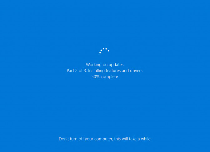
So it does its thing and turns off just as promised. I come back next morning, expecting my PC fresh, updated and ready to work as never before. But when I turn it on, it moves to “Part 2”, meaning it continues its update. Apparently there’re things Windows can only do after reboot, but hey, why couldn’t you do it yesterday? Can’t you reboot, do Part 2 and _then_ shut down? If there was a programmer who decided “well, user will turn their PC back on eventually, and we can continue _then_, so we don’t have to write that reboot code”, well, that programmer was WRONG. It’s very, very inconvenient, especially if I didn’t touch my PC for couple of days and then all of a sudden, when I finally need it to do _my_ stuff, turned out all that idle time was wasted and now _I_ have to wait? Nope, I don’t think so (actually, I have to, because I have no choice).

And man, does this thing takes forever. I’m not sure what it could possibly be doing, but I bet my i7, SSD and broadband connection are capable enough to download _fresh_ Windows 10 image, unpack it and override each individual file in a fraction of a time it takes Windows to install _incremental_ update.

So I leave it be for the next half an hour or so. Obviously. I find other stuff to do. I get distracted. After half a day passed I remember I wanted to do something on my PC, I get back expecting update to be finished by then. Well, sure Part 2 did finished. But guess what? Yep, there’re more than two parts in this process. After I finally sign in, I got congratulated with a new and updated Windows version and, you know, actually, we need some more time to finish the update.

True story. Happens every week or so. I guess, Microsoft never sleeps. There’s always stuff to improve.

Disoriented every time I'm trying to save a picture on vk app. Should I save it to camera roll or my photos? Still can't get used to it.

Our favourite UI/UX gem: Slack. Tells me I'm viewing messages from March 13 to March 13 and says "Jump to recent messages" while pointing at a space between two icons.

Design inevitably sends a message. On that picture, from top to bottom, you see field label, user input in a textarea and an input field with a placeholder text. But why is label more contrast than the input? Is label on a site more important than what its visitors have to say? Because that’s the message I see.

Thx petrmaslov for the picture

It's a classic non-problem: you want to use one element to indicate the status AND to toggle it. This works fine for phones: you see a big red HANG UP button and you know that the call is ongoing at the moment.

But it rarely works elsewhere.

Here Netflix uses the check ✓ to show that the item is in "My List", and clicking it removes the item. This is extremely weird: ✓ is to remove!

Why is it a non-problem? Because you can just divide this into two explicit elements: one for status, one for action. Yes, it won't be as minimalistic and "cool", but it will make perfect sense and avoid visual paradoxes.

Pages:
155...2827262524232221...