Grumpy Website


One more Telegram annoyance to report is that sending images “in a quick way” is by no means quick.

Expectation: I drop a picture “in a quick way”, it’s got sent immediately.

Reality: a modal popup dialog appears for the very obscure reason. It tries to ask if you want to add a caption, but it’s really hard to figure out because the majority of it is consumed with the picture you’ve just (supposedly) sent. What’s going on? Why isn’t it sending? There must been some mistake. But there’s no error message... And no “Ok/Cancel” buttons, nothing. Why is it showing _my_ picture to _me_? I just wanted to send it...

After some effort you might notice that there’s “Well, actually send it already” button but it looks just like a icon or even a logo.

So yeah, worst dialog ever.

Going to drag and drop an image to a friend of mine in Telegram. Two huge panels appear obscuring everything. Drop images here, but photos there. What's the difference between an image and a photo I wonder? Every photo is an image, isn't it? Almost every image is a photo nowadays caught with your phone. So what do they want from me? There is enough empty room in each panel, at least they could put any tips there. Or add some logic on the server side by analyzing image's size, EXIF-tags or whatever else. But not asking me every time I'd like to share an image.

This is our microphone, a part of a "professional sound system" that we use for questions from the audience. When editing our records, I found that most of the people were speaking when the microphone was turned off.

Look, isn't that switch button made great? It has three positions; two would be to few for a "professional" one. Mute is in the center, the most common place for that switch. Being muted still makes green led to shine, so a person who stands in the darkness just looks at it and thinks that everything works. And you really need long fingernails to move that damned thing to the most top position where if finally starts working.

Now imagine you need to deliver all of this to every person in the audience.

Was it so difficult to make just a convex turn on/off button? Would it be to "unprofessional" otherwise? Thanks to "great ergonomics and user experience", we've lost our records -- the very thing we bought the device for.

See that nice PLAY/PAUSE button? Guess what it does.

Nope, it doesn't play/pause.

Right now the active pane is the speaker selection. Click on play/pause and you get back to the playback pane. The real play/pause button is on that pane.

This is just sloppy. You can't not expect the user to see this as play/pause!

(This is iOS 11 Control center).

With an Android phone, you have to suffer with separate sound levels for each application type: alarm, phone ring, applications or whatever else. When you increase the global level on the main screen, there is no guarantee that damed application will keep it.

The iOS follows this mistake. For unknown reason, an application may have either the same volume level you set on the main screen or completely different one. For a long time, I haven't noticed any regularity there and still don't have a clue.

It's easy to reproduce: here I decreased the volume level to its minimum value. Now I open YouTube and it starts playing at almost max. Why? Was it so difficult to get the global value I set just a second ago?

I wish my device was like a physical record player. There were a tape driver, CD driver or even USB system on it, but the volume level was single an none of subsystems could change it.

Ah, Flickr. A photo hosting website that is good for anything but browsing photos. Here you can see their “Camera Roll” UI that is part of Flickr UI renovation.

Yet, to download just a single image, you have to select it (1), then travel all the way down to “Download” button (2), and finally back to the center of the screen to the “Download 1 photo” popup (3). Seriously, it’s just one freaking image, how hard could it be?

One more UI sin you can spot on this picture is the fact that clicking on a thumbnail does not open the big version. This should be one of the fundamental UI principles, in my opinion: if you see something that interests you, and you click on it, you _have_ to get a bigger version.

On a Flickr, though, to see a picture you have to hunt down small Expand (or whatever that is) icon in the top right corner of each thumbnail. Even worse: those icons are invisible, so you have no idea they exist or can’t travel directly to them, you have to hover thumbnail first.

One word: a messr.

Mobile version of Reddit.com shows this huge popup on nearly every page, trying to convince me to install their app because I deserve the best.

1. It's 50% faster. Okay, sounds good.

2. Infinite scroll. Wait, how is this UX anti-pattern a good thing? Infinite scroll is a great way to lose focus and be frustrated (see the footer of grumpy.website for more info).

3. Autoplay GIFs. What? Guys, seriously…

So, no, I will not install your app, it seems to have one nice thing and two bad things — not a good ratio.

Also, check out the copy on this popup. The huge bright button will bring you to the app store, away from what you came for. Of course, they won't (and can't) remember where you've been when you clicked on it, so after installing an app you won't be able to quickly continue (CONTINUE! right?).

And if you just don't want to be bothered, you have to click on a tiny grey link that "go to the mobile site". I'm already here, I don't have to go anywhere, just get this half-screen panel away, please!

Here is an idea: provide a great experience right off the bat so that I don't dread coming back.

Would be great when I follow a link to an YouTube _comment_ (e.g. from their own notifications), YouTube video wouldn’t start playing automatically. Just saying

I don't think there's a single person in this world who understands how Google Accounts work. At one point even Google's own developers give up and go: screw this, we're only letting one logged in user per service.

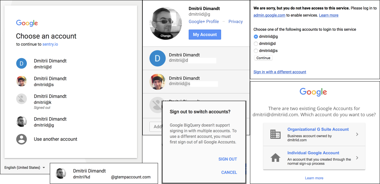
All of the screenshots are from the same browser, on the same day, with the same users logged in:

— Your accounts are listed in the order in which you logged in. Except when they aren't. And except when they are grouped for some reason.

— A service will look at `/u/index` (or `/?authuser=index`, or `/?u=index`) in the URL and choose that user. If your account X is in position 3 in the list today, and it's in position 1 tomorrow, a link with `/u/3` will log you in with different users.

— That's why links to events and to documents will often tell you that you're not authorized to view them, because the currently logged in user is whatever.

— Except Youtube. Only the first user on the list can watch Youtube. Even if you change accounts. And if your account isn't authorized to watch Youtube, too bad. Log out of all accounts, and log in with the account that can watch Youtube.

— Except how do you know if your account is authorized? Google will helpfully let you chose between an organizational and a personal account. Which is which and what's the difference? Who knows. Personal account will gladly automatically create a `something%whatever@gtempaccount.com` for you. What?

— Except when you arrive at one of the pages that lists your logins, and you chose a login, you will get an "We are sorry, but you do not have access to this service". Unless you select "Sign in with a different account", and sign in with the same very account you tried to select previously. Then everything will be ok.

— Unless, of course, the service will end up randomly selecting a different account from the list of logged in accounts.

— And, of course, when you switch accounts some services will do one of the following: open the other account in a new tab (Google Docs), open the other account in the same tab (Google Analytics), will totally ignore your selection and stay with the same account in the same tab (Youtube, most of the time). Or will not even allow you to have more than one account (BigQuery).

*Update (April 2018)*. Google Forms doesn't even let you switch accounts. It will just show an error message stating "you have no permission to access this form, ask the person who sent you the link to send you a correct link". Of course, there's no way to do that.

*Update (April 2018) via @reneritchie* Click on Google Drive link. Go to Drive app. Get booted out of Drive app and sent to the web to login. Login, and get told the file is unavailable unless I log out of every other account first.

This is Telegram's official MacOS App. The first "Copy Link" copies the link to the post, the other "Copy link" copies the link to the link you right-clicked. Are you confused? Good, you should be.

As Deadpool says, "This is just lazy writing"

Pages:
155...2625242322212019...