
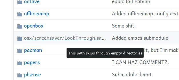
hey, there’s an important information you’re hiding! I wonder if popup can help... Nope. Never mind
Thx @greenest_pig for the picture
hey, there’s an important information you’re hiding! I wonder if popup can help... Nope. Never mind
Thx @greenest_pig for the picture

Volume controls are pretty minimal these days. But it works because they all work the same: left is zero, right is max volume. Until somebody breaks this. In the picture above _black_ bar represents the volume, and it starts from the right. No way figure this out, no icons to help you understand what’s going on
Thx @greenest_pig for the picture
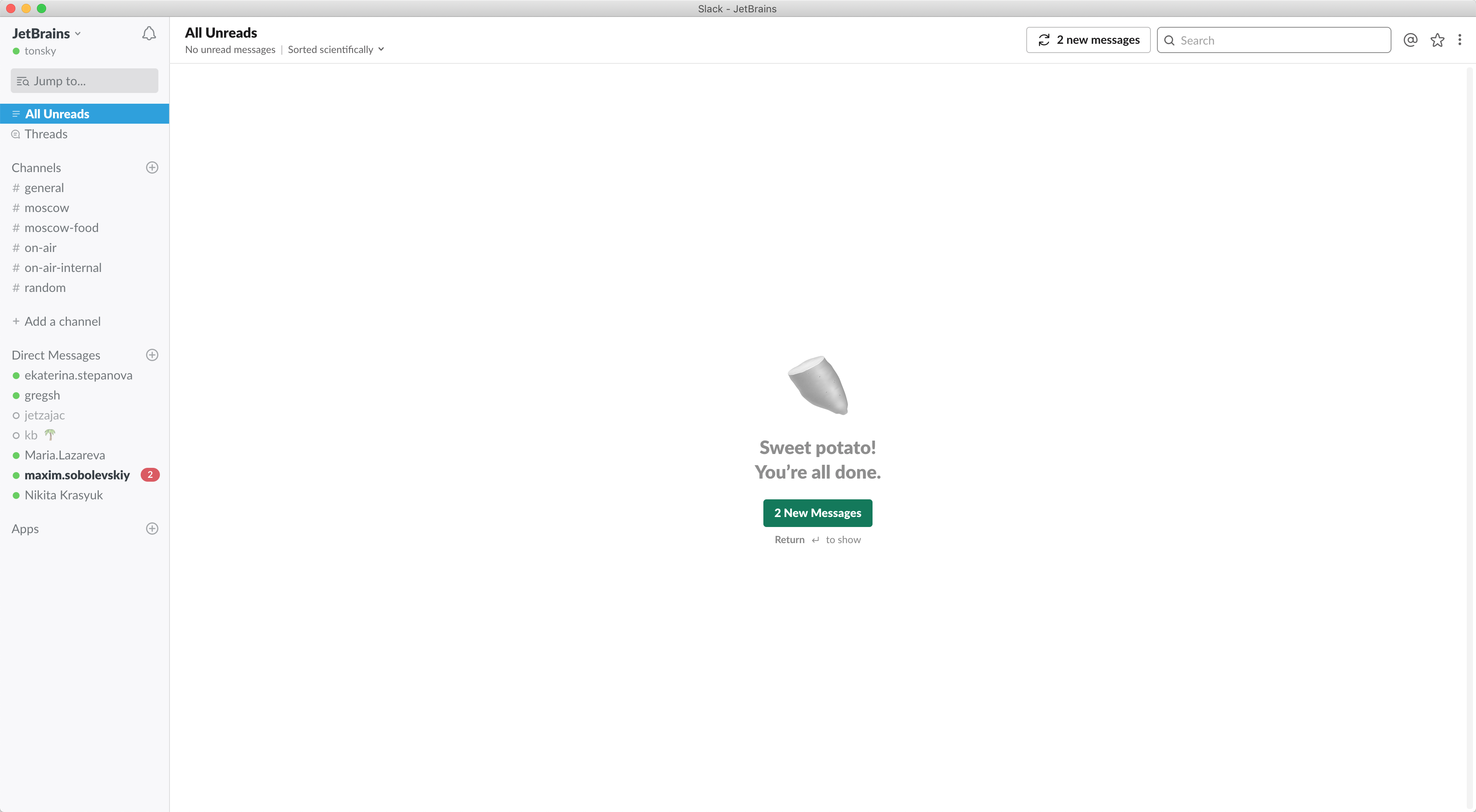
so slack has a feature to display all unread messages on a single screen. Pretty handy feature, I thought. I’ll leave it open and won’t need to click on each room separately to see what’s new. Little did I know. Even with all that free space, Slack thinks it’s pretty funny not to show me new messages and make me click a button to see them first. Sad
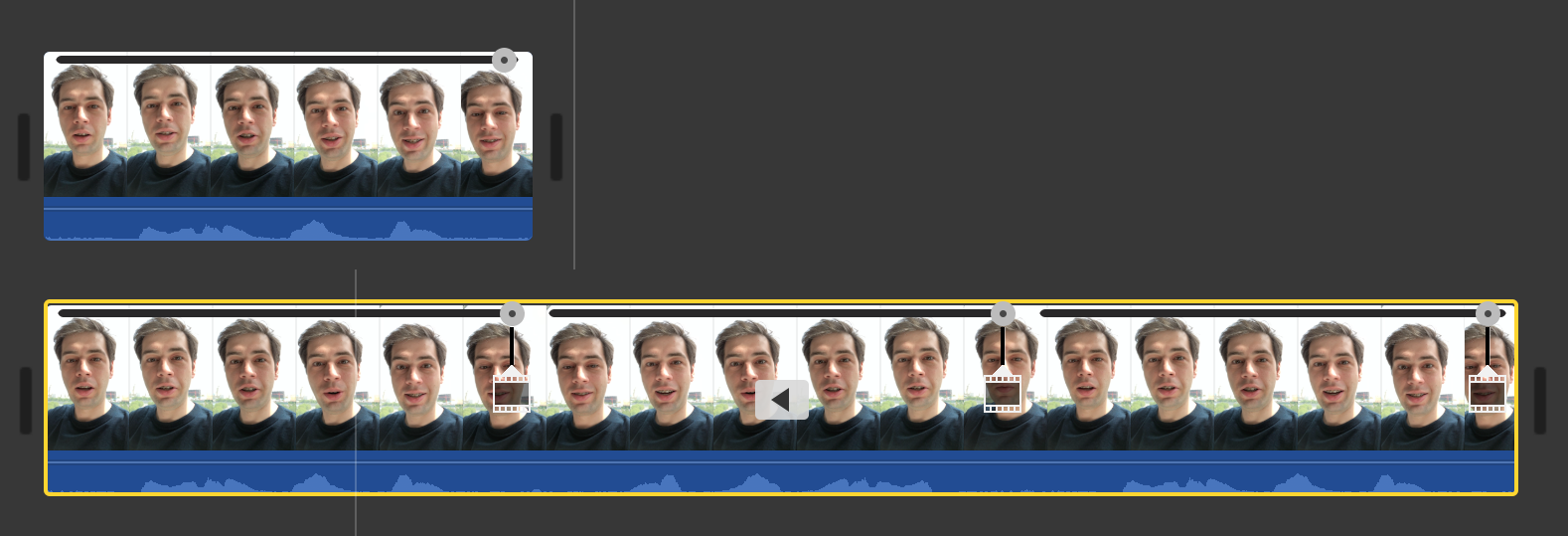
iMovie is strange. Everything it does it does with an unexpected twist. Nothing works as expected. It almost seems they do it on purpose.
Take reverse. It’s a simple task: I want my video to play backwards. You either have this function or you don’t.
But not with iMovie. When you reverse a video in iMovie, you end up with a video three times as long. Why? Because it plays forward, then backwards, then forward again. Why? I don’t know. What’s worse, it does not create three separate segments for that, so I can’t easily delete parts I don’t need. And it displays some sort of control on top of each part, but it doesn’t snap to them and they have pretty huge gaps in between, so positioning my cursor exactly when video changes direction is impossible.
You know what? I’d prefer iMovie doesn’t have reverse function at all.

There are Apple HIG, and then there is MacOS App Store.
Nearly every single interaction is different: a different animation, a different modality, a different way to dismiss and/or navigate. Slide left, a modal in the center of the screen, slide right, a modal at the top of the screen, a modal dims the screen, slide up, a modal doesn't dim the screen, an item in the list gets its own page, an item in the list is displayed as a modal, slide down, there are animations, there are no animations...
Get 15 people, put them in 15 different offices with no communication between them, set them to work on one feature at a time. You will get something very similar to the App Store.
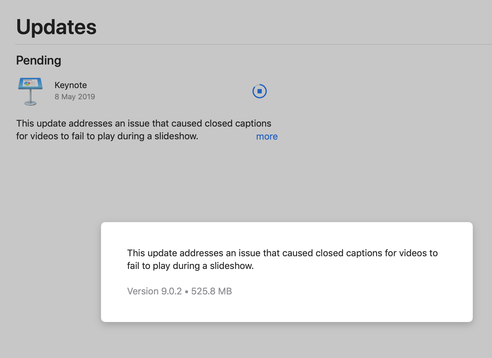
MacOS AppStore Updates screen. When you click "more" it displays a modal dialog which ... just repeats the same text. There are no obvious ways to dismiss it (you have to click outside the modal).
Moreover, once the update is downloaded, the "more" link/button no longer works. It just sits there, and you can click it, but nothing happens.
To quote Apple's own guidelines [1]:
"""
Minimize the use of modality. Generally, people prefer to interact with apps in nonlinear ways. Consider creating a modal context only when it’s critical to get someone’s attention, when a task must be completed or abandoned to continue using the app, when a task calls for modality (such as using a drawing or selection tool in a graphics app), or to save important data.
Provide an obvious and safe way to exit a modal context.
"""
Oh well.
[1] developer.apple.com/design/human-interface-guidelines/macos/app-architecture/modality
Apparently Twitter has almost 4000 employees. Their new website design is described as "slick, sick, amazing, incredible, a viable alternative to native apps, the best rendition of Twitter available right now".
Leaving this with no comment.
Oh. It also behaves like an epileptic overdosing on MDMA: grumpy.website/post/0RQvmdNmN
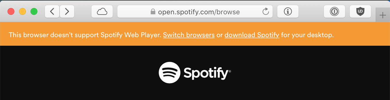
LOL. It’s Spotify who doesn’t work in this browser, not the other way around


While surfing the web in a text browser, I've got a message blaming me for using ad blockers. Wrong. For not having JS enabled you wanted to say. Because nowadays, no JS support means getting punished everywhere.
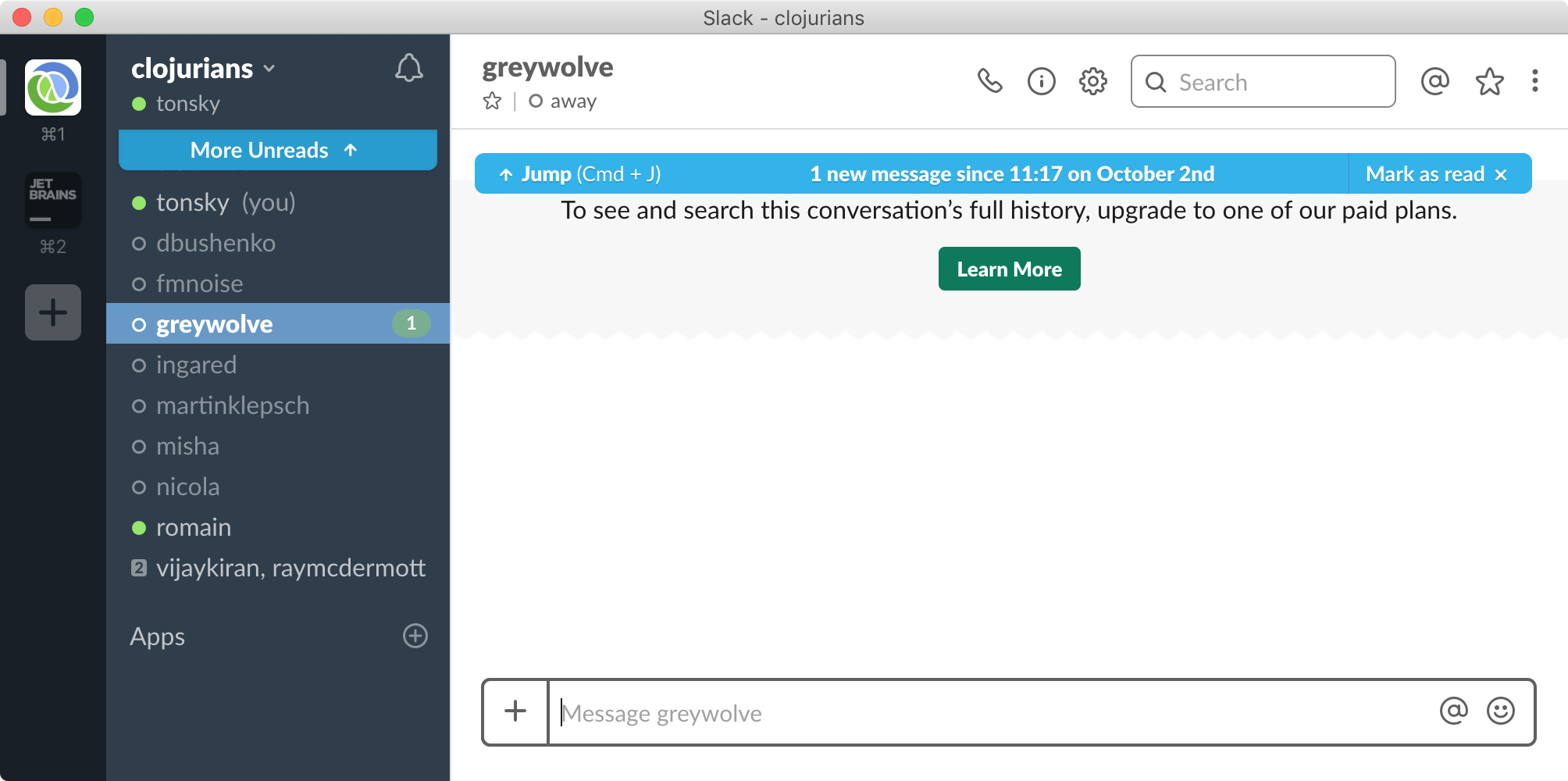
So Slack keeps bugging me with “unread” message in a workspace. If I try to locate it it turns out it already deleted it because it “doesn’t support full history”. So it wants me to read a message that it can’t display. Ok. There’s a convenient “Mark as read” button. That one does nothing, because, guess what, it can’t mark invisible messages as read. Ok. Just close that chat maybe? Nah, you can’t close it because it has (1) bubble in place where close button would normally go. And close is nowhere in on multiple chat context menus. The only winning move is not to play.