
The only thing I'm doing is scrolling through the PDF preview. And the animation (mp4? gif? don't know, don't care) flickers.
You'd think this would be tested. Can't wait for Dropbox's new Electron-based (that is, website) design.
The only thing I'm doing is scrolling through the PDF preview. And the animation (mp4? gif? don't know, don't care) flickers.
You'd think this would be tested. Can't wait for Dropbox's new Electron-based (that is, website) design.

Dear twitter, if you support drag and drop, make sure to actually show us where it works and where it makes us lose input.


Another entry in “What this puzzle could possible mean?”. A smiley face, another smiley face, a bell? How do I leave feedback with those?
Thx @rsynnest for the picture
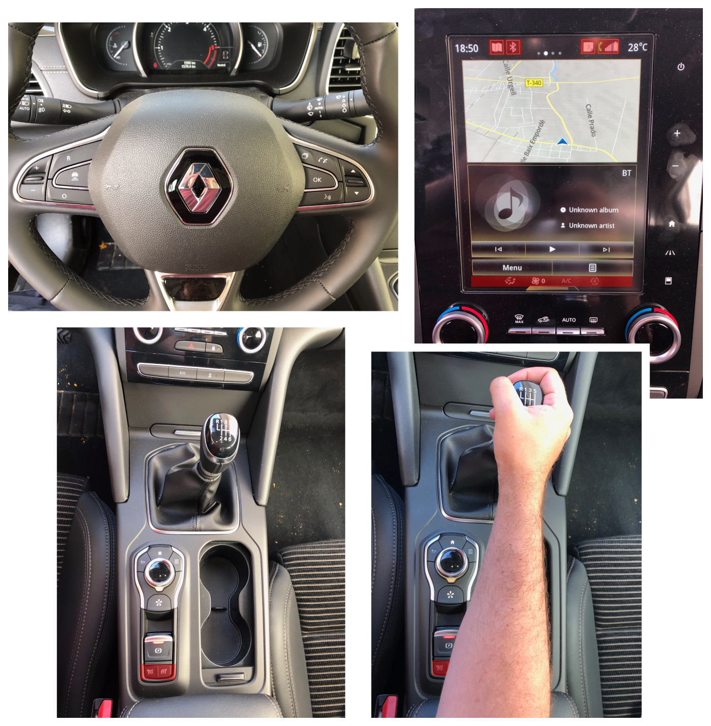
My favorite theory (which is yet to be challenged) is that modern car interfaces are designed by people who have never even seen a car in their entire life.
The latest entry in my parade of "who in their right mind would come up with this" is Renault Talisman 2019 (could be 2018 but it doesn't matter).
I could go on about many things:
- The steering wheel contains two dozen buttons, and you regularly use maybe three of them. They had to add another stick underneath (you can't even see it) to control audio volume. But you can't change tracks or switch radio stations.
- The touch screen is filled with insanely small targets (I've highlighted some of them in the upper-right photo) with no margin for error or tolerances. You missed it? Good luck finding your way out of a new screen because all the controls constantly shift around the screen (change track is in the middle? now it's at the bottom, now it's gone etc.), they change their appearance and behaviour (now it's an icon, now it's a button, now it's a draggable area), all the animations are inconsistent (slide up is fast, slide down is ridiculously slow), etc. etc. etc. There's literally no end to this insanity. The screen will always find a way to confuse you.
But it all pales in comparison to the switch that toggles assistive driving (aka cruise control). Once on, cruise control is controlled by three dedicated buttons and a thumb stick on the left side of the steering wheel. Logic would dictate that you turn it on by a dedicated button located there as well.
No.
On the central console or somewhere in the abomination of a touchscreen?
Oh, you sweet summer child. Also no.
Wait. I cannot possibly be under your right elbow behind the parking break switch?
Bingo.
There are more times than I can count on my right elbow when I deactivated it by accident. On a highway. Doing 120 kmh. Prime time to crane your head awkwardly down and slightly back while awkwardly bending your right hand to try and re-activate it.
This decision alone would put me off Renault for good. Coupled with an abhorrent touch screen and a functionally void steering wheel, I'd say that this model is a disaster waiting to happen. It actively makes the driver take their eyes from the road for every single little thing.
Which is a shame because the elements of the design that don't have any actual UX are extremely well executed (both the aforementioned cruise control, lane assist and some minor things).
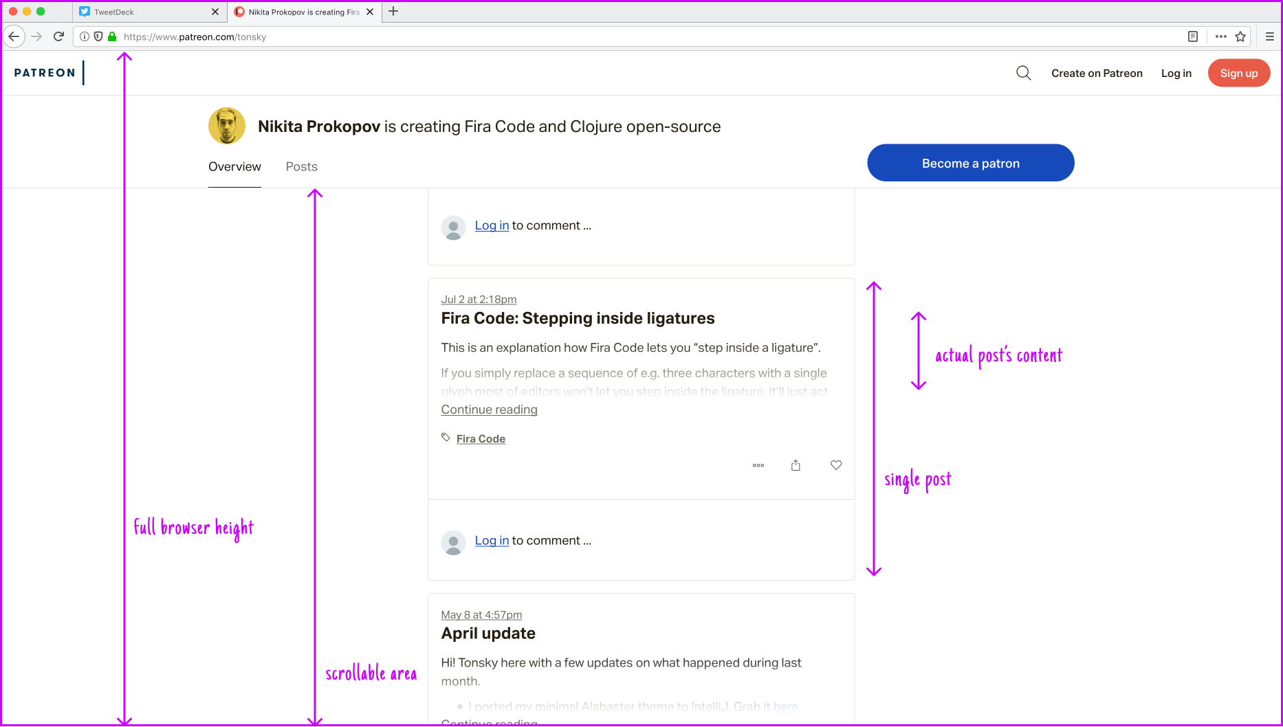
Given 1080 pixels of height, Patreon struggles to show more than two lines of text for each post. Everything else is just plain white. Ridiculous
Icons can not be as specific as the text they illustrate. Do not put letters, numbers, any specfiic info there. Because then people will think it is the information and will try to read it. Bad
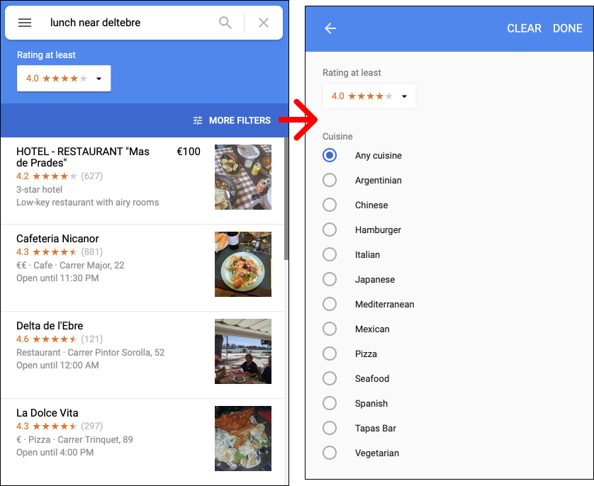
Yes. That's the entirety of "More filters" in the desktop browser version of Google Maps.
No, it doesn't change if you search for, say, Barcelona.
Yes, the app has many more filters immediately available such as "open now", "relevance", "distance".
No, this is entirely within Google's complete and utter disregard for its own design guidelines and general disregard for Maps (see previous, grumpy.website/post/0QqUsEQvJ)
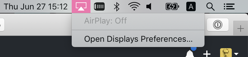
AirPlay icon appears when there are devices supporting it around. It also appears when there is no such devices around. Sometimes it doesn’t appear at all. There’s also a mysterious AirPlay: Off option that is disabled. God knows what that one does
I like that on macOS almost everything is drag-and-droppable. It makes for such a nice interaction. I also like that you can set up folder shortcuts in the dock for quick access to desktop, downloads and what have you. But those two features combined make almost impossible do drop anything to the Dock. If only macOS had “lock dock” option! Windows had it for ages
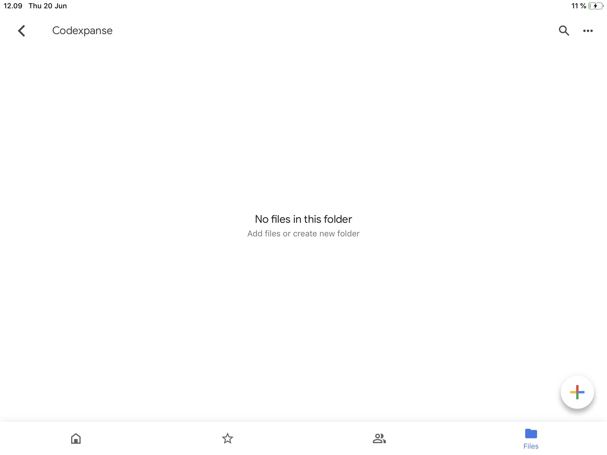
Google Drive's main purpose is to show files in their correct state, but it can't distinguish between "empty folder" and "no internet".
This folder is not empty, I just have no connection at the moment.
I feel like nobody is even trying anymore...