

Just turned on iCloud Photo sync on a new Mac. It started _UPLOADING_ something. Not sure what—I definetely don’t shoot photos on a Mac. We’ll never understand how clouds work. Even Apple can’t make a meaningful UI for them
Just turned on iCloud Photo sync on a new Mac. It started _UPLOADING_ something. Not sure what—I definetely don’t shoot photos on a Mac. We’ll never understand how clouds work. Even Apple can’t make a meaningful UI for them
this is your regular reminder that the worst thing you can do with a text on your webpage is to make it appear on scroll. It makes webpage feel like it can barely catch up.
It also obstructs reading: you expect letters to appear from the bottom but see nothing. Is it over? No. Just wait. Here it is
Too much animation doesn’t make your site “interesting”. It just causes nausea

that moment when you wanted to click Update (big blue button in background) but a popup appeared with a non-undoable action right under your cursor the moment when you click.
Thx @usernameistooshort for the picture

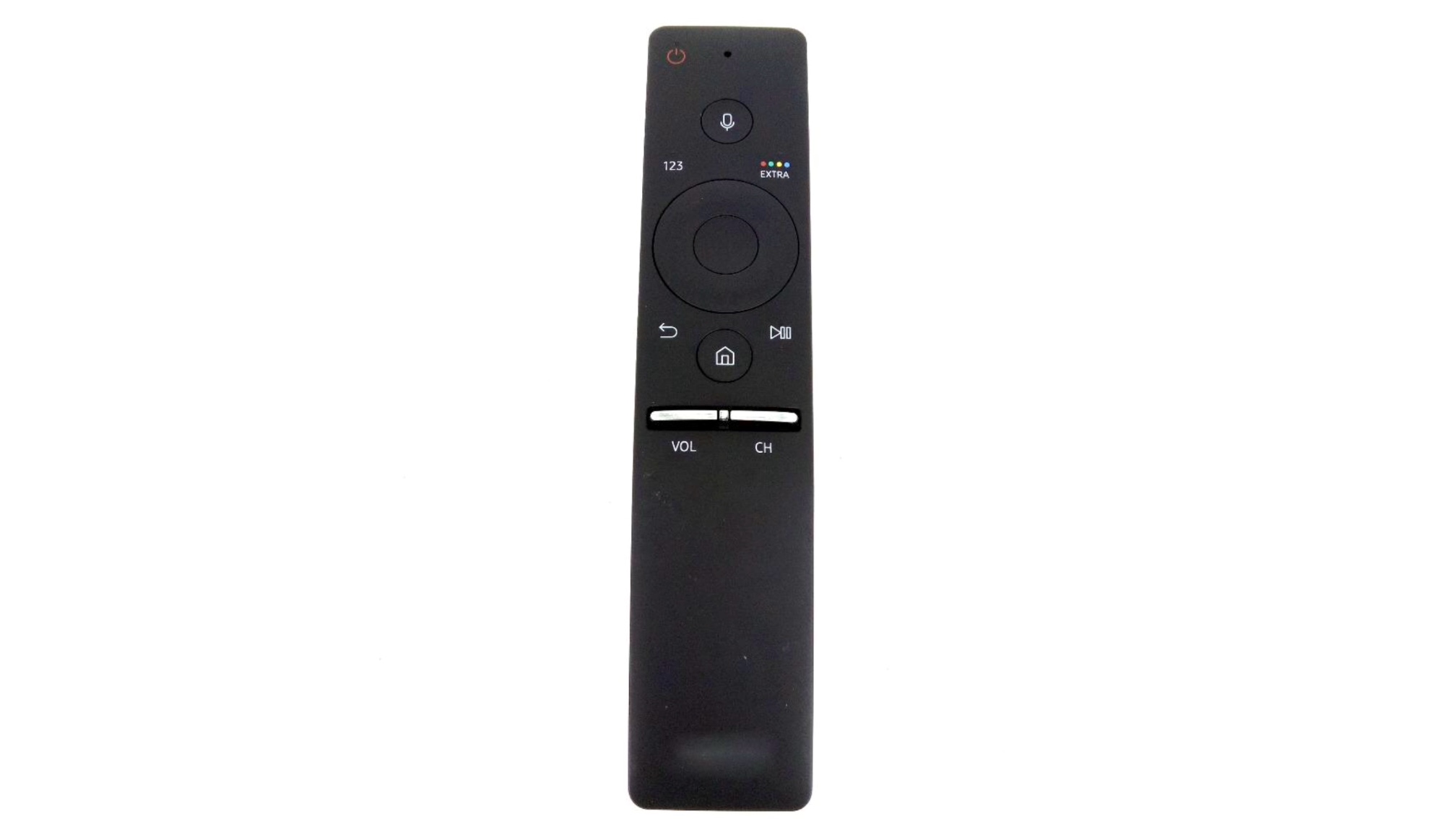
How to increase the volume on the TV? Nothing is easier. It’s the most important TV feature. But not this time.
I stayed in a hotel room with a big smart TV. I wanted to turn it up and looked at a minimalistic remote:
— Is there a directional pad?
— No.
— That’s it, look, here is a VOL button!
— It mutes the sound .
— I might try to hold it?
— No, the voice assistant is activated.
I pressed all the buttons. I went through all menus. And I didn’t find out any solution. Eventually I gave up and continued watching TV quietly.

You had one job, SpeakerDeck...
You gave users the ability to click the "Save" button during upload, and you handle the result in the worst way possible: lose the input, blame the user, force them to start from scratch.
Mickey Mouse avatar
thx @mxtnr for the picture
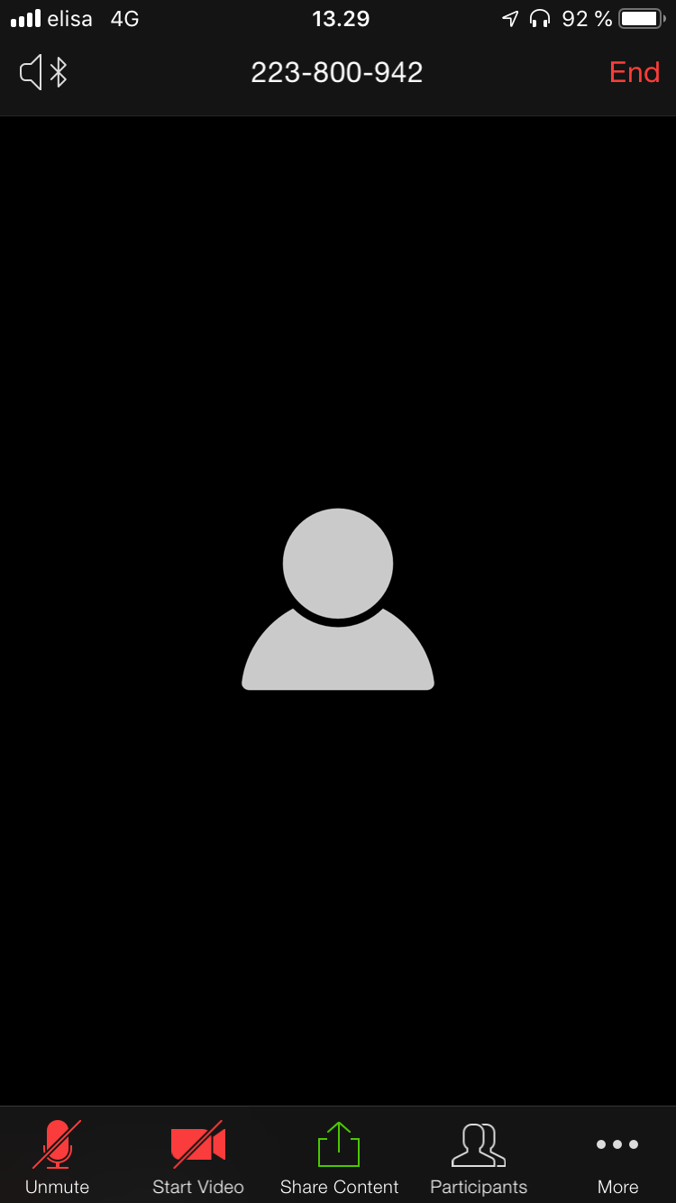
Zoom app for iOS.
Ah, The Hardest Problem in interface design. How to combine the status ("muted", "no video") with the action ("unmute", "start video")?
Because right now this doesn't make much sense. To unmute, click on a red crossed microphone. To start a video, click on a red, clearly disabled camera.
The answer is don't. Don't mix status and action. Separate them enough to reduce ambiguity.
Yeah, and don't use navigational menus for actions and status in the first place. These elements are for navigation.
Zoom is a surprisingly annoying on iOS. Even without video, like on this screenshot, the app hides all the buttons after 3 seconds of inactivity, so that the user can enjoy this informative black screen with a huge "nothing here" symbol.

There’s content you are missing. Because it does’t exist. Did I get you interest? Never mind bye!

No matter how hard I try I can’t figure out what that “<<< Swipe >>>” refers to. There’s definitely nothing to swipe. Nothing swipes (I tried everything). Yet it’s central, animated and clearly put there to bring people’s attention to some swiping function that they tend to not find by themselves. Funny but that animated caption didn’t help a bit. I still haven’t found it