Grumpy Website


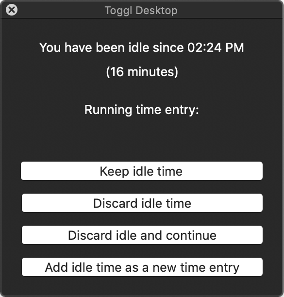
Toggl is a time-tracking app. If you start a new session and don't interact with the computer for a while, next time you move this message appears.

The intention is excellent: maybe I forgot to stop the timer and it was "tracking" work while I was watching a video or was away. But these buttons break my mind every time and I spent several seconds thinking what should I press. Multiple times a day.

Can you guess what they mean? Why are there two types of "discard" but only one type of "keep"?

"Keep idle time" is basically "Ignore this": it doesn't change anything and doesn't stop the timer. It's the same as just closing this window.

"Discard idle time" means stop the timer and remove the idle time from that timer's entry. In other words, stop the timer in the past, not right now.

"Discard idle and continue" means stop the timer, remove the idle time and start a new timer of the same type. In other words, stop the timer in the past and start a new one right now.

"Add idle time as a new time entry" is a completely different use case: stop the timer in the past, create a new time entry with the idle time.

Something simple like this i.imgur.com/bgnhNzj.png would work better, at least for me:

- one clear option to dismiss the whole window

- color and icons to anchor attention and create habits

- this is about the timer, so speak about the timer explicitly, not implicitly

- least common use case is clearly separated

Youtube iOS app allows you to set filters and sort results. After checking all the things you want, go ahead and... click "Back".

This is very counter-intuitive and it just feels wrong. I just made a meaningful input, "Back" should reset it, and some sort of explicit "Confirm" button should exist.

I guess when YouTube says it’s going to sort videos by date it actually uses just the date, ignoring time of the upload completely. All these videos were uploaded in strict order, with significant intervals between each upload. And yet

Dear Aeroflot, it is incorrect to use orange exclamation mark to let me know how to edit a date of birth. It looks like there’s some sort of mistake you want me to fix, and buying a ticket is a high-stress task, so better revisit this decision.

If you are a programmer, how much sense you can make out of git push output? Compressing objects? Reused 0, delta 0? Resolving deltas? local objects?

I mean, look at git commit output. At least it says... something. 8 files changed, 144 insertions, plus sign (+), etc. It speaks my language.

What could push output? How about list of commits that were actually sent over to remote? With messages? Or if it’s too much, just a count?

StackOverflow is amazing for reading the code. When a line doesn't fit a fixed width, a horizontal scroll bar appears obscuring the line. The only way to get rid of it is to reload the page. And yes, don't hover the code block or it comes back.

Let me just scroll down to see what this is abou...

YOU WILL COMPLY WITH REQUEST. RESISTANCE IS FUTILE. ALL YOUR COOKIE ARE BELONG TO US.

Recently Twitter launched a redesign. It was much lauded for how fast, performant, amazing, PWA, the future, best React and web practices it was.

When you try to switch between Twitter's own tabs, or even if you leave it alone for more than 15 minutes, the design is nothing but epilepsy on steroids.

The example in the video is not even the worst I've come across. Daily.

In the words of @nikitonsky, "Cache invalidation, naming things and maintaining scroll position"...

Not the best part of the iOS. Sunday, 17 UP NEXT creates the illusion the event is gonna happen on that date. When in reality it’s just a current date, with event date being written at the end of a plaintext details, not very easy to spot.

When you have an interesting idea for visual design, but sacrifice real space for form for no good reason. As a result, even a moderately long email does not fit.

Thx @petrmaslov for the picture

Pages:
155...4645444342414039...