
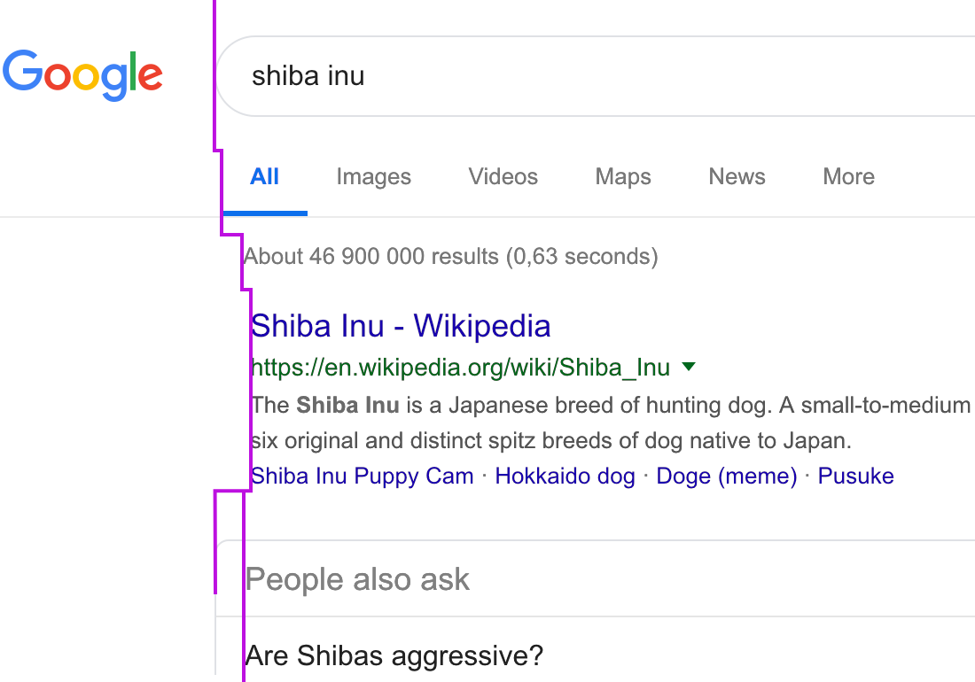
Forgive me, I haven’t been using Google for a while. When was the moment they forgot how to align things? It’s all over the place, and not in a beautiful way.
Forgive me, I haven’t been using Google for a while. When was the moment they forgot how to align things? It’s all over the place, and not in a beautiful way.

Mail.app shows three bins: archive, trash and junk. I find it extremely confusing because they all are essentially bins. The icons fail their main function: being easily identifiable among its neighbours. If you look for a metaphor for you icon, consider what it will be standing next to.
In this case I’d prefer a checkmark (Done) for archive and a cross (maybe?) for deletion. Spam should probably just be a word, it’s hard to find a good metaphor for it.
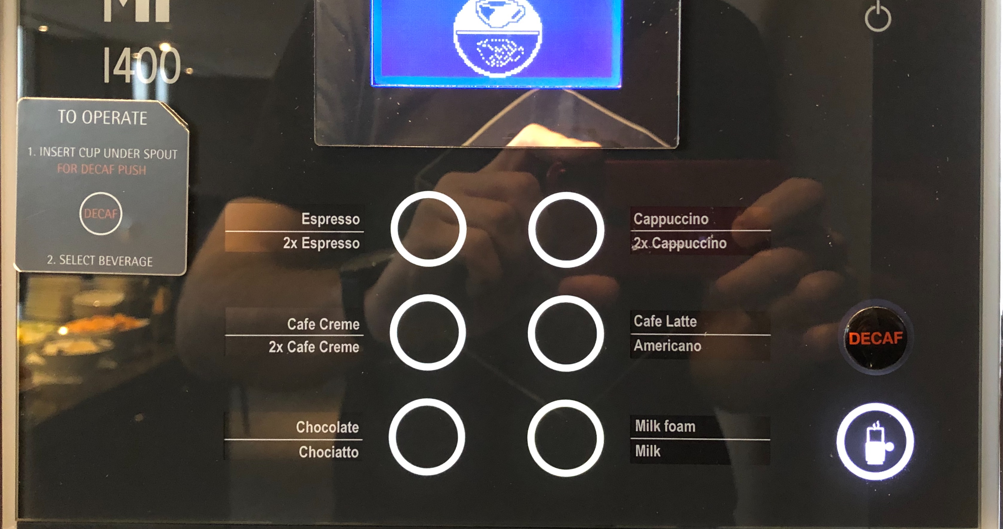
a coffee machine. Each button let you make two different drinks. How to choose which one? Try to guess.
Yep. There is a status screen at the top that is actually a button. You press the screen. Duh.
What I don’t understand, you have a budget to make this complicated device, you add an interactive lcd display to it. So it’s not a dumb device. Yet. Yet you can’t make twice the buttons? A button per drink? It’s so obvious, so easy to use. Infinitely simpler. What makes you miss that and make both the implementation and the use harder? Why? Why?

Ah, Quora. Slowly turning into another Reddit [1]
Before I go on, I really want to quote Quora's "About page" in almost in full:
— start quote —
Quora’s mission is to share and grow the world’s knowledge. A vast amount of the knowledge that would be valuable to many people is currently only available to a few... We want to connect the people who have knowledge to the people who need it.. and to empower everyone to share their knowledge...
— end quote —
If you make the mistake of logging in (and they make you log in to read some of the answers), this is how knowledge is shared with you:
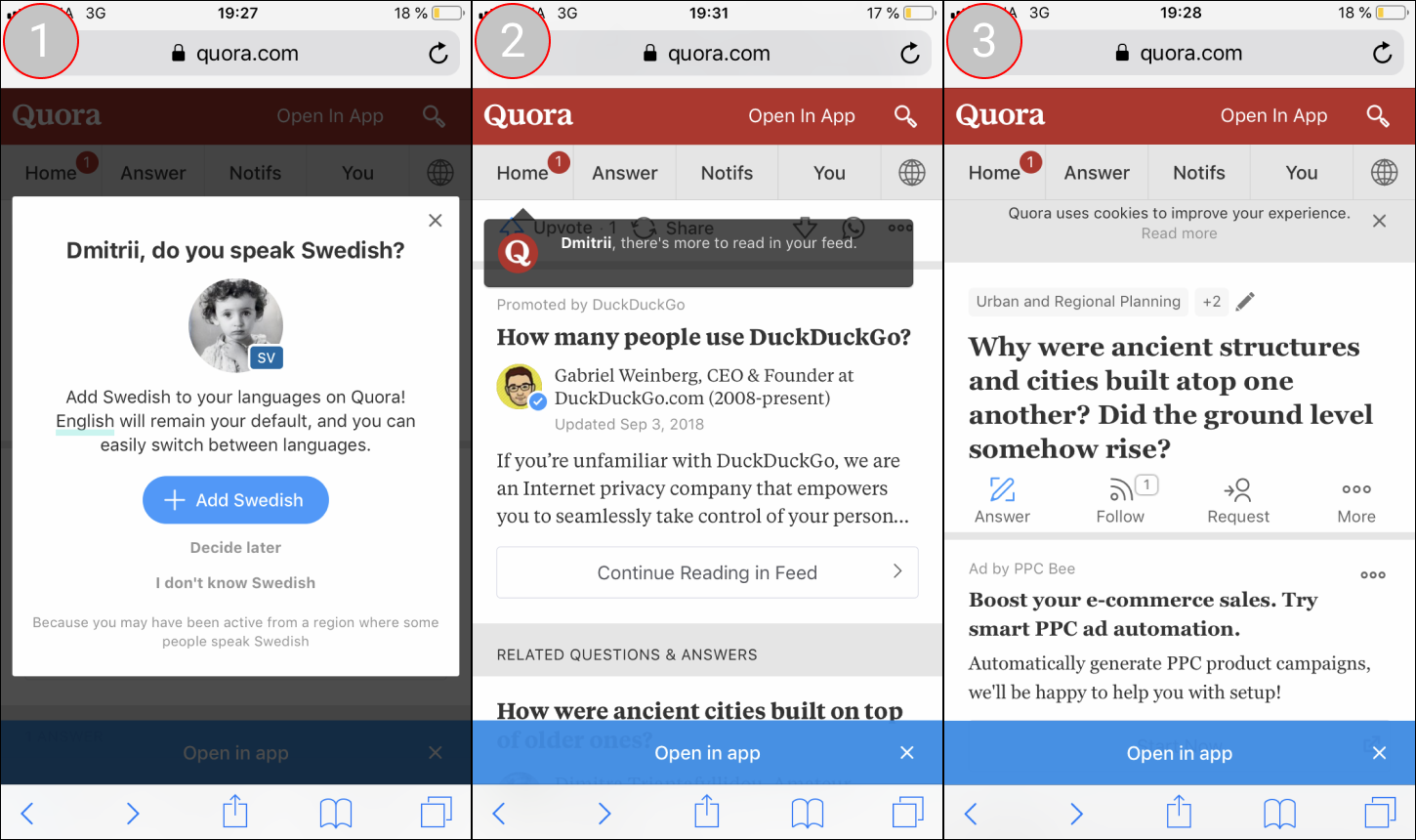
Step 1. Because you may have been active in a country, Quora will block you from reading, and employ what can only be described as dark patterns to force you to add a language. And yes, I've already been through these steps before [2].
Step 2. What a lovely tooltip. Hint: if you need a tooltip to tell me where the feed is, why not just rename "Home" to "Feed"?
But the biggest transgression of the tooltip is this: if you try to click on it, hoping that you will dismiss it, it turns out it's not a tooltip, it's a link which will immediately take you away from the question you're reading to, well, your feed.
After some unspecified amount of time. The tooltip.. Fades... Slowly...... So..... Very...................... Slo......... Oh, finally it's gone.
Step 3. Open in app cookies why were cities boost your commercials open in app.
I'm sure there's a question and an answer in there somewhere. By this time I've lost all interest, and the knowledge remains unshared.


Yet another sticking header I thought moving my pointer to the right cross button. But at least thank you for letting me close it. What a surprise it was when it dropped me to the main page! Then I understood. The bar cannot be closed. The cross button "closes" the current article and gets you back to the main page. Like you do it in windows. Smart!
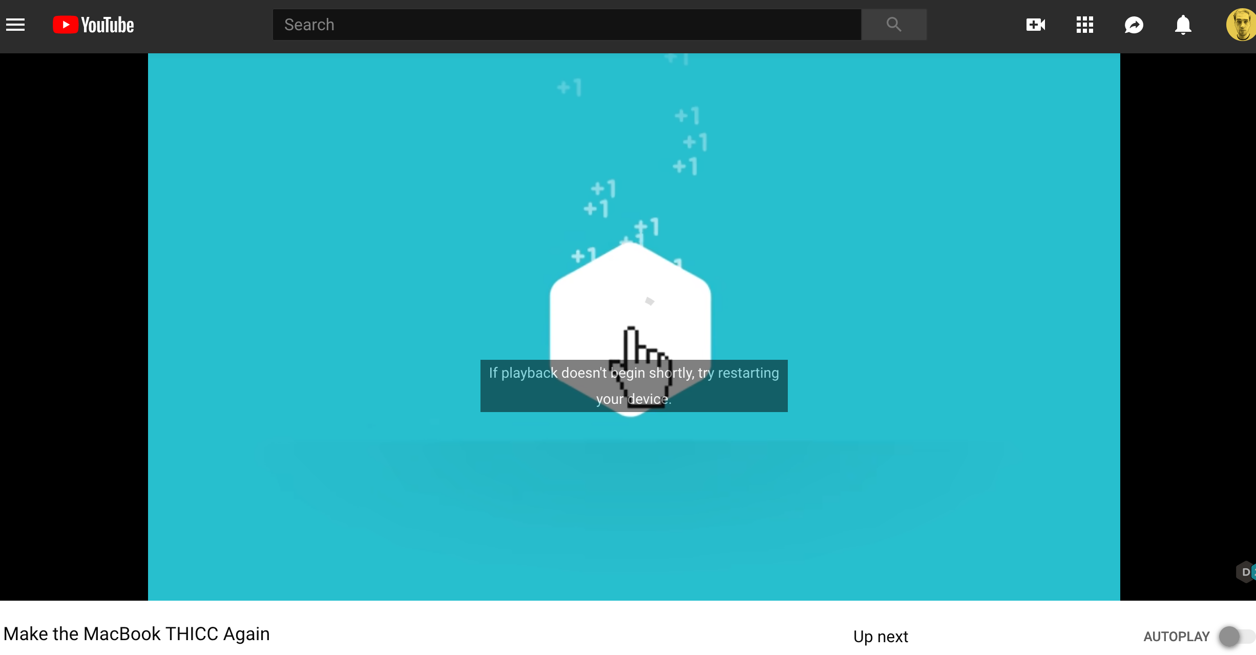
Seriously, youtube. Restart my device? How important do you think you are? What’s next? A Google website suggesting I buy more powerful laptop? A Google Maps suggesting I rethink my life choices?
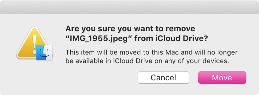
in macOS you can share the contents of your Desktop between all the computers you use through iCloud. It’s a matter of checking a single checkbox.
What a great idea, I thought! Before I realize that now every time I try to move files from a Desktop it bugs me with a popup every time. It’s like it took your files hostage and don’t really like letting them go.
Strangely enough, it’s perfectly fine to delete file, no popup in that case.
Move == non-destructive == alert and confirmation
Delete == destructive == no alert
General rule is that confirmations are bad. If you catch yourself adding one, stop and think again

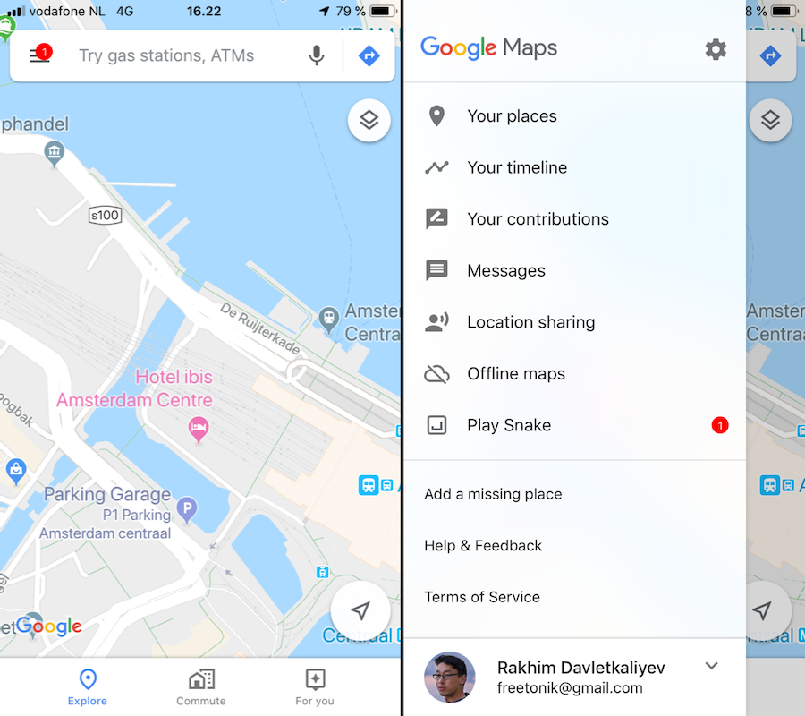
A notification inside Google Maps! Wow, this must be important. Maybe some road I often take is closed or trains are delayed.
Nope. It's "Play Snake".
Please, please don't water down the importance of bright, red circles. They signal IMPORTANCE and URGENCY. Using it to promote a silly game feels so much like "dirty web-design" with flashing banners.
This header is animation is not a bug. It is intentionally animated with javascript to be a bit slower than rest of the page. So when you scroll up it comes with a delay. Why? No idea. But it creates a feeling of page being slower than it actually is. Only add animation if they make things clearer and never add animations that make things feel less responsive
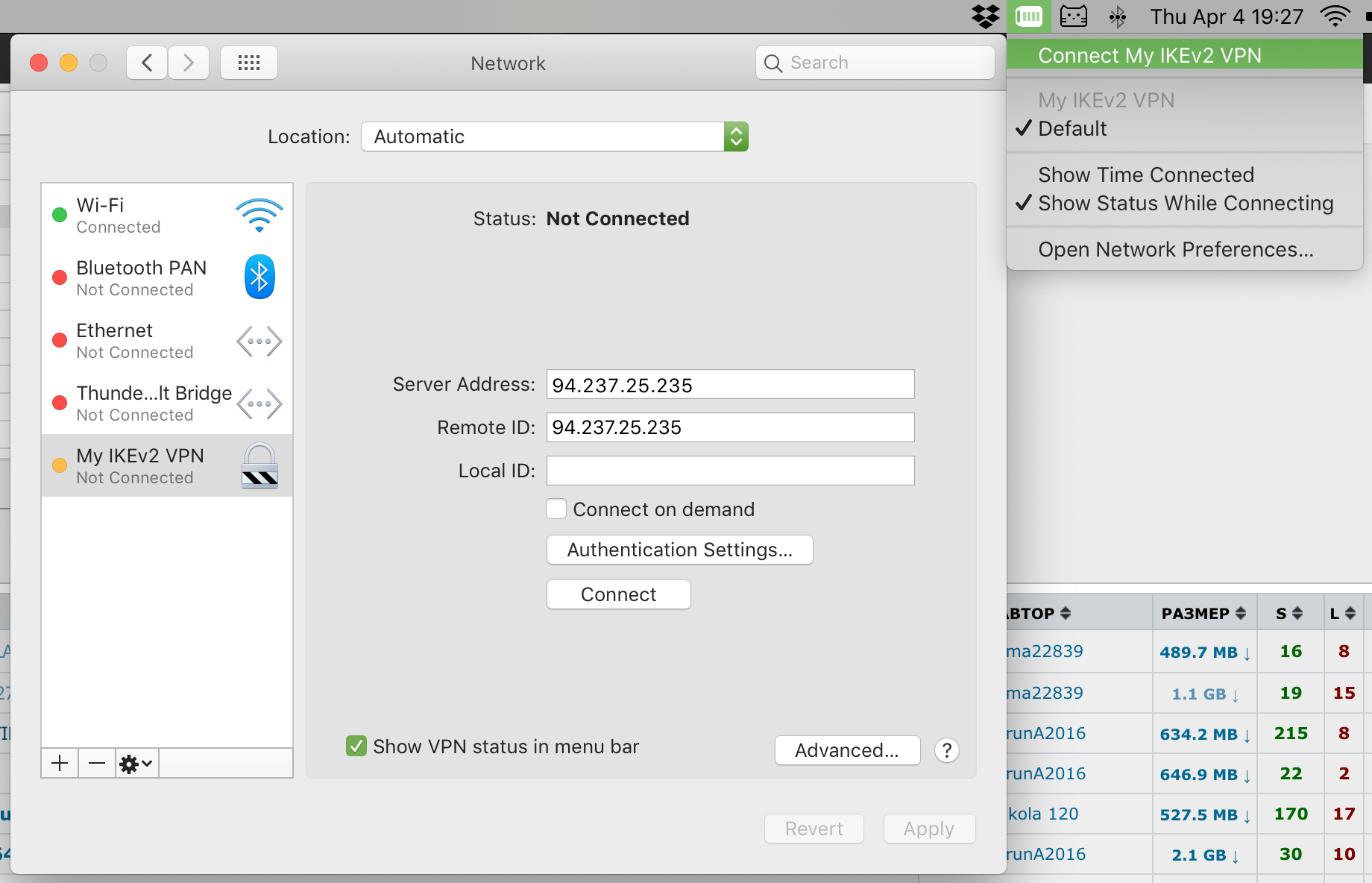
macOS has “Connect on demand” checkbox in VPN settings. What it does is it tells VPN to reconnect whenever it loses connectivity: network disconnect, notebook sleep, after restart etc.
It also has manual “Connect”/“Disconnect” command in a menu.
The problem? If automatic reconnects are enabled, Disconnect stops working. If automatic reconnects are disabled, well, your connection drops after the first network hiccup.
What I want? I want “always reconnect” always enabled by default. Who won’t want that, after all? Who likes to manually restore a connection each time something goes slightly wrong? This should be a default behaviour, not a setting.
And I want to Disconnect to work too. Meaning, if I told OS to “Connect” once, it should try to do whatever it takes to maintain that connection for me. Even after computer sleeps, even after restarts. Until I change my mind and tell it to Disconnect, which should mean “disconnect and stay disconnected”.
I mean, what’s so hard about that? And how what we have now makes any sense?