
This application is too scary for you to see its name. Sorry
This application is too scary for you to see its name. Sorry
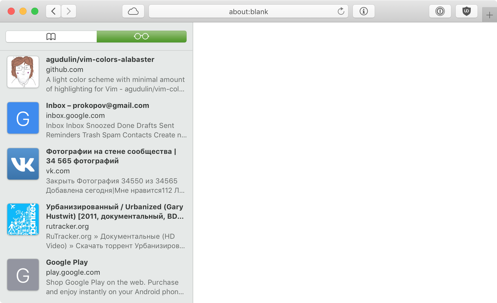
If you accidentally open a this useless left panel in Safari (or somebody else did for you, or it was enabled in default configuration) it might be really hard to figure out how to get rid of it. There’s no close/hide control on it. You might think: go to the menu! But you don’t even know what it’s called! Glasses panel? There’s no menu entry for that. The pressure is high though: it covers good portion of your screen and stays open on every new tab you open. You might manage to resize it to zero but that does not get rid of it. Like a phoenix, it will ressurect on the very next tab you switch to.
Thx @apust for pointing this out.
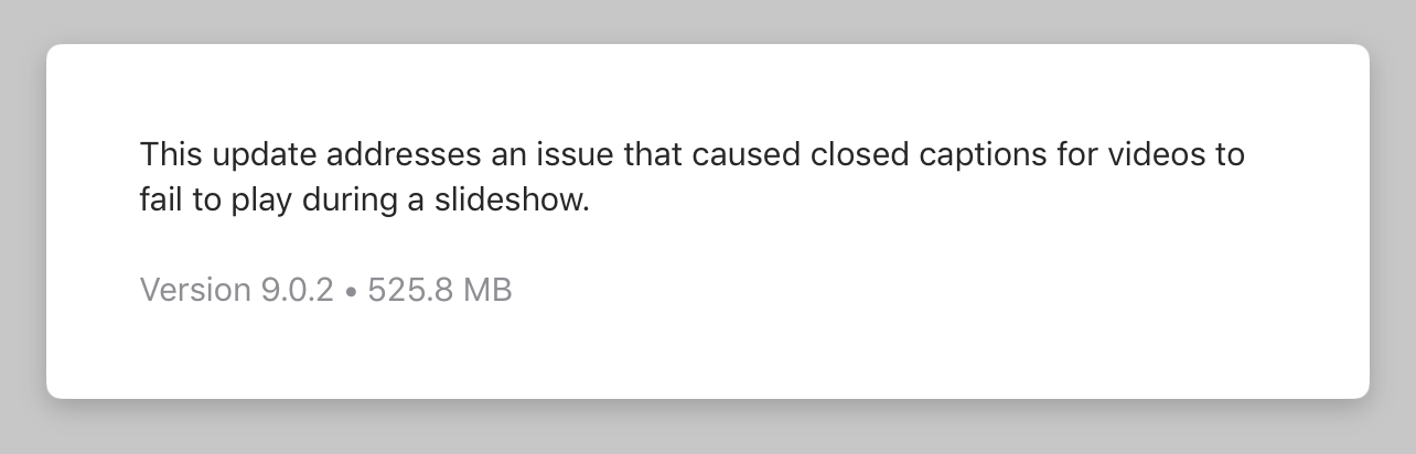
A keynote update that fixes a single small bug. Not unlikely a one-line change. It does not add any new functionality—everything was already there. Just a few megs. 525, to be exact. Half a gigabyte. Because, why not, right?


Developer tools are notorious for their horrendously bad UIs and are rarely called out.
The text in both notifications goes on, and on, and on, and.... I couldn't read all of it even when I stretched the window to the full width of my MacBook Pro display.

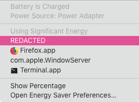
which one is currently active?
Let’s just agree at this point that Github repos don’t generally have “default” images. They have userpics, and userpics are a terrible depiction of the repo’s content. Especially when stretched way beyond its normal size to serve as preview image.
You see, if you don’t have a natural image associated with your page, IT IS OK not to use any image at all. Really. Your engagement will be fine. You will be fine. And I will be happy.

People tend to hover the cursor on things they are interested in. This natural gesture should not make important information disappear.
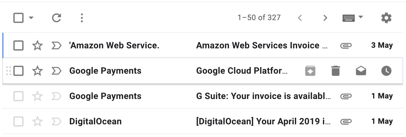
I use gmail just a few times per month, but get frustrated every time: how dare you to hide the date when I hover! This message is EXACTLY what I want to explore!
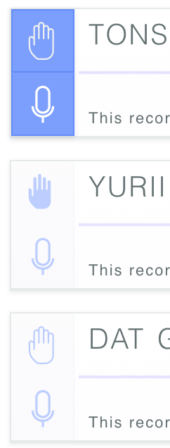
If you implement a “raise hand” function in your conference room consider not using same muted appearance and same brand colors. It should stand out
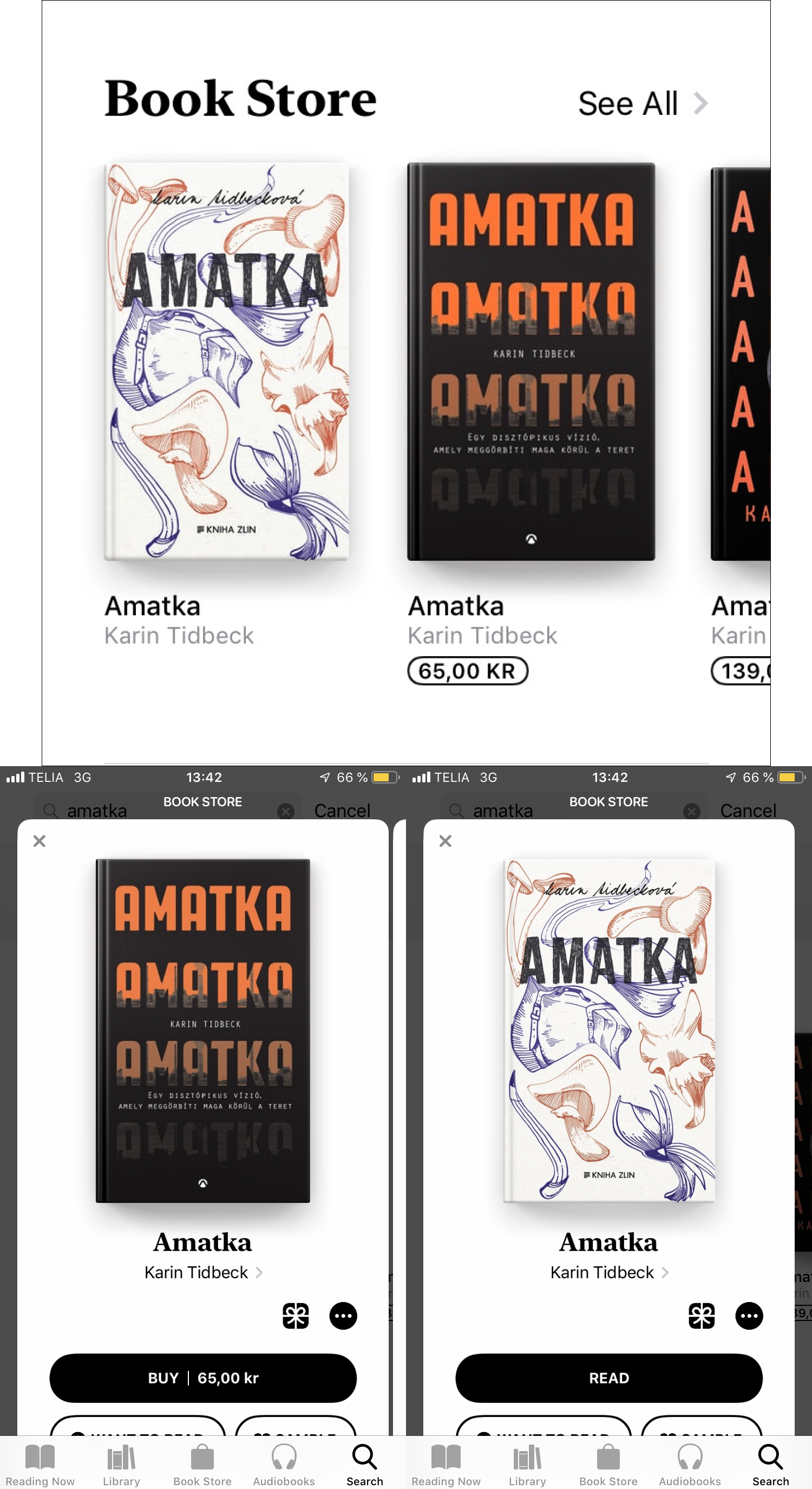
I live in Sweden. My AppStore (and, by extension, my Books Store) is set to Sweden. My phone's language is set to English. The last 100 or so books that I bought through Books were in English. Here you can see me searching for a book by a Swedish author.
It is obvious that the results of the search must be presented in this order: a Czech translation, a Hungarian translation, an English translation.
1. It's nearly impossible to tell which is which. Even when you select a book, its description is way below the fold. The info on language is near the end of page two below the fold (hopefully, the description will alert you to the language if you do go below the fold).
2. Even when it isn't different translations, iOS Books are notorious for showing multiple editions of the same book with widely varying prices. Do I want Edition A which costs $20, or do I want Edition B which costs $80, or do I go for Edition C which costs a meagre $8, why is it so cheap though? How can I compare them?
3. And of course there's no straightforward way to refund a book. Go to your Computer. Open iTunes. Go to your account. Log in. Go to your purchase history. Find the item you bought. Click more. Click refund. Log in in the browser. Refund. And the items to refund may take a few days to appear in the refund UI.
I guess this is what passes for "Extreme attention for detail" these days.

Docker's interfaces provide a fun (not) and interesting (not) challenge. It's called "Spot the links".
The logo is a link. The tabs are links. Top-level menu items are links. The "Edit profile" link is a link. Even the buttons ("Create Repository +", "+" and "Explore") are links.
None of the items in the drop-down menus are links. The clicks are handled by some Javascript which, in 100% of all cases, redirects you to a different page.
The ad banners aren't links either. The clicks are handled by some Javascript which, you guessed it, redirects you to a different page.
What boggles my mind is that it's actually harder to implement this mess than to let links be, well, links.