Grumpy Website


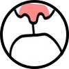
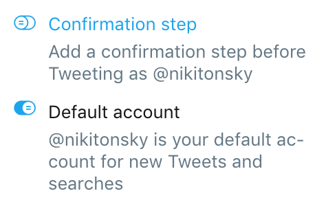
Many UI elements are based on physical anologues, or at least try to reference something in the real world.

In case of a toggle, it’s obviously a movable switch. Those lines you see on its head are supposed to be physical bumps that prevent your finger from slipping. But they only work if they are perpendicular to the movement direction.

The designer who was designed those obviously didn’t know that and considered them to be a purely decorative. Combined with the rest of the widget they send a mixed message and confuse instead of helping

How far could minimalizm go?

Here you see the latest Figma redesign (before → after). Yes, they removed the most borders around controls because, I don’t know, it’s cleaner?

Cleaner it is, but is it better? I actually admired Figma for how elegant _and_ functional their controls were. Just the perfect amount of detail to communicate what the control is, but nothing too excessive, no hard shadows or gradients. It is, after all, a tool for professional use, something you’ll spend five days a week looking at.

By removing the borders they made it even cleaner, lost a lot in clarity. Controls and labels now look the same.

They became less usable too. Controls are now smaller and harder to click because you only see the text, not the whole control area. And you can only hover/click what you see.

Add to it that dropdowns magically grow in width on hover, that you don’t see a structure in Layers until you hover it, and you get a disaster of a redesign.

Figma, undo!

See that exclamation mark in a triangle in a top right corner?

For a designer, it’s just a button with an icon, like any other button. Click it to report the store.

But for everybody else out there, it’s a warning sign. Something is wrong with that store. Hover to know the details.

Morale: don’t pick warning signs for button icons

If you have access to a shared library in Google Photos, it offers you to save "some or all photos" to your own library.

"Some or all" seems like you can set some filters maybe? But in reality it's "some or none".

Yeah, for us, programmers, zero is as "some" as any other integer!

I've been looking for account settings on Bitbucket for half an hour, maybe. It turned out, there is an extra hidden button below the one with a question mark. Why it's invisible? Because I haven't got an avatar and thus deserve this torture. No stroke, no a standard icon for that button. Such a shame for a designer who things a user always has an avatar. But even programmers messed up: when you sing with Google (what I always do), it returns a user's object with an avatar's URL. Was it so difficult to assign that URL to my account?

One can't but admire Google's Material Design. It's clean, reasonable, internally consistent and non-contradictory. To see how true this is, go no further than the project's main page, material.io.

In the screenshot above, everything that arrows point to is links. Links that look like buttons. Links that look like links. Links that look like plain text (btw, good luck trying to figure out whether some plain text is a link).

No wonder their own teams struggle with the design guidelines and come up with the beauty that is Google Maps: grumpy.website/post/0QqUsEQvJ

Google Translate saves all of your previous translations in a handy list (first pane). Except, it doesn't save most of mine!

Start typing, and you'll get the translation immediately (second pane). No good reason to press "Go" at that point, so I never do: I got what I wanted.

But only pressing "Go" constitutes a complete action of translating, and only then this translation will be saved into the "Recents" list.

One feature of Google Translate hurts the other.

If you no longer want your Local desktop to be synced to iCloud, macOS will offer you to remove everything you have locally and only keep copy in the cloud. So that you can download them again, I guess. And hope everything was synced before (hint: it never is with the cloud).

Why is this table half-open? Closed on the top, open on the bottom? No idea, but it’s getting me nervous

What you get for searching for Skype icon on your phone home screen:

- Autocompletion.

- Random contact.

- Siri definition of the word Skype.

- Skype twitter account.

- Random calendar event.

- Websites Siri thinks mention Skype.

- Definition of the word Skype from macOS dictionary. Apparently different from Siri definition.

- Random podcast.

- Random news item mentioning Skype.

- One random website. Again, different from what Siri suggested earlier. Why do Siri and iOS suggest different things?

- Not one, but three random web videos.

- An invitation to “Search the web” in case Siri websites and iOS websites and (Siri or iOS) web videos are not enough and you missed “Show more” link on each one of them.

- Finally! An invitation to search an App Store!!! Who knows what’s in there? Maybe it has Skype, maybe not. We are Apple, and App Store was only made by Apple. No way they’ll let us show search results directly on the search screen.

- Maps?

What you don’t get:

- Link to an actual app.

Pages:
155...4746454443424140...