Grumpy Website


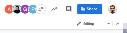
Five other people are reading this doc, right? Wrong! The user with a white avatar is actually a button to start a chat! Why does it look like a user and is placed where all other users are, we’ll never know.

But wait, isn’t there a chat button next to Share? No, that’s comments! What’s the difference? Comments are square, while chat bubbles are oval!

Also, if you ever wanted to check how your stocks are doing, there’s a button for that too.

simple rule: if you display the same information twice on screen (you shouldn’t, but IF), make both versions agree. Otherwise chaos

Thx @acedened for the picture

Ah, Apple Arcade. "A game subscription service unlike any other, Apple Arcade was made to explore."

Let's explore. You'll be left wondering:

- Why can't it cache images when you click between tabs?

- Why can't I watch trailers and videos in fullscreen?

- Why can't I control sound volume in videos?

- Why clicking a video sometimes pauses it and sometimes opens a different page?

- Why clicking the same video in the same place may or may not do the same thing it did the last time?

- Why doesn't volume setting (on/off) persist when going between pages showing the same video?

- Is there a worse place to put the volume control for full-page videos?

So many questions. No answers.

One thing for sure, it follows the footsteps of the rest of app store: it's an ungodly mess (see how App Store breaks every HIG rule here: grumpy.website/post/0RsaxCu3P).

What can be easier than a "recent" list in a books app? Sort the list of books by the time they were last opened.

Here's how Apple books does it:

- iOS, "Currently Reading" tab. Recents show recent books, in correct order, but doesn't show all of them. It randomly skips over some books and displays other

- iOS, "Your Library" tab. When sorted by recent, shows recent books in correct order, and shows all of them

- MacOS, "Library" tab. Sorts by recent... as they were opened on your computer, and never synchronises the recent list with the iPhone

Because, you know, reasons.

Apparently full exact text match is weighted less that 4 out of 5 letters match, half a word matched, but “Made by Apple”.

Thx @sl_remy for the picture

How many clicks does it take to log in with a non-default account in a Google service? At least three *before* you get to the "Sign in with a different account" (not pictured) which is a yet another clusterduck of clicks and options.

Confused? You should be. No one in the world, including Google themselves understand how this works: grumpy.website/post/0PU1U2r3v

If you build a feature, make it discoverable. I’ve been using macOS for about ten years now, and this is the first time I hear there are default shortcuts for dialog buttons. In Windows you just press Alt and every button that has a shortcut is revealed. In macOS, I guess, your only option is to read a developer documentation?

Thx @andreuvoronin for the picture

Let’s make our text as wide as the picture is. What could go wrong?

Do I go home often? You bet. So often, in fact, I labeled it “HOME”. And I specifically clicked on that label. Still think I should label it School or Gym instead, Google?

Thanks, Google.

Pages:
155...6564636261605958...