
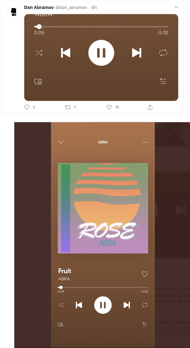
Top: how Twitter shows the image in the timeline
Bottom: the actual image
Top: how Twitter shows the image in the timeline
Bottom: the actual image

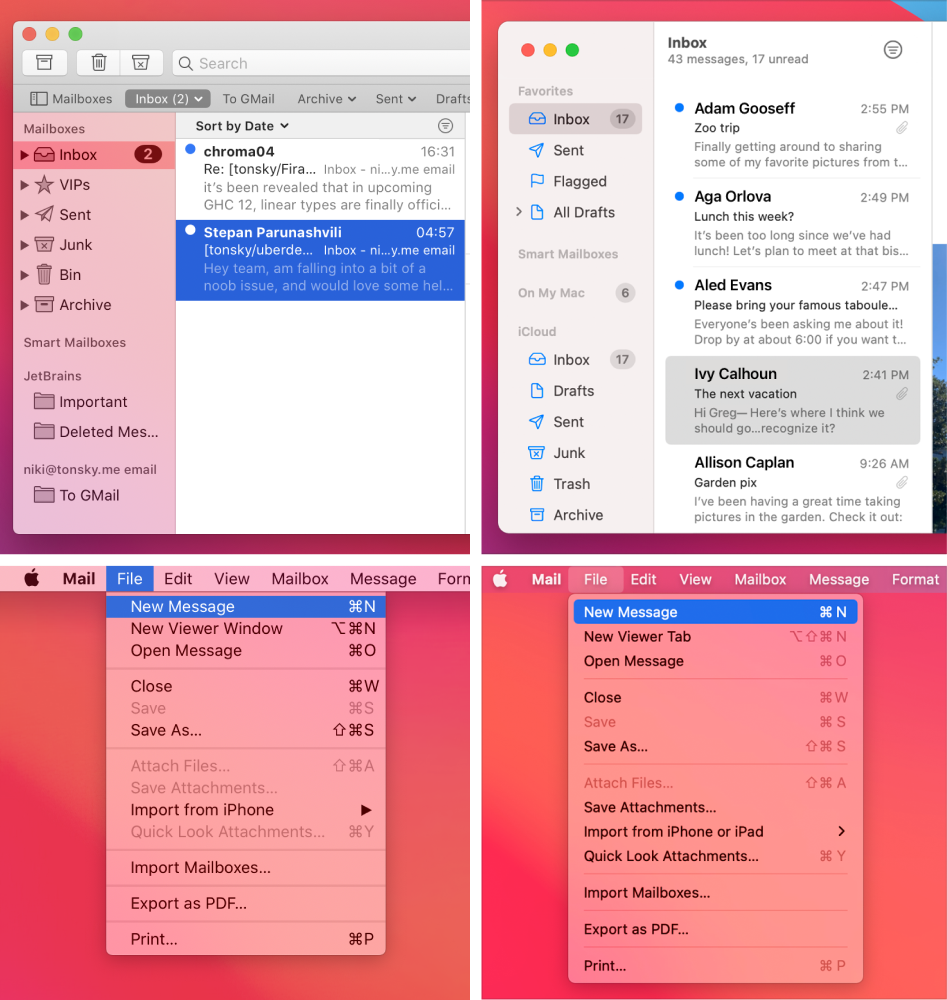
Left: macOS 10.15 (old). Right: macOS 11 (new).
Here’s the thing with rounded rectangles. They are beautiful, no doubt. But they are also pretty heavy-weight, visually. Corners attract attention, margins attract attention, padding. That’s why you shouldn’t nest one rounded rectangle inside another. That’s why selections look best when they are edge-to-edge and not rounded.
Look at the Inbox selection on the right: the window border, the selection, and the unread counters are all nested rectangles and all together looks terrible. Compare it to the clarity of the previous design. Selection itself does not attract attention, it’s true to the form of the content that it highlights.
Another problem is that nested rectangle complicates the panel. On the left, panel is just single flat surface. On the right, selection has margins. That creates a feeling that there’s another invisible panel of smaller size nested inside that beautiful flat surface. Again, unnecessary complication.
Finally, it’s just space-inefficient. Nested rectangle requires both margins and paddings, basically doubling allocated space around non-selected elements.
Unfortunately, nested rounded rectangles is exactly what Apple is doing in the upcoming macOS 11. R.I.P.
I never had a problem with flat design. Github is the first time I don’t recognize buttons as buttons because I am SO used to their canonical design and layout. Now when I move my eye looking for “Merge” or “Clone” and don’t see a shadow and a gradient, only a black text label without any background or border (there actually are some but almost unnoticeable), I just don’t detect them as buttons. They also look exactly like labels, to make things worse.
Left: button background 93% white, border 78%.
Right: background 97% (!!!) white, border 86%.
Most importantly, buttons used to have gradients, so you can distinguish them from labels. Not anymore.
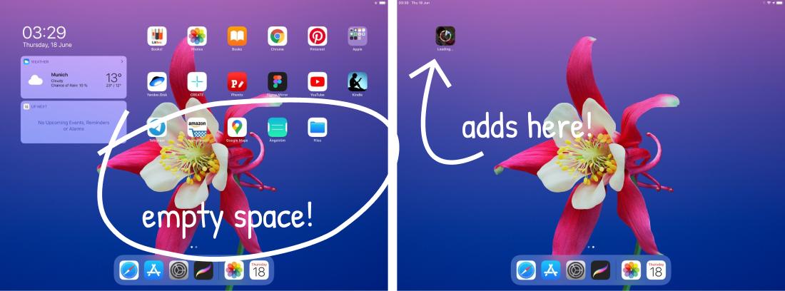
One thing I don’t understand about iPad and iPhone after so many years. I have a single screen with plenty of empty space for icons. Yet whenever I download a new app, it creates a second screen and places it there. Takes me a while to figure that out every time: there’s no indication of a new screen being created, and I am not used to have more than one.
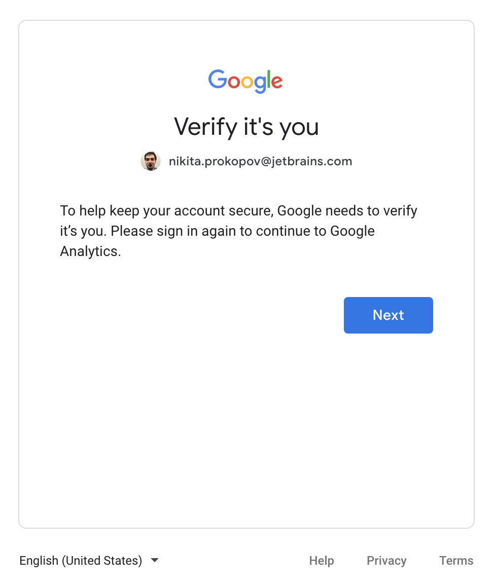
That moment when Google asks you to verify that’s you but that’s NOT you (you are on another account). Sure, I can verify, but what’s the point?
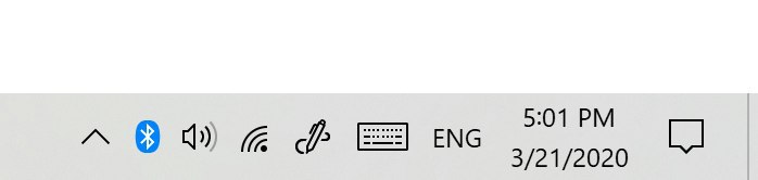
Windows 10 has a fantastic style for most icons: calm, stylish, distinct. But Bluetooth has to be blue :(
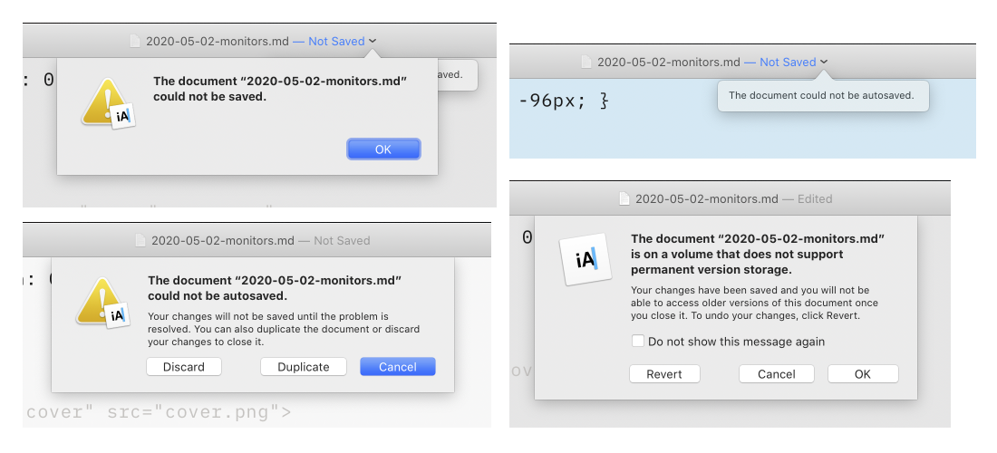
Don’t ever try to keep files from modern macOS apps on non-APFS volume. Here I tried to edit a simple markdown file from ExFAT, couldn’t save it and got reminded about it 4 different ways. And no, there’s no way to ignore that and no graceful degradation. You changes can’t be saved in any way or form, period.
Wanted to Reject our cookies? How about clicking on our social icons instead?
(no you can’t access Accept/Reject at all with any amount of scrolling)
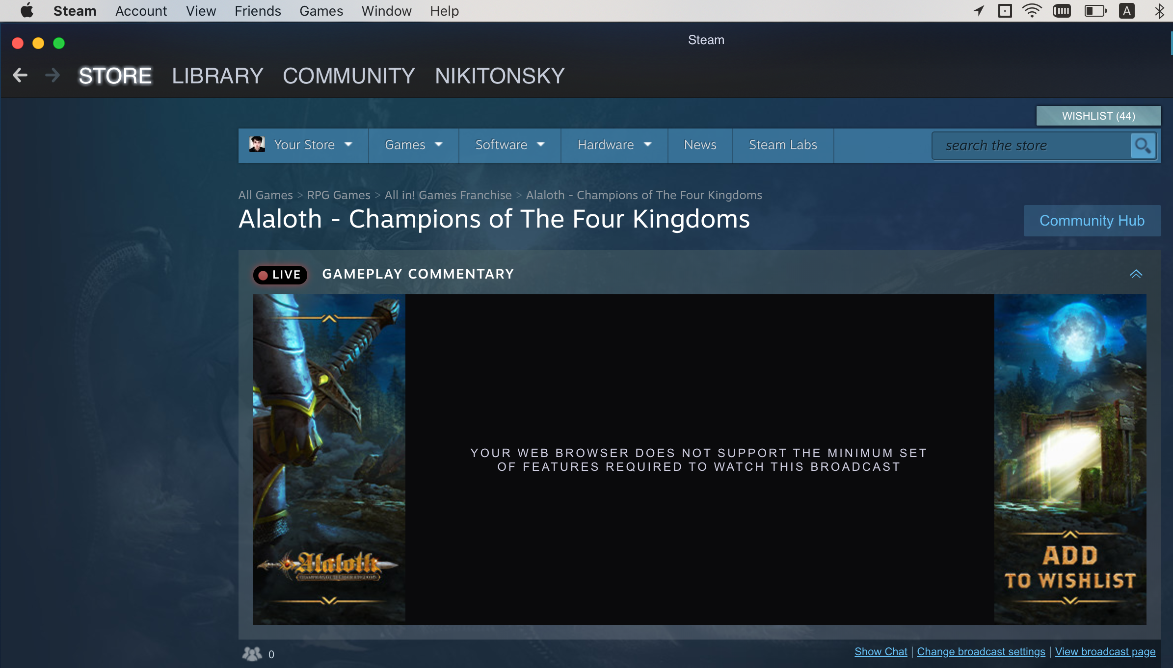
Steam itself unable to display broadcast hosted on Steam, blaming me for that. Classic
If you want your UI to look better, aligning controls might be a good start