
Not enough space on a page, better show tiny scrolling arrow.
Thanks @generalgda for the picture.
Not enough space on a page, better show tiny scrolling arrow.
Thanks @generalgda for the picture.
Interesting location of scroll arrows (inside the content, not at the edges)
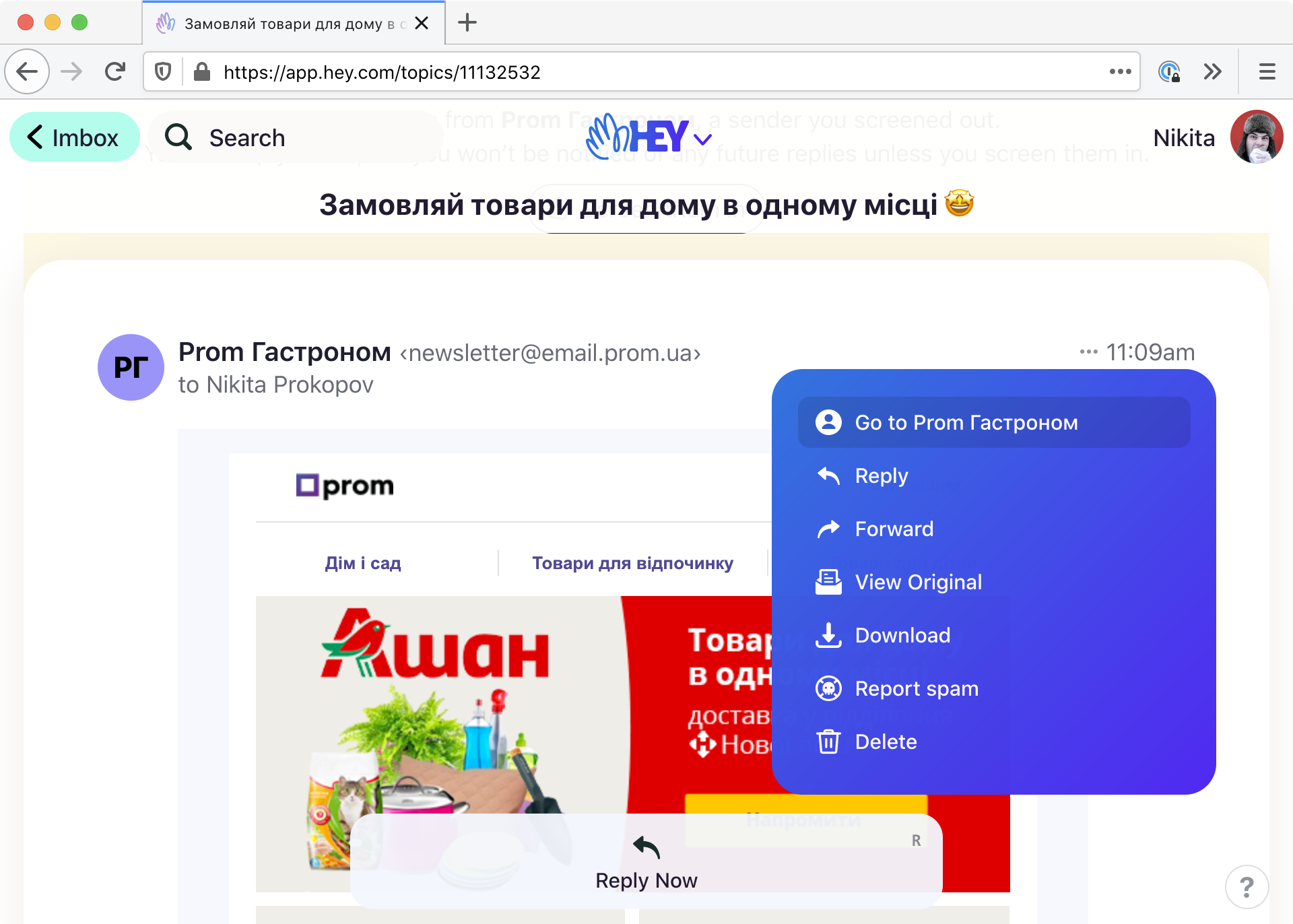
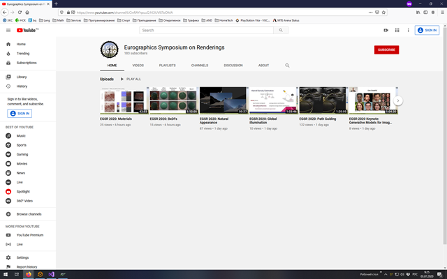
A simple thing Hey reminded me about. If you implement some sort of context actions (right-click menu, per-object floating panel, etc), those actions should be the same EVERYWHERE you see that object.
If you get this wrong, it creates confusion. People don’t think in terms of contexts, they think in terms of objects. If I see the same letter, looking the same, I don’t care what context I see it in. I expect it to do everything letter is supposed to do.
In case of Hey, if I see a letter in Screening context, I can preview it but can’t reply, in Read together I can’t neither sort nor reply, finally, when I am replying, I can’t sort it.
Other notorious example is macOS. In Windows, no matter where you see the file, you can do exactly the same things with it: open, rename, delete, etc. It works in Explorer, in Start menu, in File dialogs—everywhere! In macOS, it only works in a Finder window. If you right click on a file inside File dialog, you’ll see just four basic actions. If you put a file to Dock, you can only open it. Finally, if you have a folder shortcut and find a file there, there’s no context menu at all!
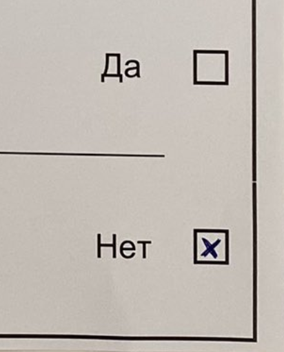
This is my personal quirk, of course. I can’t make peace with using a cross for marking a checkbox. Normally cross means “No”, but for some reason, when put inside a checkbox, it’s supposed to mean “Yes”? Doesn’t make sense for me.

So little space... Clearly it’s best to cut off the section title before it overflows.
Thanks @artnester for the picture
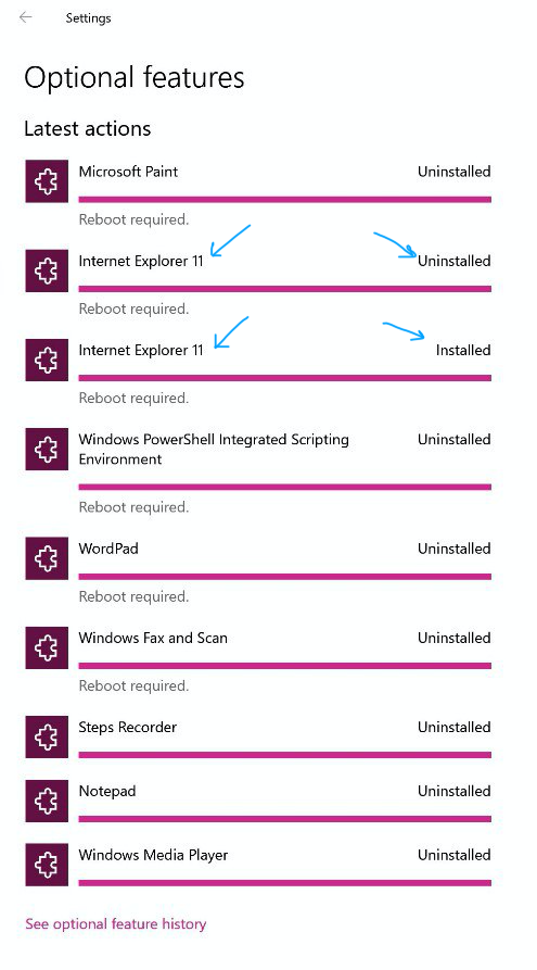
Schrödinger’s IE
Thanks @aw_bv for the picture
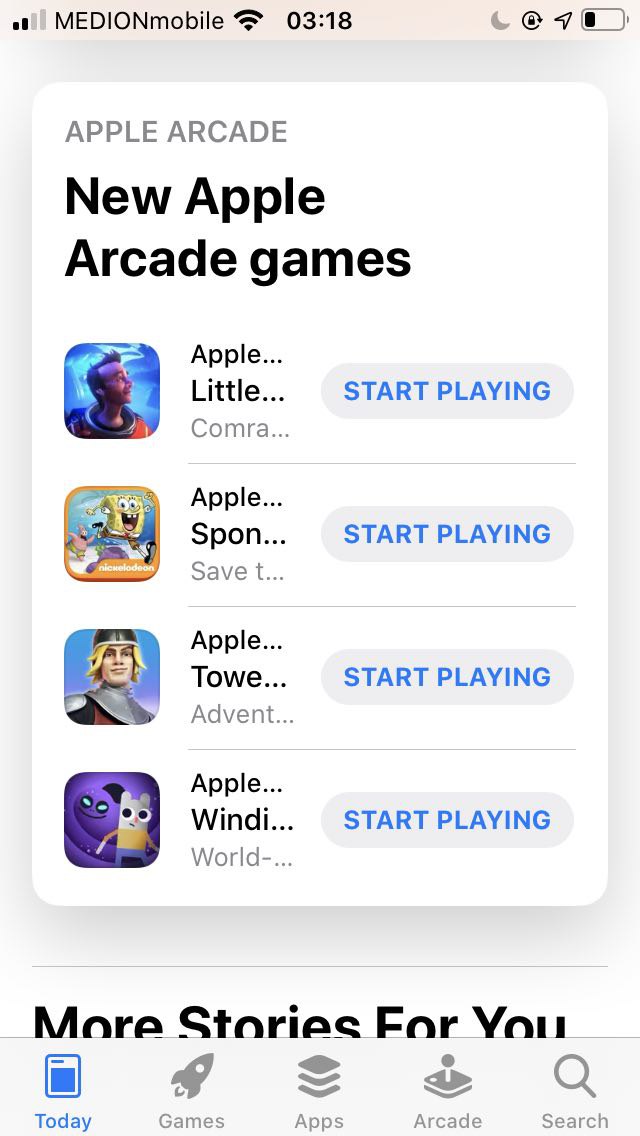
START PLAYING Apple... Little... Comra... Some... thing...
Multiple dropdown menus are very taxing for users. We are all more or less used that if you don’t see an action on screen it must me somewhere in a “More...” menu. But if you have five, it becomes a wild goose chase.
Two top menus split navigation (Imbox/Feed/Paper trail in one, Drafts/Clips/Contacts in another). Two “...” menus have the same icon, but have different actions (Reply/Forward/Delete in both, Labels in one, Spam in another).
Other abusers:
Simple rule: if you see something expandable and click on it, you should see what you clicked, but closer. Click on an image preview—get larger image. Click on a avatar—get larger avatar (maybe on a user profile page, but avatar HAS to be larger there).
In iOS 14, you see four icons in a folder but when you click on them you see different icons on their places. The order is messed up for no reason at all.
A simple thing: white text with black shadow looks dirty. Come on Apple, you used to know this! What happened?