
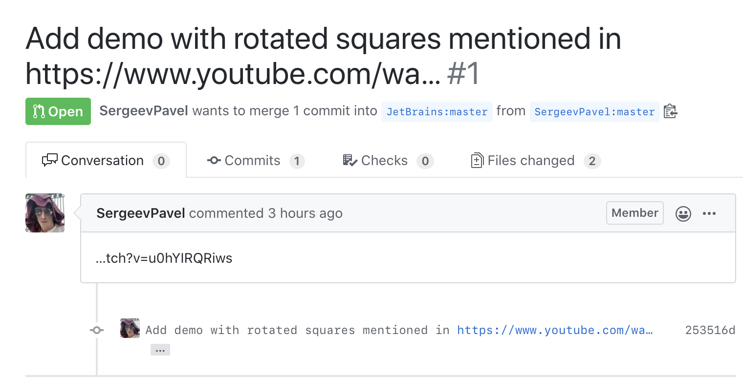
Seriously, Github? You cut issue title in half, in the middle of the link, and put the rest in the comment? Even if it had no link, in which situation can it, just theoretically, can do anything good?
Seriously, Github? You cut issue title in half, in the middle of the link, and put the rest in the comment? Even if it had no link, in which situation can it, just theoretically, can do anything good?

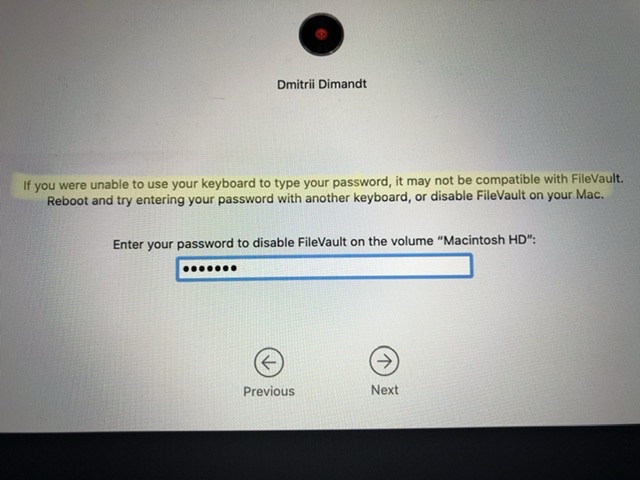
I spilled some water onto my keyboard. At first I thought it wasn't working, so I restarted my computer just to make sure. Couldn't log in. And then I was prompted by MacOS to restart to enter Recovery Mode.
What. The. Actual. F?
"Your keyboard is incompatible with FileVault"? But any other will be compatible? What does this even mean? And why do you readily accept keyboard input in this screen, but not during login? Who thought this was a good idea?
And yes, it still doesn't accept my password.
for some reason, you can’t scroll to a first few seconds of a video on youtube
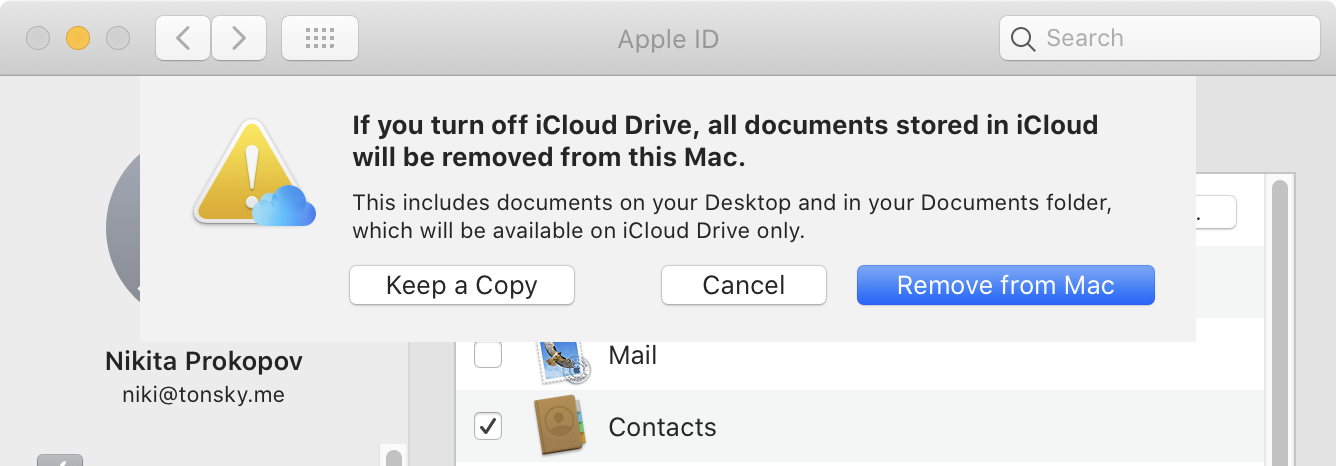
It seems that iCloud misunderstands the main principle about user files: never delete anything! And I mean, NEVER. Don’t even give user an IDEA that system might, even in most unforeseen circumstances, delete something. The whole idea of cloud storage is that I trust my files with you in the hope you’ll do better job at keeping them safe.
Here iCloud says that if I turn off Desktop ↔︎ iCloud sync, it will remove EVERY file I have on my Desktop. WHAAAAT? Are you OUT OF YOUR MIND?
First, one thing has nothing to do with another. I don’t want to sync files to the Cloud. Big deal. Why does it mean I get to lose them?
Second, this is outright scary. No matter how many explanations they put there, none of them is enough because the sentence has words “ALL” and “REMOVED”. Heck, the action button says “REMOVE”. This leaves no room for alternative interpretations.
Third, the explanation is really bad. “Documents stored in iCloud”. Okay. Will be removed. Okay? From this Mac? What? How could documents stored in one place be removed from another?
Fourth, there is an option to “Keep a copy”. Why do I get to keep copy, but not the originals? Unknown. Then, it says “Keep a Copy”, but does is it mean everything that it says above should be ignored? Because, you know, the button is still under that scary message, so it kinda means I somehow agree, no matter what I click?
Terrible, terrible design.
Menus are for quick and confident only. And I don’t even want to know what Velocity and Quality mean under Login.
Thanks @alexdemchenko for reporting this
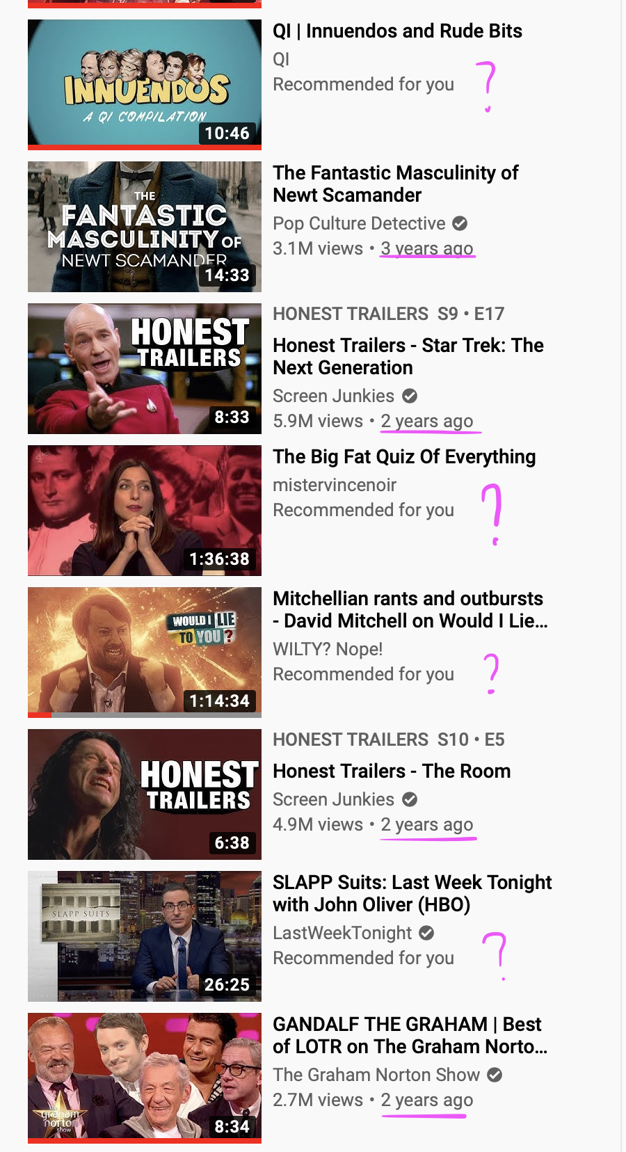
Youtube's recommended videos. Because, you know, who needs the date of upload. Just trust the mighty Youtube recommendation algorithm. Because we all now how great it is: grumpy.website/post/0Te47z10- (spoiler: it's shit)
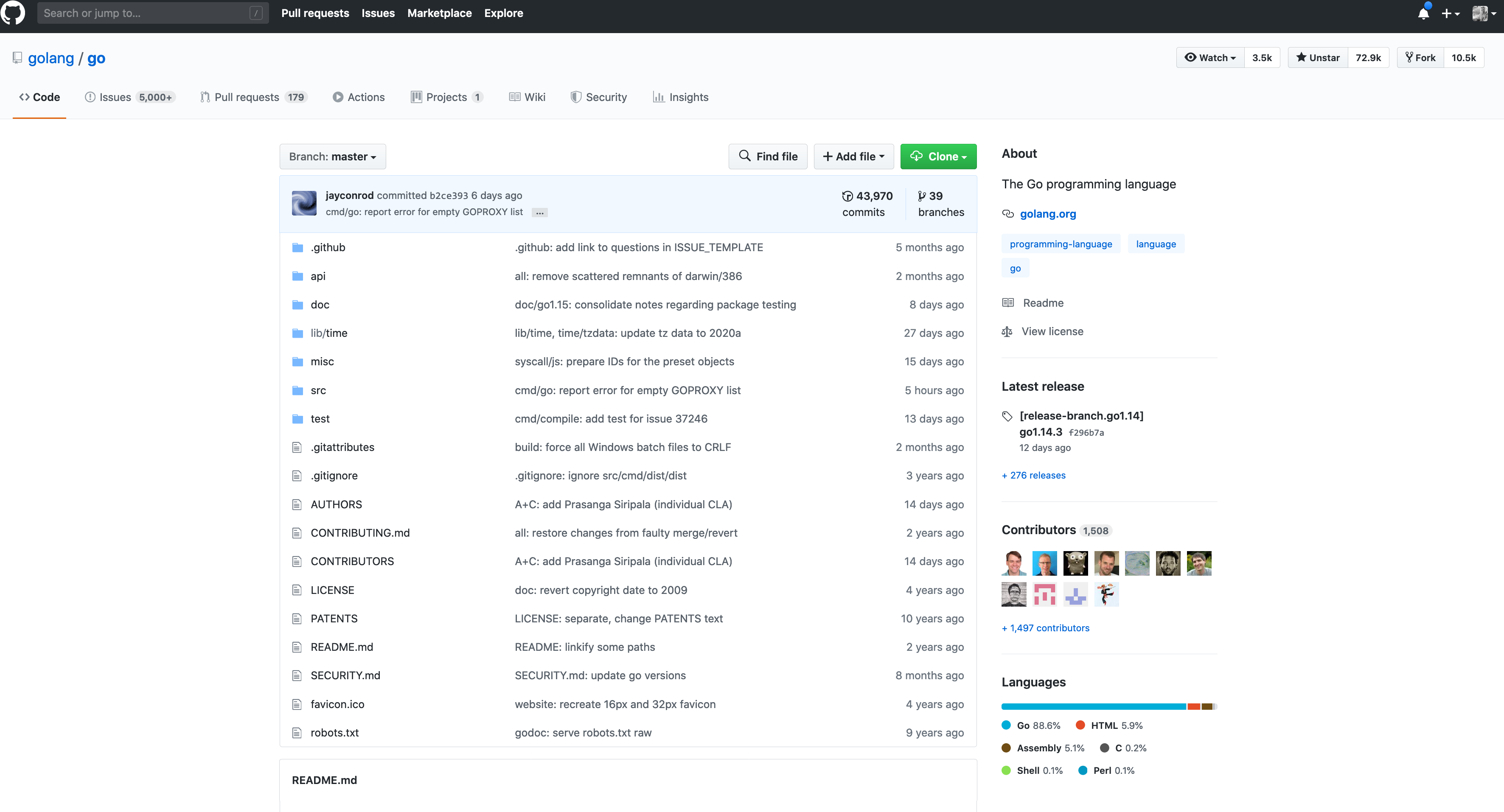
Github is testing new repo page design: gist.github.com/broccolini/2245234ac3a4936049e8ffc13f376986
Good parts:
- The right column looks awesome: does not get in the way when you need code, but also immediately available when needed.
- Solves two-storey nested tabs problem.
- Fantastic that you can see contributors’ faces — after all, open source is about people first and foremost.
All in all, I’m glad too see many of my ideas from February 2019 implemented tonsky.me/blog/github-redesign
Bad parts:
Repo header. They call it “responsive” design. But all they did is stretched the old, non-responsive one. It looks weird, given that the page content itself does not stretch. You have to move mouse more, which is a bad thing, and that’s it. You also get huge gap in the middle. There’s no real benefit of having this stretched.
guess what type of control that is?
Address 1 and Address 2, that nobody know how to fill in properly, but for passwords? You got it!
Thanks @vintlucky for the picture
NEW!
Thanks @runxel for the picture