Grumpy Website


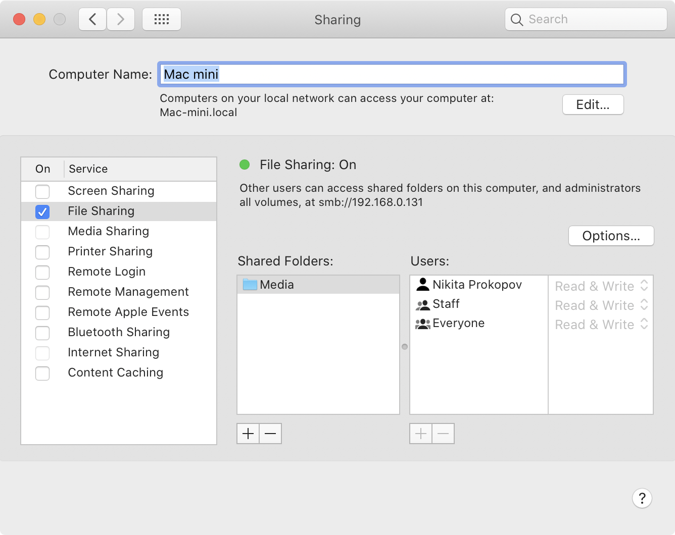
I have to admit, even in 2020, even on macOS, even between Apple-only devices, sharing a file is still an unsolved problem.

- AirDrop lists accounts, not devices. E.g. if my partner has MacBook and iPhone, she’ll be listed only once (?)

- If I send file to a MacBook, iPhone gets share notification too.

- If she accept and file starts uploading to the MacBook, popup on iPhone stays.

- If she clicks “Cancel” on iPhone (because we don’t want file on iPhone, only on MacBook, and she already accepted there), transfer to MacBook gets cancelled!

- Even after we learned it the hard way and stopped clicking buttons on completely unrelated devices that just happened to be in the same room, we failed to transfer 650 Mb file. It fully transmits, then just says “Failed” in the end. No error message, no explanation.

- If you transfer two files, and one fails, macOS reports it as a successful transfer. No error messages anywhere, you just won’t find the file.

- AirDrop dialog is modal. All other Finder dialogs are normal windows that don’t block anything and allow you doing other things while file copies. Not AirDrop.

OAuth scopes sounds too comprehensible? Lacks mystery? How about we add TWO such fields?

thanks @AdrianSieber for the picture

the more you resize, the less of the file name you see

mm yes?

Can’t believe you can’t set second timer on iOS. I mean, what would be the possible reason to not allow that?

Ok I finally installed Zoom. Out of many things that deserve to be called out, this UI caught me by surprise. No clue what’s going on, no idea even. Avatars are not clickable

Selecting a radio button is a pretty demanding task, requiring around 850ms to fully process this super complex action. Also a good illustration why long feedback makes UI unusable

Yesterday, out of the blue, Apple renamed my computer. For no reason whatsoever. It used to be Minikita, and after reboot I found out I can’t connect to network share anymore. Why? Somehow macOS decided it knows better how my computer should be named. I used to complain when Linux reordered icons on my desktop without asking me, but that was Linux. You can expect anything from it. Is macOS as bad as Linux now?

UPD: It also silently deleted all my VPN configurations, with no way to restore. I suspect it’s related to 10.15.5 update. Way to go Apple!

When the same action in a tiny dialogue is called three names: Close, Quit and Continue.

Let’s use this opportunity to talk about use-cases (or jobs to be done) in UX design. Here some designer figured people need two things on podcasts:

1. They just missed something and want to go back.

2. Current topic is boring so they want to skip forward.

The same designer probably thought that 10 sec is best for catching up something you just missed, and 30 sec is an average half-length of a topic to skip.

And she might not even be wrong! This might be a good guess. The mistake here is assuming that average (or most common) values are the most important values. In reality, MANY other situations exist, in which you might want to skip both backwards and ahead by 5, 10, 15, 20, 25, 30, 60, 120, 240, — any number of seconds, really.

That’s why nominating most common values is a mistake: you enable most common case, but at a price of sacrificing many less common but still valuable ones. What you should do instead is give users fine-grained control (e.g. symmetric +/-10 sec) and let them USE controls to adapt to the situation they have in hand. A car with a single “go to destination” button is infinitely less useful than a car with a steering wheel. The latter is less convenient most of the times, but it also has so much more uses.

Thanks @delaguardo for the picture.

Pages:
155...8483828180797877...