Grumpy Website


How Apple Music was built:

“We should let our users choose an output device.”

“Great idea! Let’s use checkmarks to indicate what’s currently selected!”

“We’ll have to draw a new icon for it then. We are Apple, we don’t have free world-class designers just walking around. Let’s use CHECKBOX instead.”

“Checkboxes are multiple choice, and we want to let users select just one device.”

“Ok, let’s HIDE all unchecked checkboxes then, so that users won’t think they can choose many.”

“Even if we have just one, users can still uncheck it. What would that mean?”

“Yeah, that makes no sense. What if we DISABLE it? That way they won’t be able to uncheck it!”

“Genius! It just keeps getting better and better. But I feel something is missing. After all, it”s the world’s most advanced operating system.”

“Yes, the UI is too responsive now. Let’s add a WHOLE SECOND of delay when switching to built-in audio.”

“Perfect! Let’s also CLOSE THE POPUP, but not always, like ONE THIRD OF A TIME, at random?”

“Now we are thinking different! I LOVE IT!”

“Ship it!”

Reddit's search. Enough said.

Windows Media Player is notorious for not using Spacebar for play/pause. Apple Music decided they too need to break some fundamental UI paradigm.

In their player, Play button does not change into Playing/Pause/whatever when clicking. In fact, it doesn’t change at all! Subsequent clicks just restart the song from the beginning — very “useful” feature (not).

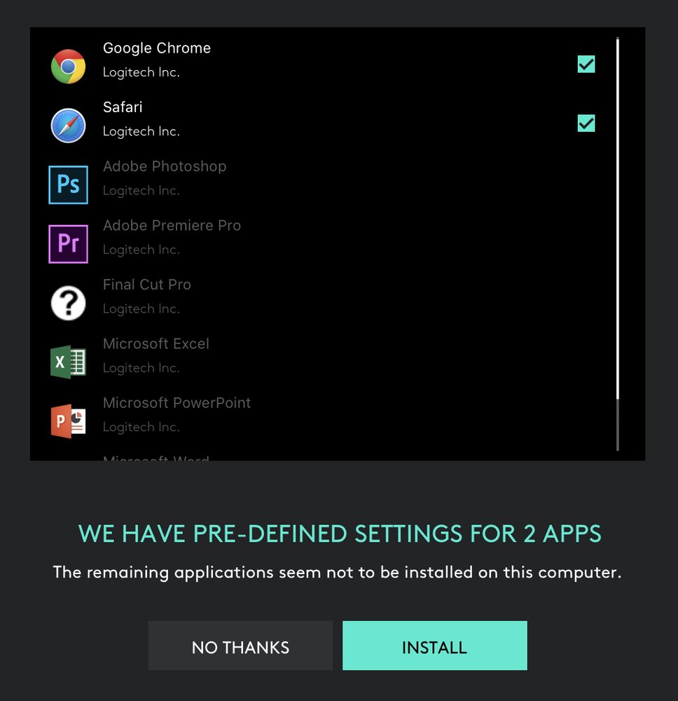
Not sure what all these “Logitech Inc.” labels are supposed to mean. Looks like all these apps were made by Logitech which they obviously weren’t

Why?!

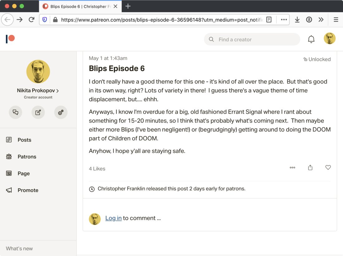
Patreon “Not logged in” UI. Despite my face in three places in the UI, including next to the link to log in, I am not currently logged in.

I’m still amazed how many fails could something as trivial as Todo app have. For example, how about not creating a task?

Google Cloud Console. Adding and naming a chart in a monitoring dashboard.

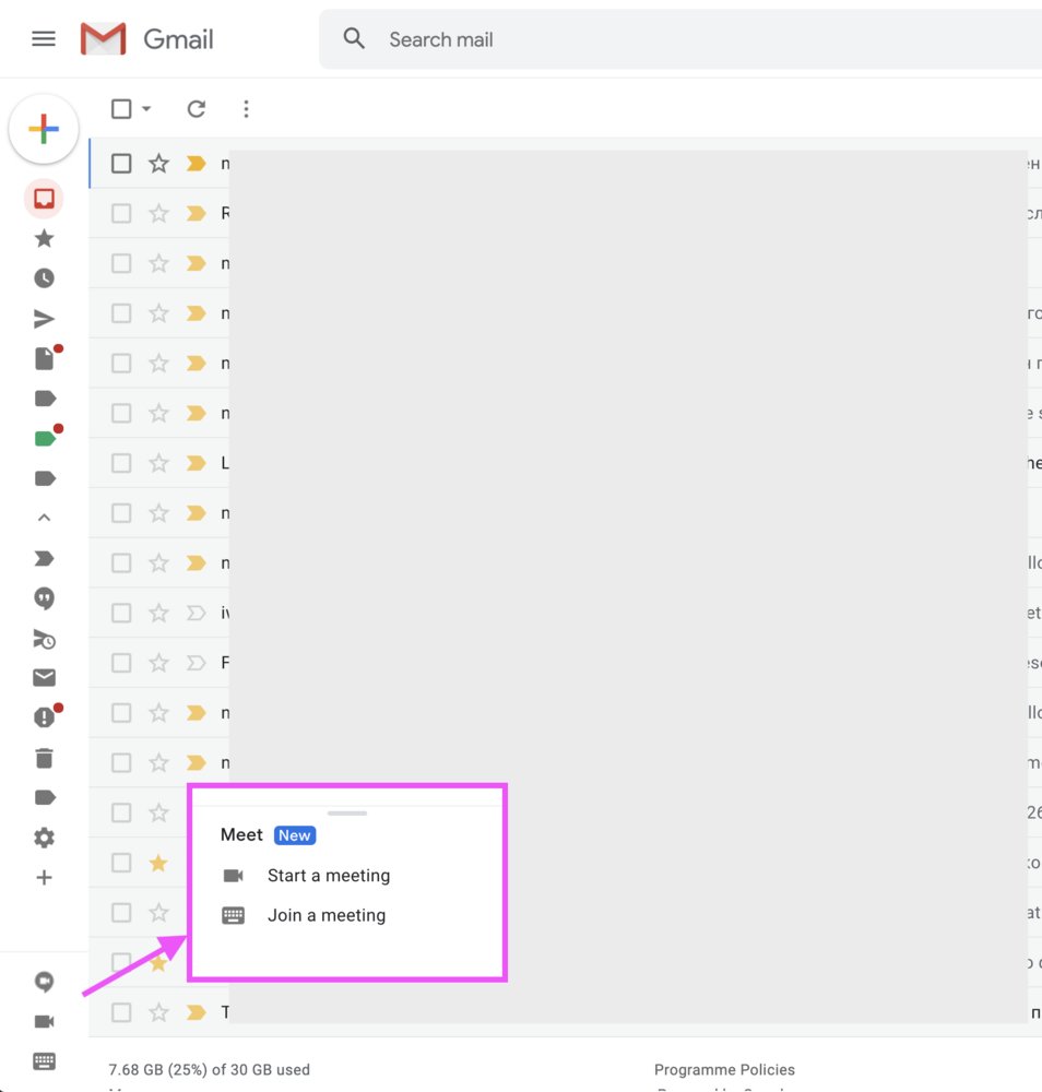
Just... just LOOK at all those icons!

You know what's funny? The bottom three icons are new: it's Google Meet (one of 39 messenger services from Google which was renamed 17 times during April). The camera icon is "Start a meeting". The keyboard icon is "Join a meeting". The speech bubble icon is... nothing! It just becomes a title on hover!

But wait, there's more! The separator line with a handler thingy — you can resize this "meet" section with it. But only by 5 pixels upwards and downwards. I suspect it's there for the future, when you have multiple meetings going on and want to resize the list because it doesn't fit the sidebar because it's full of endless icons and labels.

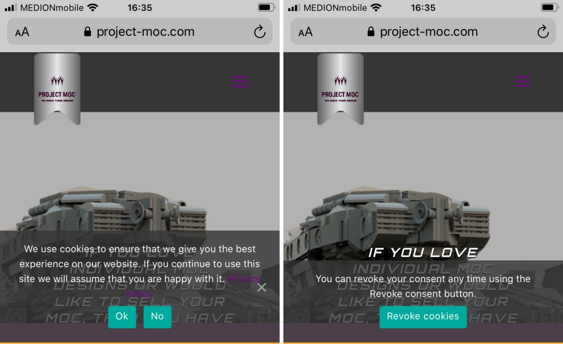
Accepted our cookie policy just to get rid of the banner? Well tough luck! Because now you can revoke your consent and you definitely need a banner for that too.

Pages:
160...8281807978777675...