
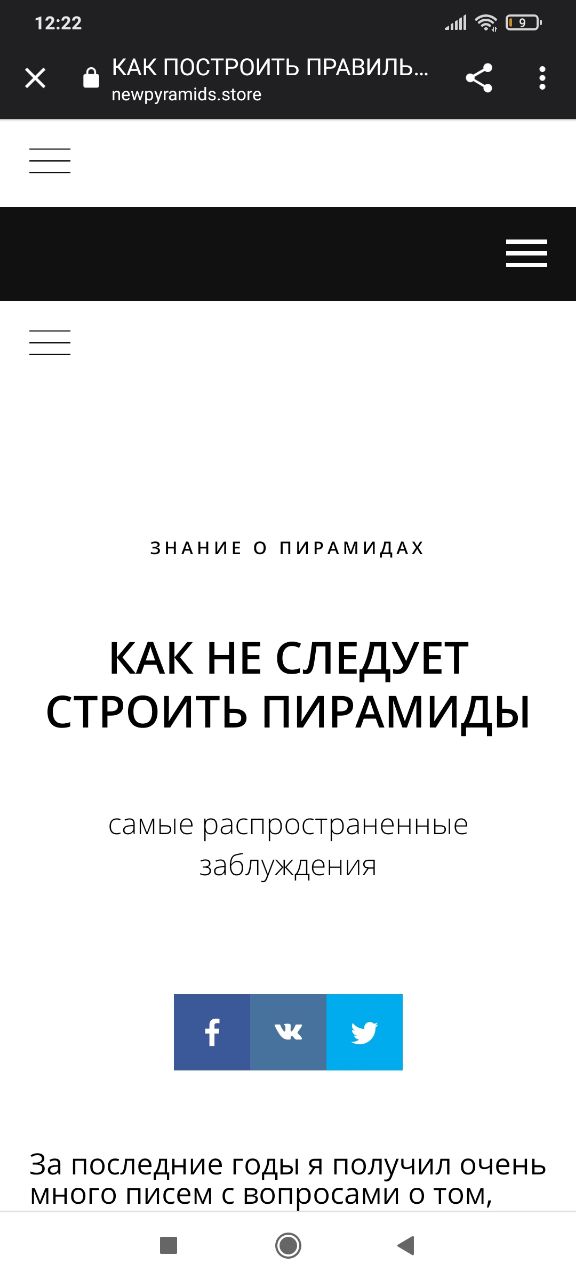
A website with THREE hamburger menus!
Thanks @bouncepaw for the picture
A website with THREE hamburger menus!
Thanks @bouncepaw for the picture
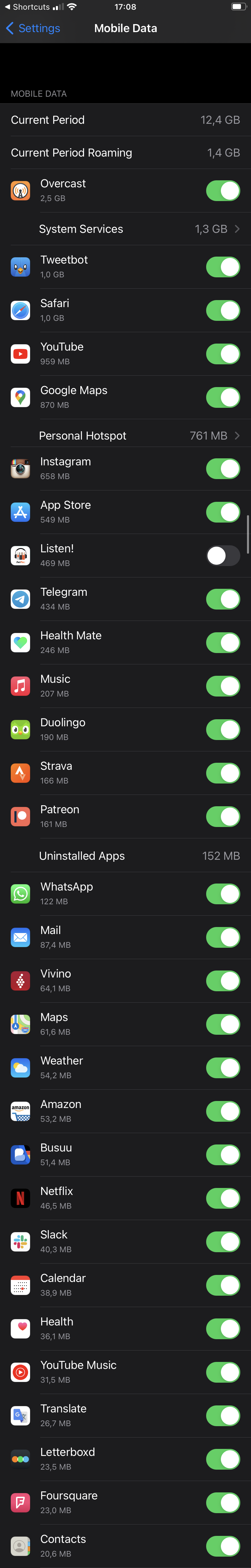
Sorting is important! So if you need to turn off a particular app in Mobile Data, good if you can guess how much data your app has eaten. Otherwise, good luck finding it in this crazy-sorted list
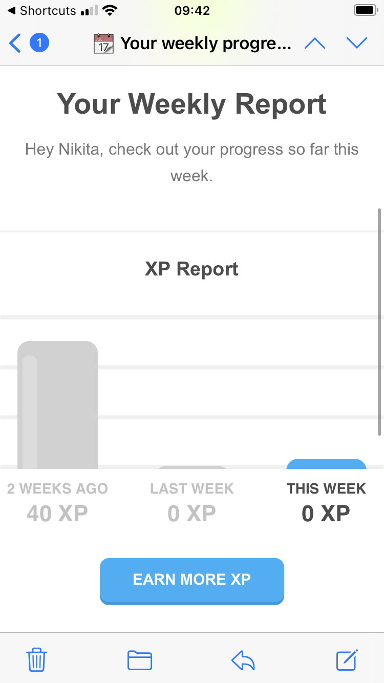
This week 0 XP is significantly higher that last week 0 XP!
Learn more by changing the font in a tooltip!
Thanks Kai for sending this video
Aren’t those arrows swapped?
Thanks Siri for helping out

Blue Yeti mic looks great, but the cylindrical shape makes every side look more or less the same, which leads people to think that you should talk to the tip.
Turns out that cylinder does have a front side (on a screen above, front side faces the camera) and the correct use is to talk there. But nothing in the design helps you understand that.
Yesterday we talked about the shortcomings of traditional calendar view grumpy.website/post/0Uad3BltE.
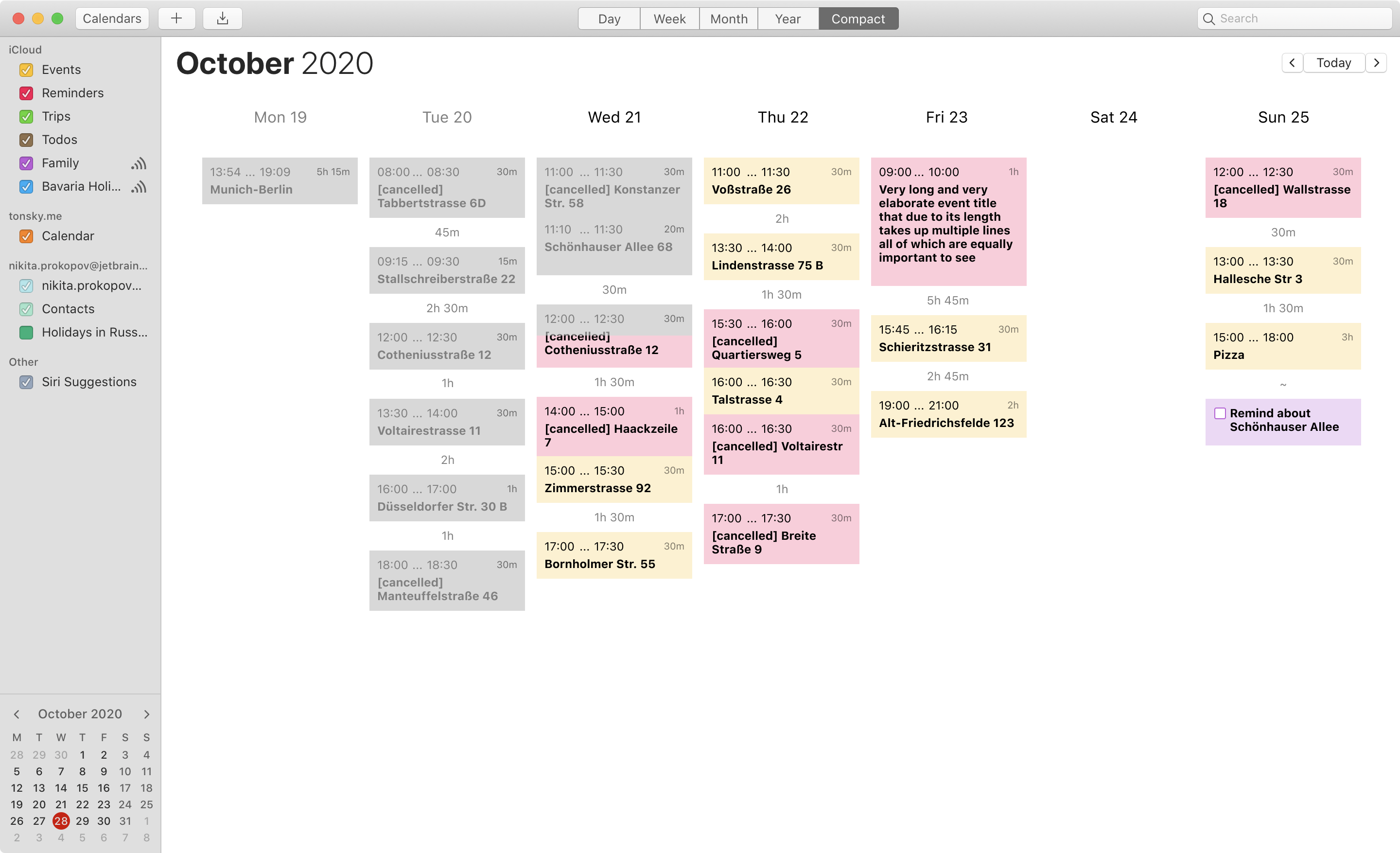
Here’s my proposal that fixes the information density problem of Week view: “Compact week”.
- Event height is not related to its length. ANY event card (even 15-min event) can fit as much info as needed (multiline titles, attachments, etc).
- Show start, end times and event length. All are useful in different contexts.
- Show amount of free time between events.
- Events are listed in order, not glued to single linear timeline. Fits more events.
- Events in the past are dimmed. Easier to find “Now”.
- Because columns are no longer actual timelines, one can add “open-ended” items (meet with friends) or simple todos (no particular time at all).
This is a middle ground between “flat linear todo list” (which I always have problem finding where does one day starts and another one ends) and full “timetable” view found in other calendar apps (which has problems fitting long title into small rectangles proportional to event length).
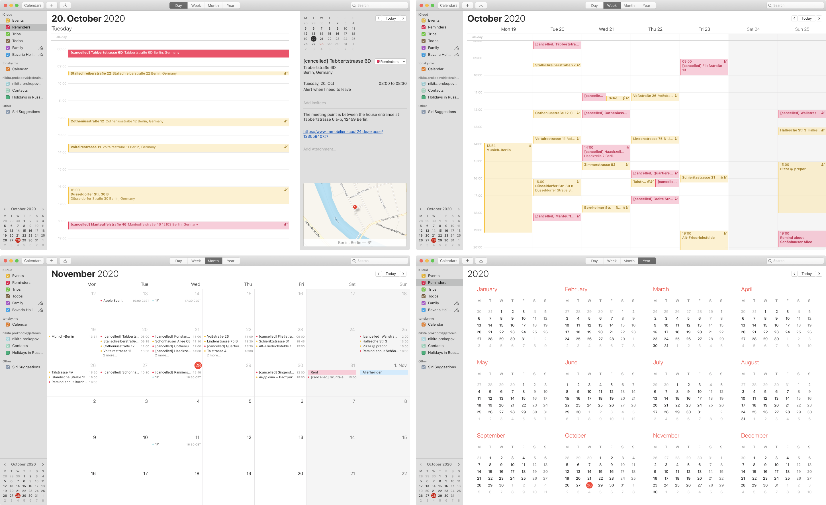
The inefficiency of Apple Calendar kills me. So much empty space, yet the important information is collapsed to a comically few letters.
Day view: we stretch each event to the whole screen width. Unnecessarily. Yet we can barely fit just 12 hours at each moment out of 24. Humans are awake at least 18 hours a day, hello! Plus sometime we have to wake up early to something — wouldn’t want to miss that.
Week view: most useful of all. Same 12 hours problem. Also, each event title is truncated, just to few letters if two events intersect. “Schö...”? “Tastr...”? Seriously? While 70% of the screen is EMPTY?
Month view: a day has 6 events? How about we show you 4? Good enough for you? Hope you can remember the last two. No matter that the rest of the month is literally empty, each empty day will take exactly the same amount of space.
Year view: don’t show any events at all. This is just a calendar card.
You’d think that other calendar apps, the ones that have a business based solely on selling a better UI, would invent a more efficient information representation than Day-Week-Month-Year. As far as I looked, they all just copy the Apple design :(
P.S. Thanks @monory for showing me that you can switch to 24-hr view instead of 12-hr that is default. The problem with overlapping events and truncated titles still stands, though.

Ah, yes, Amazon, thank you for your helpful suggestions powered, undoubtedly, bust best-in-breed machine learning and AI.