
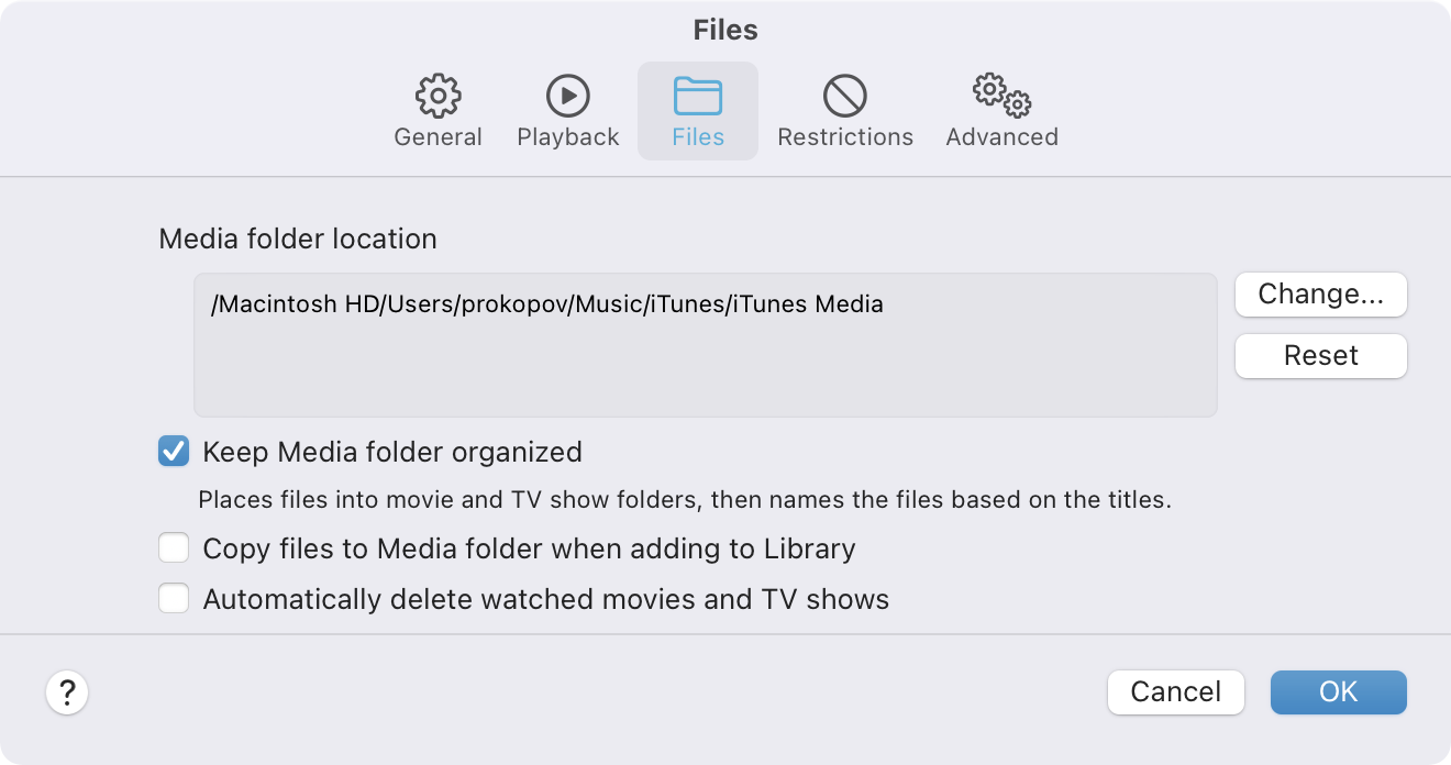
Where should we keep downloaded movies and tv shows from TV.app? Is it Music? iTunes? Media? Why not ALL?
Also, let’s add Ok/Cancel to settings dialog, which macOS normally doesn’t have. Will make our app stand out!
Where should we keep downloaded movies and tv shows from TV.app? Is it Music? iTunes? Media? Why not ALL?
Also, let’s add Ok/Cancel to settings dialog, which macOS normally doesn’t have. Will make our app stand out!
“How do we make our UI more modern?”
“Highlight the most important thing!”
“What’s the most important thing?”
“Arrows on the dropdowns, duh!”
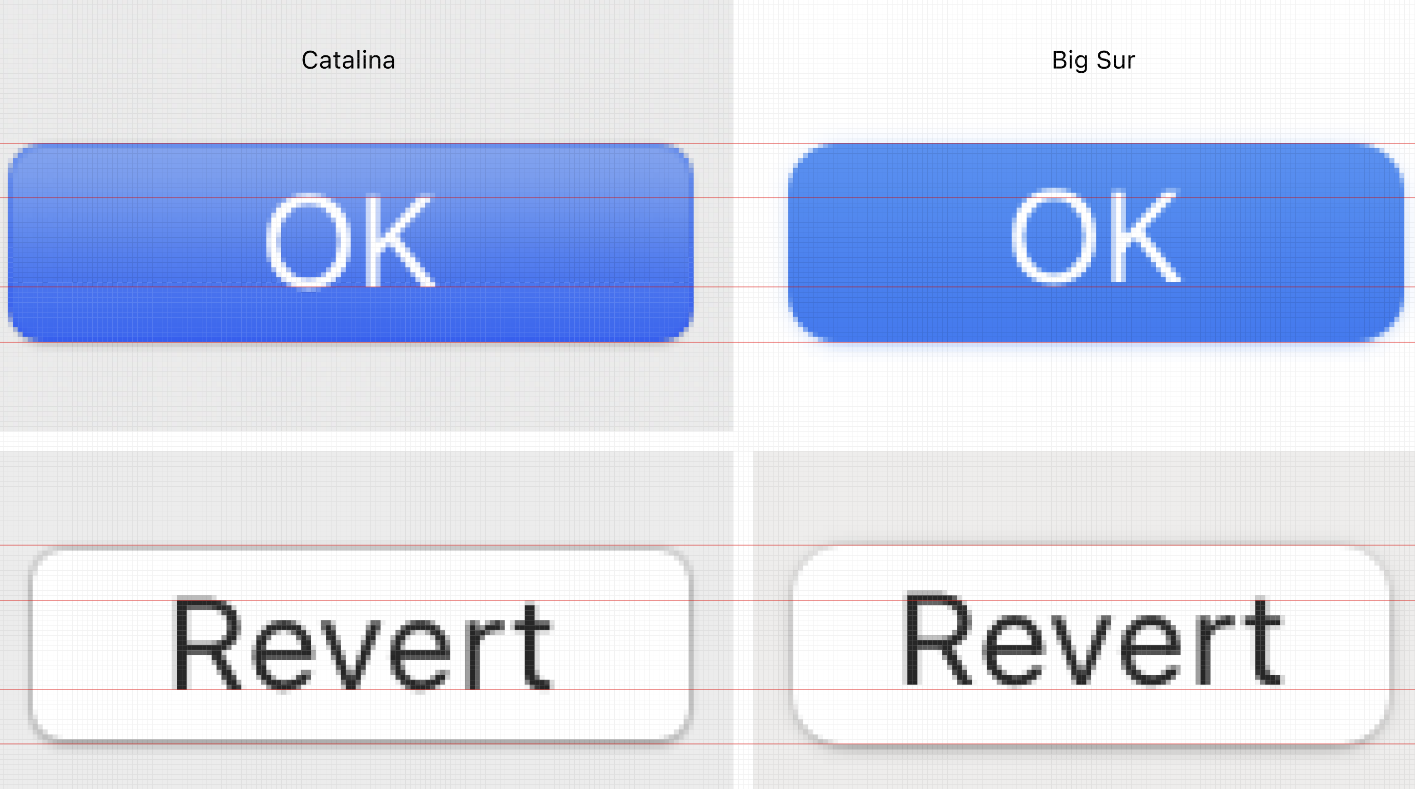
Years of web development trained me to spot a very specific thing: text not aligned vertically in a button. It is hard on web, where end users might use different fonts, devices and OSes.
But Apple controls everything: devices, OS, font! Yet in Big Sur, for the first time in human history, Apple did a poor job aligning text in a button. The end is nigh.
P.S. Yes, you can totally see it. Yes, it is consistent across OS. It is in EVERY button, every tab, every dropdown. Yes, it’s annoying as hell.

Why would anyone want and implement this behaviour?
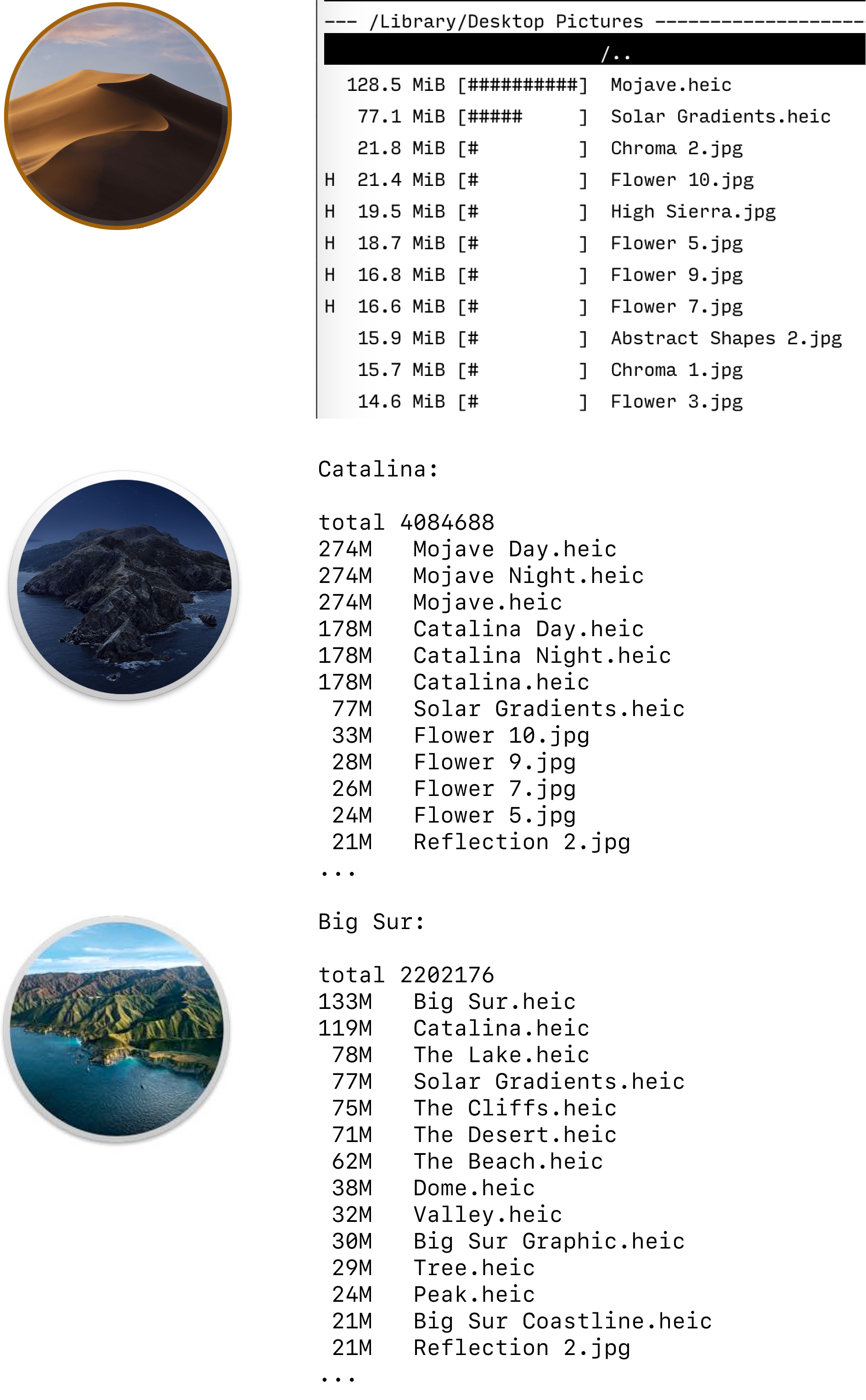
How much disk space do macOS wallpapers take? 1-2 Gb depending on a system.
Are wallpapers crucial for OS to function? No.
Can they be downloaded from Apple website only by those who want them, on demand? Absolutely.
Even if I use one of the 50 wallpapers, what do other 49 do? Waste disk space.
Is there a reason why wallpapers are put on system read-only volume, so there’s no way to get rid of them? Well, I can think of one. Those bigger SSDs won’t sell themselves.
Let me get this straight: macOS would actively remove your locally cached files from iCloud and you will have to wait for them to download, while 1 fucking Gb of useless pictures is always there, laughing in your face.
Why do I care? I have a 2018 Mac Mini with 128 Gb, purchased just two years ago. I was naive, but Apple was too: they produced them and sold them to every happy customer. After fresh OS install I have ~50 Gb to work with. Routinely I have just ~20 Gb, which is ok for my work, but I can’t afford Docker, or Xcode, or games, or movies, or video editing. If I make an effort, I can free up to 40 Gb, which is still not enough for Xcode to update.
And those gigabytes wasted on wallpapers? They add up.
Thanks @nikitabarskov and @delaguardo for Big Sur measurements.
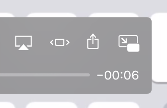
If you plan to use modern video player, you better become an expert in arrows and rectangles

Opinion time! Arrows rounded at their tip — ugly. Fight me

”...” can’t be an icon. Same way as [v] or (x) or ▼ can’t. Too easy to confuse with an actual control.
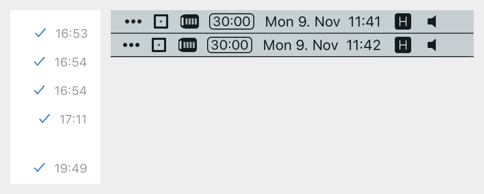
Most UI fonts have tabular numbers. It’s number figures that all have the same width. Normally they are good in tables, where you need to compare multiple rows of numbers one under another.
But it should be used for time indication too! E.g. macOS kind of annoys me when every other minute all the icons suddenly move a few px to the left/right.
UPD: default clock on macOS 10.15 seems to not have this problem. I was using non-default clock.
Thanks @theLastOfCats for the left picture
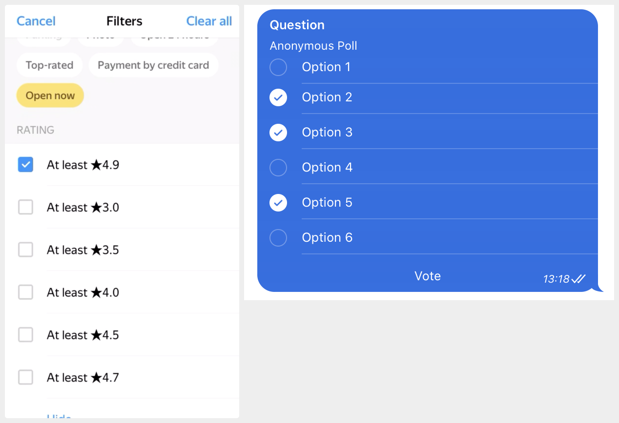
Left: exclusive choice (radio buttons)
Right: multiple choice (checkbox)
Both are wrong! Let me address the new generation of UI designers who are growing accustomed to the idea that anything can look like anything and the only way to figure out what you see it to try to interact with it. The convention is very simple: exclusive choice should use circles, multiple choice uses squares.
This is one of the few simple, good and more or less consistent visual aids in UI design history. Until now, anyway. Please, can we keep it going for at least a little bit longer?
Thanks @mxtnr for the left picture