
How many levels of nesting is there in Shortcuts app? I count 6 (not counting navigation inside iCloud Drive, but counting the menu for choosing where icon should come from)
How many levels of nesting is there in Shortcuts app? I count 6 (not counting navigation inside iCloud Drive, but counting the menu for choosing where icon should come from)
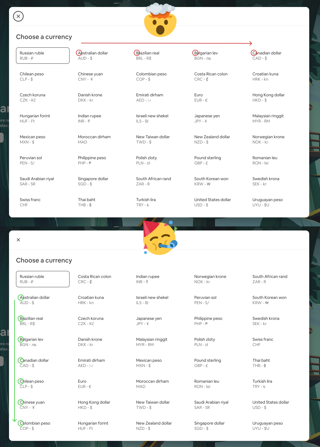
People invented column layout for a reason. That reason being that it is very easy to scan first letters and quickly find what you were looking for. If you put items in row layout instead, it becomes impossible to scan and you need to read every single entry.
Don’t believe me? Try finding Euro quickly it the top variant, and then in the bottom one.
Also, the fact that current currency is put into the first positoin makes it very easy to miss. There’s no reason for it to be out of place. That’s an anti-pattern to.
The idea of headers it to stand out, you know?
How about two hamburger menus? Right one opens menu on the left, left one—on the right.
Thanks @hutattedonmyarm for reporting this
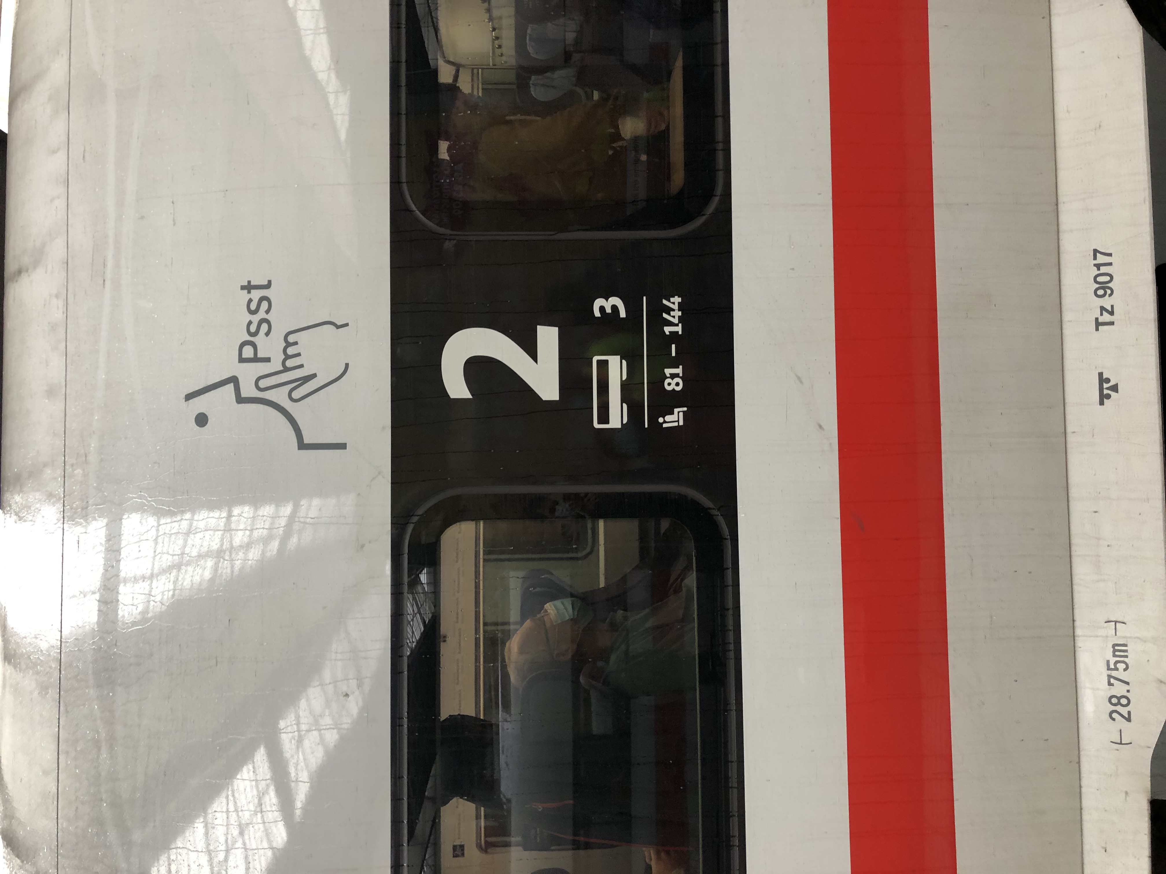
Sometimes too much minimalism is too much. Takes non-zero amount of conscious effort to figure out which of those many numbers is actually coach number
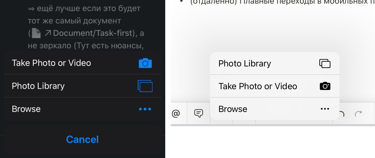
iPhone version/iPad version of the same app. Why not consistent?
Thanks @mxtnr for the pictures
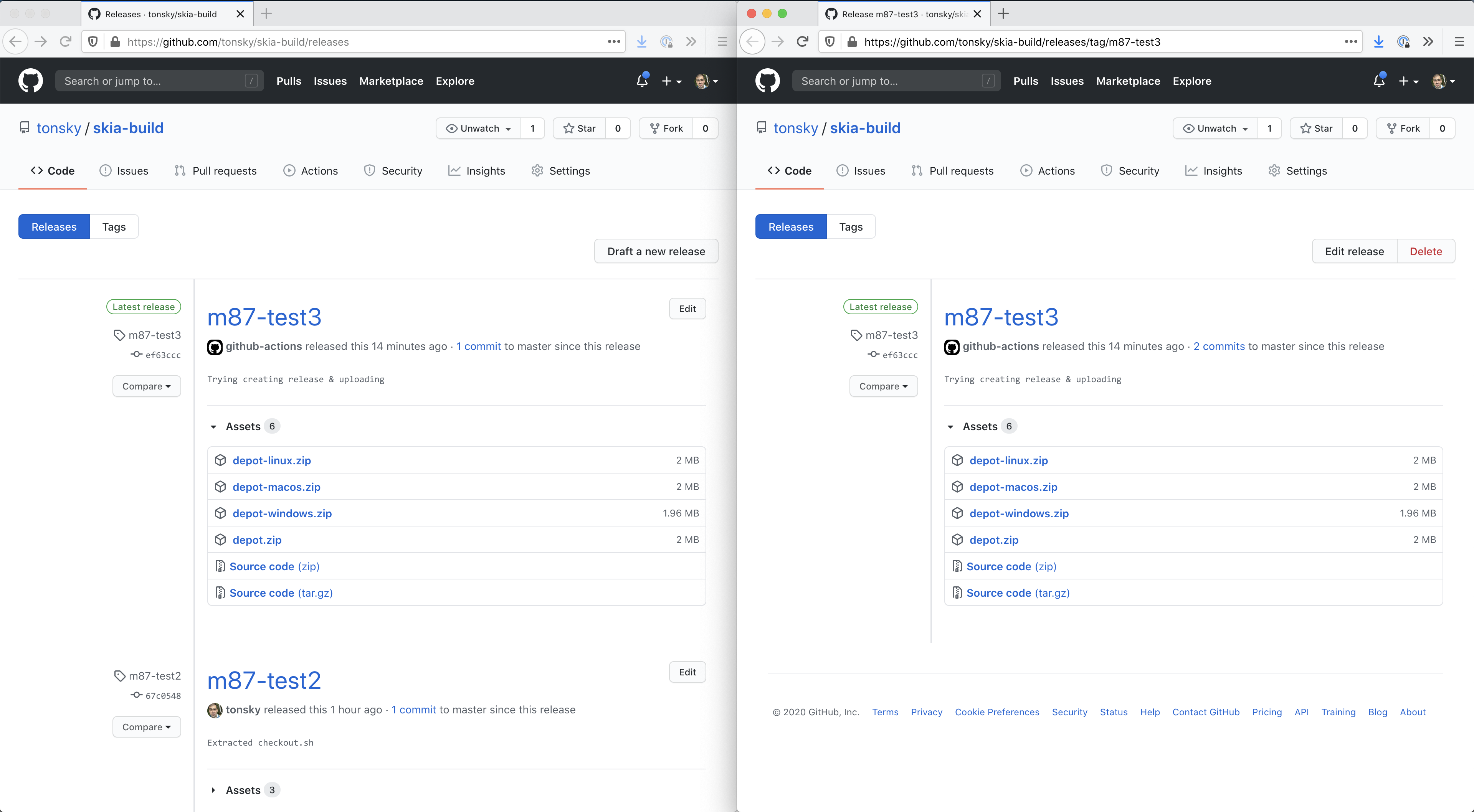
Github Releases page (left) shows full Release content and all the controls you might need, except for delete button. But if you go “inside the release”, you’ll see exactly the same content (!), but now Delete button appears.
If you show the same subject, show the same set of controls. What you can do shouldn’t depend on how you found the subject.
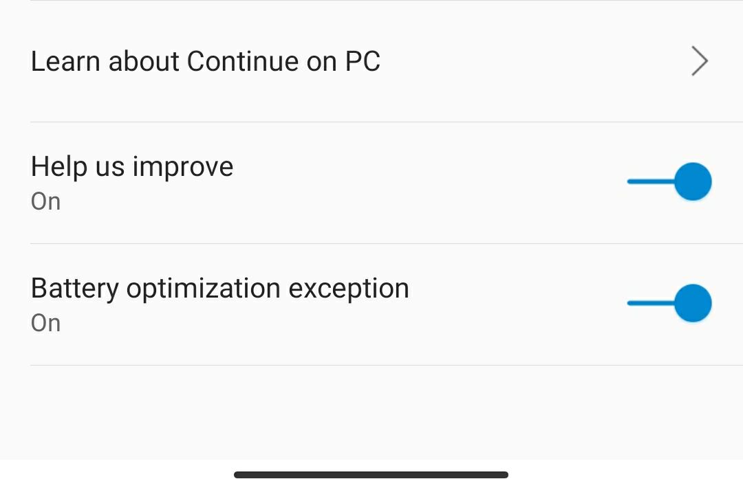
Slider or toggle?
Thanks @avrong for the picture

This side does not use cookies. It can hurt you in other ways.
(also, they DO use cookies :)

Does Google know any other UI element except for three dots in a row?